


Process Style Learning
My Design Instructor was schooled in the Swiss style of design, so naturally he gave us an assignment based on the process style learning, where a majority of the semester would be spent on analyzing and focusing on one assignment.
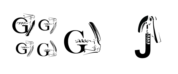
Part I:
Object & Letterform. The first part of the assignment was to find an object that can be held with one hand, and movable parts, and had strong contrast and texture when shot in grayscale. We then had to apply letterforms that would compliment or contrast the shape the image created.

Part II:
The next step was to convert the photo object into a vectorized shape, keeping visible only the parts that identify the characteristics of the object.
Part III:
After vectorizing the object it was time to brainstorm ways in which these designs could be tied to logos and brands. We had to come up with a name and a tagline that related to the object's practicality or symbolism.

Part IV:
Upon further refinement, it was time to apply these logos. We had to list the core demographic for which companies would target. For the H design I branched out into two distinctly seperate paths. (Thank you GemGFX for supplying me with the brand application templates)

(Gestalt Career Services - Career consultant firm)

(Himura - Distribution company for Japanese Wines and Sake)

(Helena - Wine catering for weddings and other festivities)


