YÖY Organic Juice
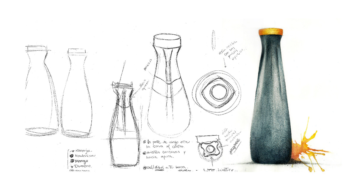
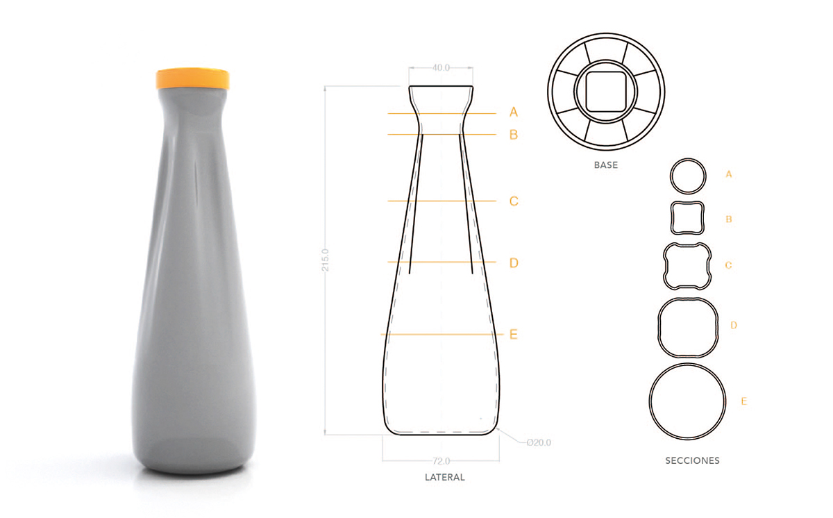
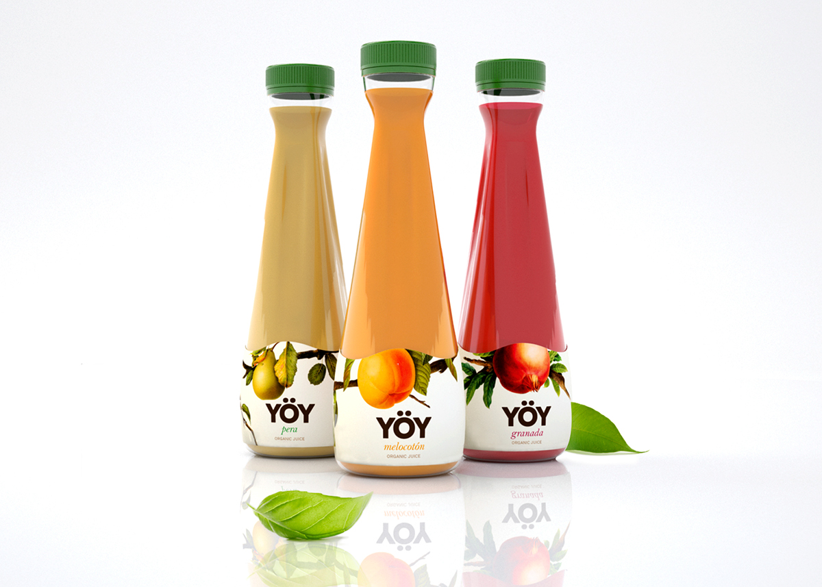
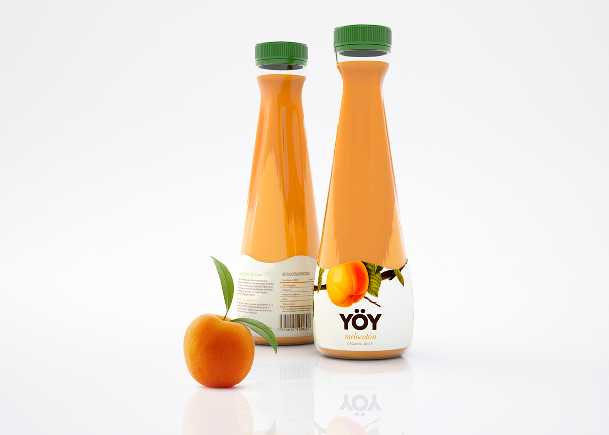
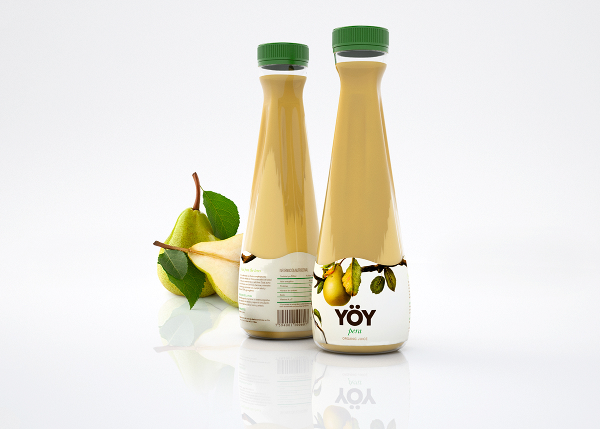
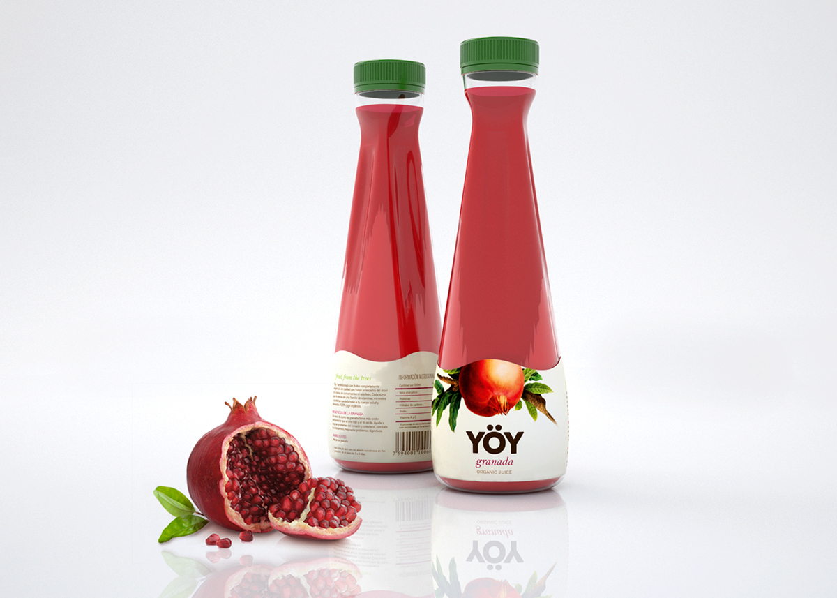
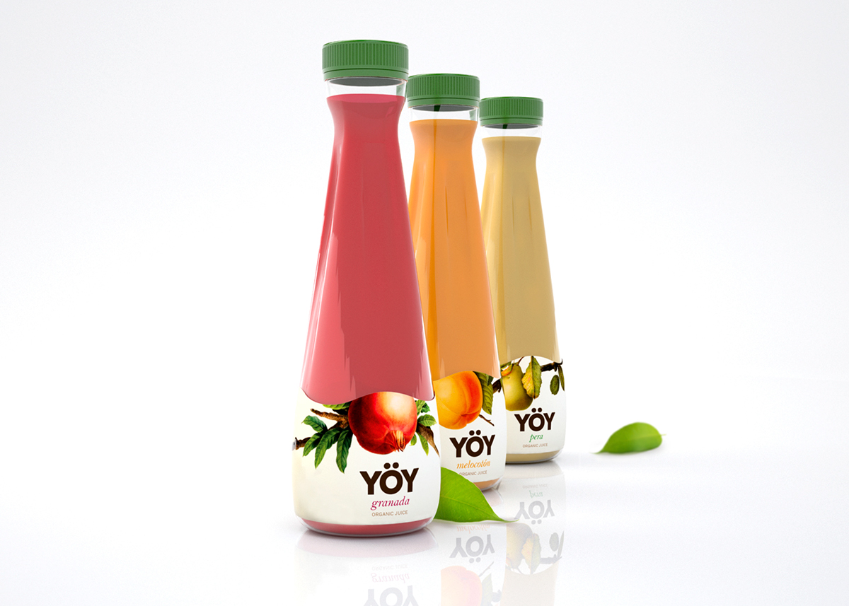
El reto era transmitir la alta calidad de un zumo 100% orgánico para compradores conscientes de la salud. Junto con la combinación de tres campos del diseño: Industrial, naming y diseño gráfico. El árbol fue la fuente de inspiración y de aquí nace el naming de YÖY, que significa “árbol” en idioma indígena Pemón. Haciendo una connotación directa con el concepto del proyecto “un zumo tan orgánico que la fruta es arrancada del árbol a tu boca” El diseño de la botella tiene unas pequeñas aristas o vertebras que simulan las raíces del árbol y unido con el diseño de la etiqueta evoca a lo natural creando una imagen atractiva.
The main idea of this design is to transmit the high quality of a 100% organic juice directed to a target of health conscious people. Conceptually "the juice is so organic, the fruit is plucked from the tree to your mouth". The combination of naming, industrial design, and graphic design was the key to develop this packaging. The tree was the principal inspiration for the project giving birth to the name YOY, which means tree in the indigenous lenguage Pemon. The design of the bottle consist in small edges or vertebrae that simulate the roots of a tree and combined with the label design it evokes nature with an attractive look.
Cristina Maldonado - María Duriana Rodríguez Pacheco ©
Master in Packaging Design ELISAVA
Barcelona, 2014.
Master in Packaging Design ELISAVA
Barcelona, 2014.


