L'Officiel Brasil Redesign
Pages and spreads from the inaugural issue of L'Officie Brasil redesign, launched on the February 2015 issue.
The goal with the redesign was to align the Brazilian version with its motherland version, L'Officiel Paris.
It was quite a challenge because we Brazilians are much more influenced by the American magazines than the European ones, so we had to do a few changes to adapt the format, the flow, the typeset, the photographic language...
I had total support from both Brazilian and French teams to develop a unique project, not necessarily recreate the same structures and layouts from L'Officiel Paris, which was very relieving, because I didn't quite like the whole french design (Pardon à mes amis)
Analyzing the competitors (Vogue, Bazaar, Elle, Marie Clair, InStyle) I realized that all of them were very similiar, very busy, full of cropped images (catwalks, stills) and with an immense lack of white, clean space and organization. Even L'Officiel Paris has its moments of busy spreads and misleading hierarchies.
So I decided to go clean. Black and white. Less is more.
Below are a few examples of pages that look pretty much the same in both editions, and pages that are quite different from the original french design.
Client: L'Officiel Brasil/Edições Escala-Jalou
Design Direction by Rodolfo França
Design by Rodolfo França and Fernando Pires
Image Retouching by Thiago Brandão
Design Direction by Rodolfo França
Design by Rodolfo França and Fernando Pires
Image Retouching by Thiago Brandão

Cover
(on the left hand side, smaller thumbs of the French version; on the right hand side, my unpublished version)
The cover structure is meant to be very similar to L'Officiel Paris covers. The headlines should be central-aligned with the 'O from L'Officiel and the main headline should be set on lettering/handmade typeface. For the first issues, I decided to go with Brush Up, a typeface from the Brazilian foundry PitassilgoPrints. The idea was to have the 'O and the "New Erotic" on hot-stamping, celebrating the launch of the redesign issue.
Unfortunately, the version above wasn't approved by the magazine's headchiefs
and another cover ran to the newstands.

Letter from the Editor
(on the left hand side, smaller thumbs of the French version with colorful blackground;
on the right hand side, my version)
on the right hand side, my version)
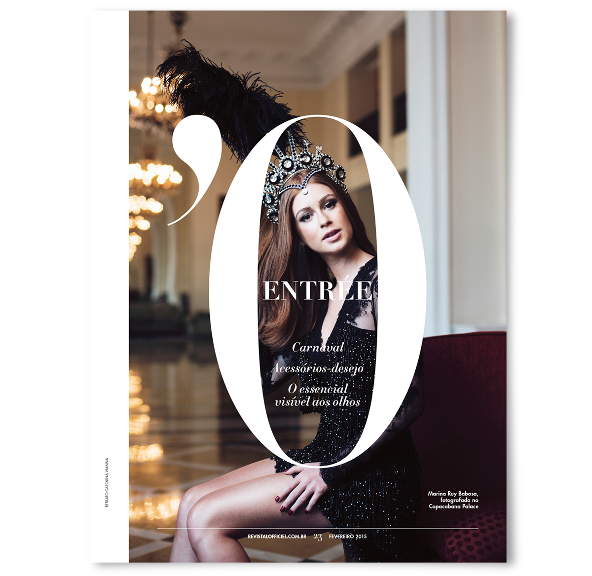
Entrée
Cover of the F.O.B section Entrée, a section on Style, Trends and News
Cover of the F.O.B section Entrée, a section on Style, Trends and News

Spread from Entrée
Two pages storie from Entrée. Portrait by Carolina Vianna
Two pages storie from Entrée. Portrait by Carolina Vianna

Um café com...
(Petit Dejeuner Avec... / A breakfast with...)
On the left hand side, smaller thumbs of the French version; on the right hand side, my version.
I decided to work with Futura on headlines, to get a richer texture of type.
On the left hand side, smaller thumbs of the French version; on the right hand side, my version.
I decided to work with Futura on headlines, to get a richer texture of type.

Anatomy of a Bag
(Anatomie d' un Sac)
On the left hand side, smaller thumbs of the French version; on the right hand side, my version.
I decided to work with Futura on headlines, to get a richer texture of type and got rid of the colorful background, to focus attention on the bag it self.
(Anatomie d' un Sac)
On the left hand side, smaller thumbs of the French version; on the right hand side, my version.
I decided to work with Futura on headlines, to get a richer texture of type and got rid of the colorful background, to focus attention on the bag it self.

Beauté
Cover of the F.O.B section Beauté, a section on Beauty, Cosmetics and Trends
Cover of the F.O.B section Beauté, a section on Beauty, Cosmetics and Trends

Spread from Beauté
Opening spread of a six pages beauty-story
Opening spread of a six pages beauty-story

Brief
(Bref)
On the left hand side, smaller thumbs of the French version; on the right hand side, my version.
Pretty much the same structure, just a tide more neat and organized.
(Bref)
On the left hand side, smaller thumbs of the French version; on the right hand side, my version.
Pretty much the same structure, just a tide more neat and organized.

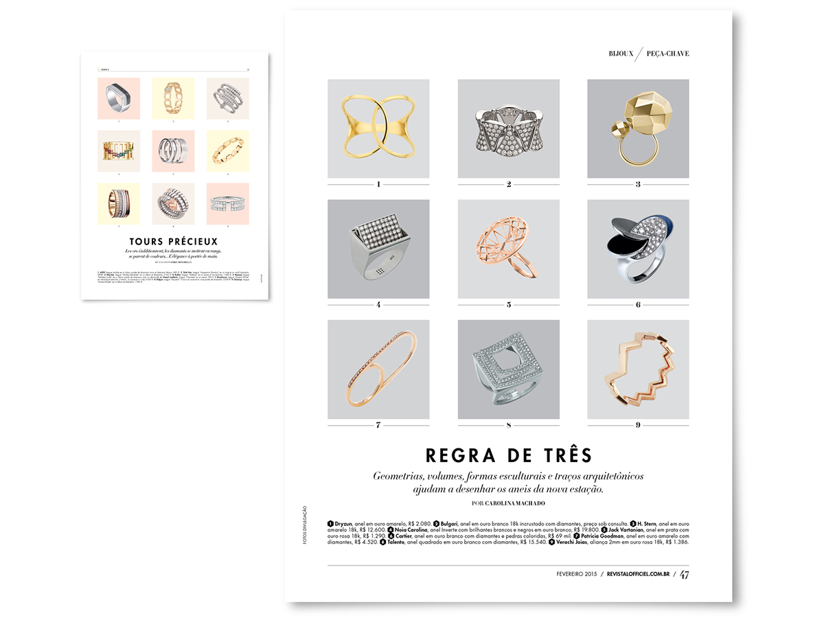
Bijoux
Cover of the F.O.B section Bijoux, a section on Jewelry, Bijoux and Trends
Cover of the F.O.B section Bijoux, a section on Jewelry, Bijoux and Trends

Spread from Bijoux
Opening spread of a six pages jewerly story

Anatomy of a Watch
(Anatomie d' une Montre)
On the left hand side, smaller thumbs of the French version; on the right hand side, my version.
One of my favorite pages! I love those big numerals all around the image! I decided to work with Futura on headlines, to get a richer texture of type and got rid of the colorful background, to focus attention on the watch.
Kingpin
(Bijoux)
On the left hand side, smaller thumbs of the French version; on the right hand side, my version.
Got rid of the colorful background squares, to focus attention on the colour of the jewelry.
(Bijoux)
On the left hand side, smaller thumbs of the French version; on the right hand side, my version.
Got rid of the colorful background squares, to focus attention on the colour of the jewelry.

Mode
Cover of the section Mode, a section on Fashion features
Cover of the section Mode, a section on Fashion features

Fashion feature
Opening spread of a 14 pages fashion feature. On the top my version, below, the French version; Every issue, L'Officie Paris brings a new awesome handlettering to its cover — because L'Off Brasil didn't have the money, I decided to work with typeface and bring the expresive touch to the fashion stories. So all the fashion features uses the cover's typeface.
Opening spread of a 14 pages fashion feature. On the top my version, below, the French version; Every issue, L'Officie Paris brings a new awesome handlettering to its cover — because L'Off Brasil didn't have the money, I decided to work with typeface and bring the expresive touch to the fashion stories. So all the fashion features uses the cover's typeface.

Fashion feature
Opening spread of a 10 pages fashion feature story
Opening spread of a 10 pages fashion feature story

Fashion feature
Opening spread of a 14 pages fashion feature story
Opening spread of a 14 pages fashion feature story

Fashion feature
Opening spread of a 8 pages fashion feature story
Opening spread of a 8 pages fashion feature story

Front Row
Cover of the section Front Row, a section on Profile features
Cover of the section Front Row, a section on Profile features

Feature stories
On the top my version, below, the French version; This is an example of a story that was first published in L'Officiel Paris and then in the Brazillian version. To bring the white and clear feel to the features,
I decided to put less but bigger images, so the rythim in the main book gets slower, calmer.
Also, the bodycopy typeface is larger than US/Europe (we Brazilians can't read smaller sizes than 10pt haha)
so I need have larger columns to fit the translated bodycopy.

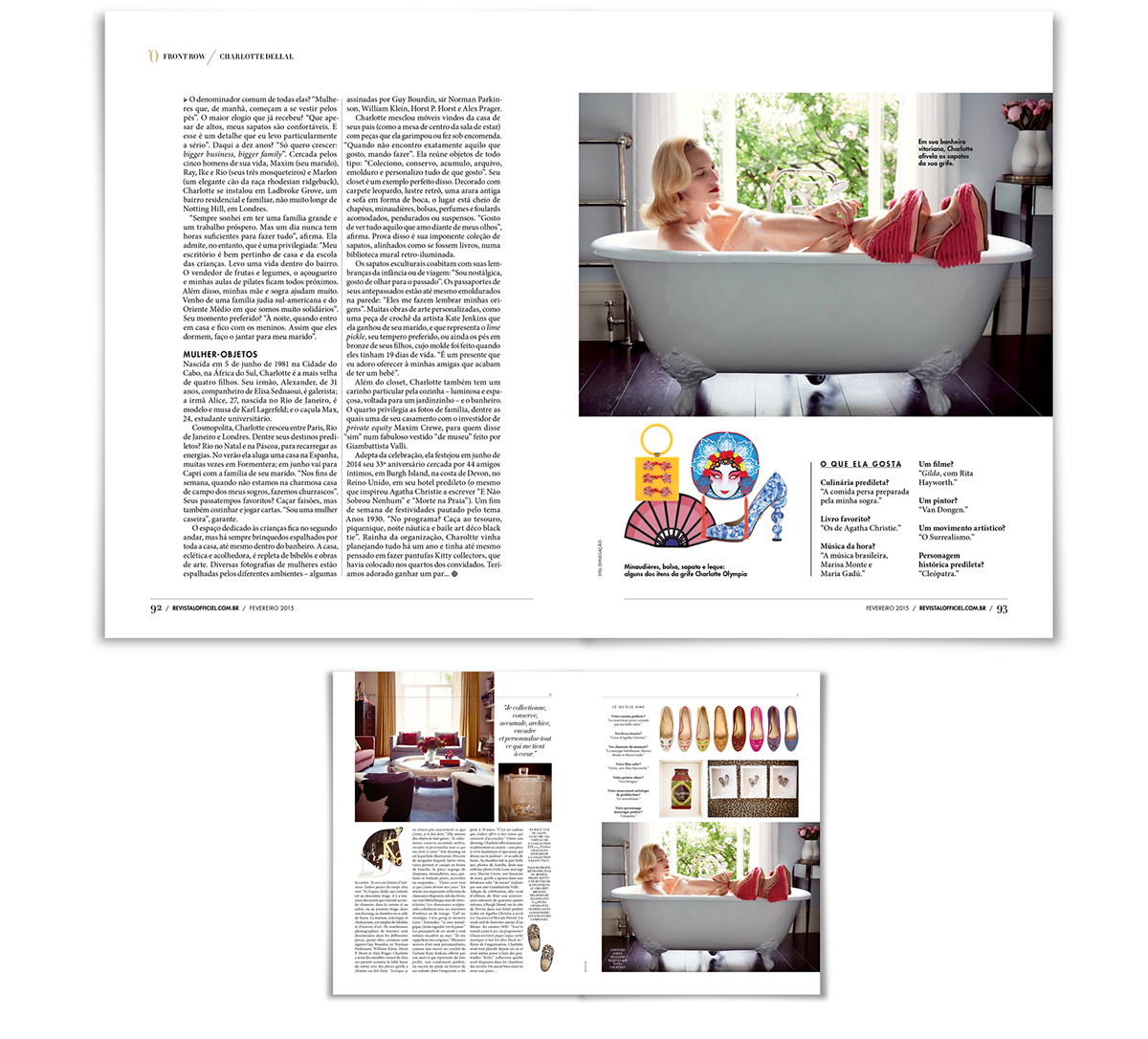
Feature stories
On the top my version, below, the French version;
(second spread of the profile of Charlotte Dellal)
On the top my version, below, the French version;
(second spread of the profile of Charlotte Dellal)
Feature stories
On the top my version, below, the French version;
(second spread of the profile of Charlotte Dellal)
On the top my version, below, the French version;
(second spread of the profile of Charlotte Dellal)

Profile Feature
Opening Spread of a four-pages story on Alexandra Fructuoso. Portraits by Julia Rodrigues
Opening Spread of a four-pages story on Alexandra Fructuoso. Portraits by Julia Rodrigues

Profile Feature
Opening Spread of a four-pages story on Rita Ora
Opening Spread of a four-pages story on Rita Ora

La Vie
Cover of the section La Vie, a section on Culture, Art, Food and Lifestyle

La Vie
Profile page from the B.O.B section La Vie. Portrait by Julia Rodrigues
Profile page from the B.O.B section La Vie. Portrait by Julia Rodrigues

La Vie
Profile page from the B.O.B section La Vie. Portrait by Julia Rodrigues
Profile page from the B.O.B section La Vie. Portrait by Julia Rodrigues


