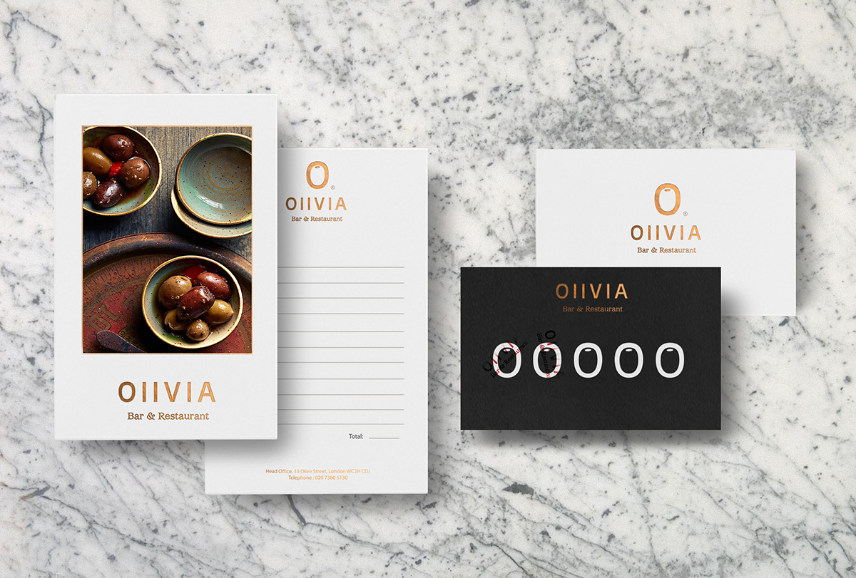
ISTD Mutton Quad Olivia is a typographical theme restaurant that takes inspiration from typographic designer Roger Excoffon who designed the type face Antique Olive “The Brand colour Pallet was carefully selected to reflect the natural colour of olives” Color is a powerful tool in graphic design.
I have used these specific colours to attract attention, organize content and to emphasize certain elements and to help my olive brand look aesthetically pleasing. I have used several fonts from the antique olive font family to distinguish different parts of the text and to show how the shape resembles an olive. The logo is a typographical design, which involves the typeface Antique olive.
Due to its unique characteristics of its letter O, which resembles an Olive I thought I would use this letter to emphasize this in my logo. By adding a circle to the O the negative space within the letter becomes the shape of an olive. The restaurant is built around several small Greek and French cuisine dishes incorporating bold tastes to accompany the bulky nord typology within the branding of antique Olive.