
We all know that some projects can take a bit of time to come to fruition (no pun intended!). It’s not uncommon for some projects to take months to see the light of day. But with these stamps for the USPS I never anticipated that the approval process would span over 12 years!
I was first contacted by Art Director and design consultant to the Citizens Stamp Advisory Committee Richard Sheaff back in 2002 to work on a series of stamps celebrating American fruits and vegetables. There were to be six different designs in the set. We had a list of possibilities to choose from including Avocado, Cherry, Grape, Persimmon, Pineapple, Plum, Prickly Pear, and Strawberry. The final selection was Cabbage, Grape Lemon, Persimmon, Pineapple and Sweet Corn. We decided that as a point of departure I would reference vintage seed packets, catalogs and fruit crate labels.
Here are a few choice pieces of vintage reference that served to help inspire my designs:


What I gleaned from all the reference was not so much layout and design, but more the attitude of these graphics—and how the various fruits and vegetables were represented.
I was not trying so much to do faithful renditions of seed packets or fruit crate labels, but to create graphics that might be seen as contemporary versions of their earlier cousins. So I never borrowed any of the elements from the earlier graphics verbatim, but attempted to update them to a more current sensibility. Also the small size and scale of these stamps prohibited using the reference in a very literal manner: reducing any one of them to the size of one of these stamps would have rendered much of their fine detail unreadable. So I needed to play loosely with the idea of referencing these graphics, making them much bolder and simpler than one might have imagined.
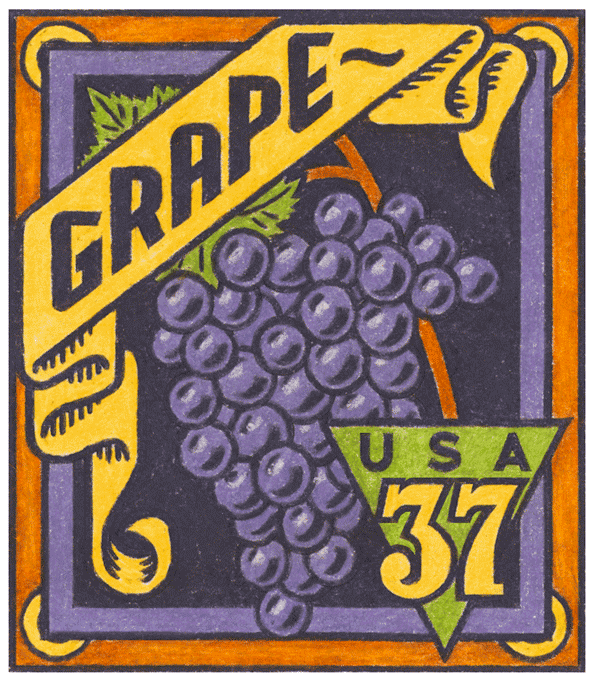
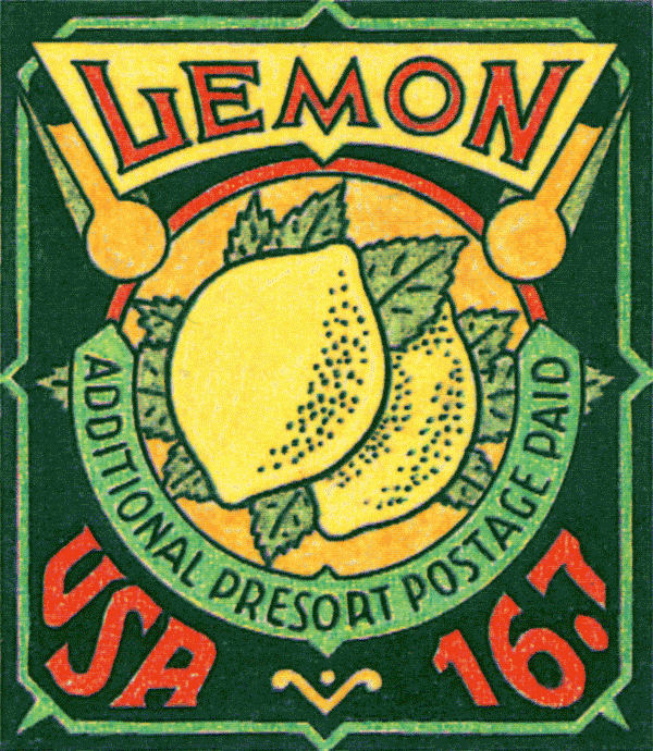
Here are the six stamp designs I created in 2002 preceded in each instance by a couple of the pencil drawings created in their development. Of the six, these first three—Grape, Cabbage and Lemon only made it to the colored pencil comp stage (yes, back in 2002 I still occasionally did color comps the old-fashioned way—by hand!).


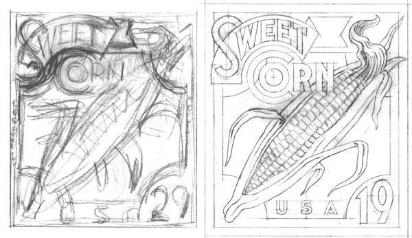
The following two designs—Pineapple and Sweet Corn—were developed to a more finished, digital stage, and so were more refined and worked out than the preceding three designs.


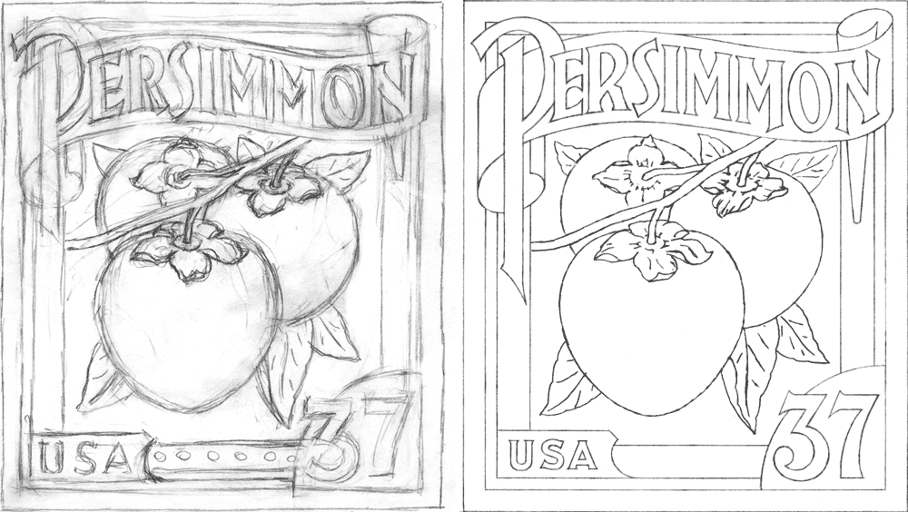
Finally, the sixth subject Persimmon, which was the last to be developed never made it past the rough pencil stage. If memory serves the project at that point was kept to the previous five designs.
At the time, it all looked very promising that these stamps would actually be produced. They were well liked, but as time went by, it was apprarent for various reasons that this series was to be shelved—at least temporarily. After more time passed it became clear that these designs were not going to get produced. I was never sure exactly why—I didn’t feel that there was anything lacking in the designs. In fact I was extremely happy with the designs I had created for this project.
Below, the entire series as it was left back in 2002:

But things don’t always turn out as you would imagine. I never felt that I should have given up hope for these designs . . . so in 2012 an opportunity presented itself with regard to these designs that I couldn’t ignore. If you’d like to know what happened, please check out Part 2 of this post.

Award-Winning Typeface Designs for every taste from Alphabet Soup Type Founders


