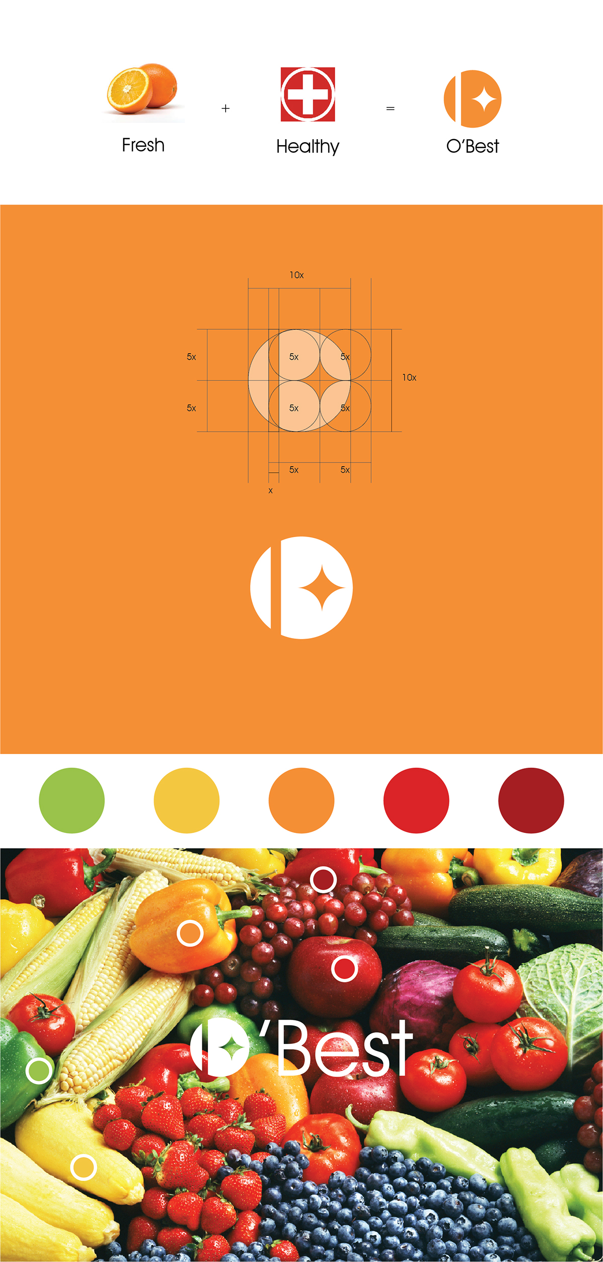
O'Best is a packaged food company that is based in the state of California. Its consumers reaches a world-wide base. The company's moto is simple, to bring the high quality food from California to the people around the world with natural ingredients that are best for human's bodies. The client wanted an emphasis on the company's origin- California. To achieve the request, an orange was used as the symbol of California as well as a fruit of healty, and natural. The letter "O" and "B" is also hidden in the logo as the intial letter of O'Best.
Stationary System


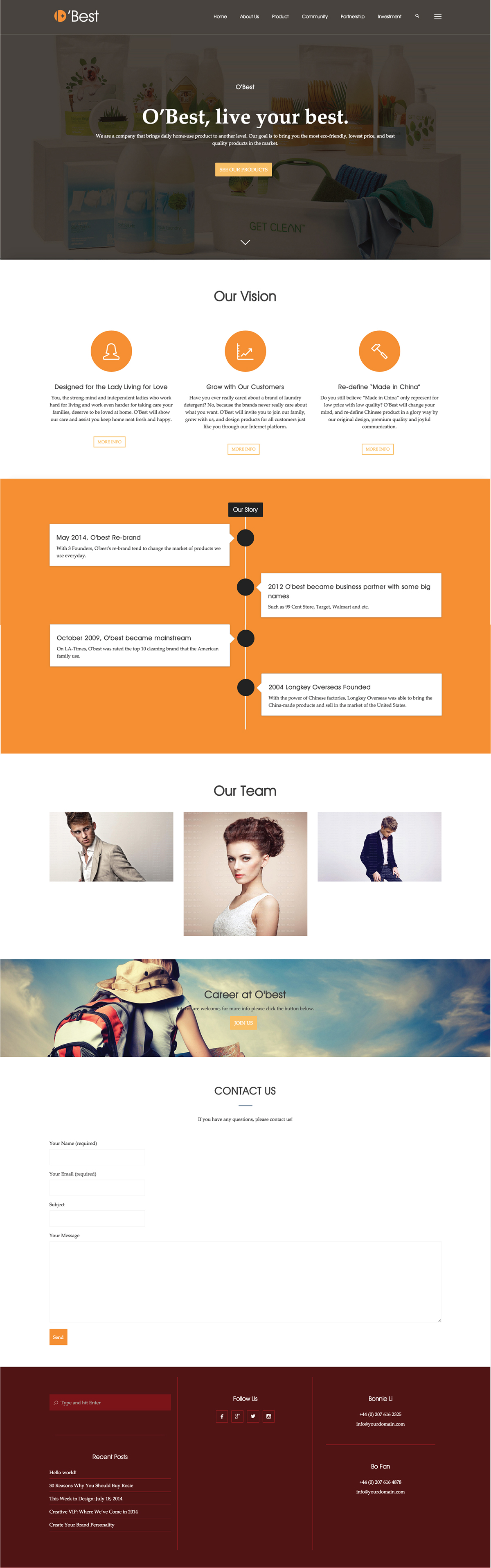
Website Layout- Homepage