
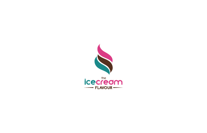
In this logo I wanted to represent the cream, of ice cream in a minimalistic way.
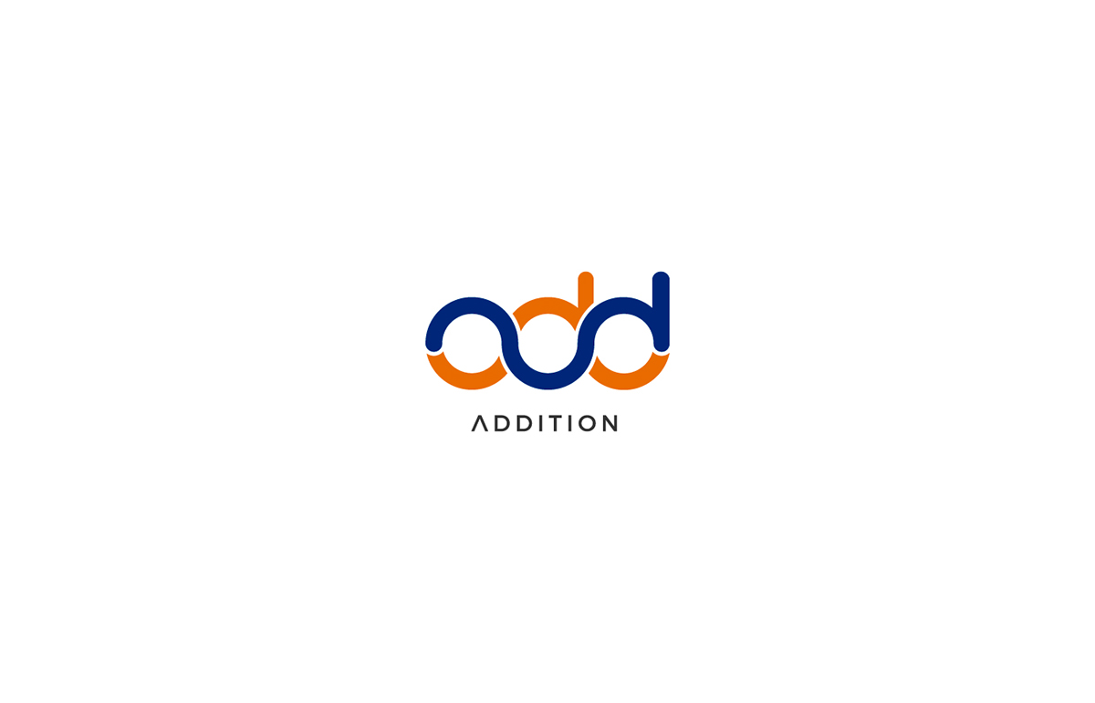
ADDITION is an OEM (Original Equipment Manufacturer) B2B (Business to Business) that provides high-quality, innovative and integrated tube bending and end-forming solutions.
ADDITION is a company based in precision manufacturing equipment.
Logo concept:
add (+) ADDITION + Tube Bending.
See the full branding project here!
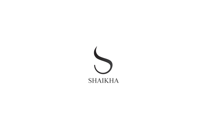
As this is for a fashion line product, I decided to keep it simple, minimalistic and curvy.

This is an abstract shape and the letter: "A" of Angola in the middle of the symbol. (Industrial Property of Angola)
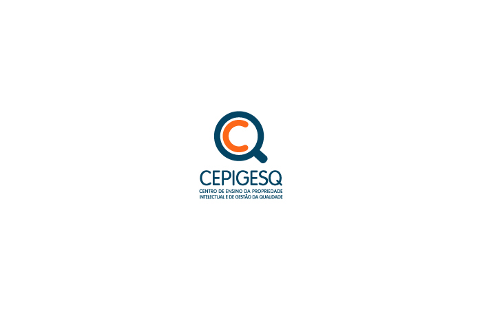
The concept in this logo is very simpe, as this is a property of Intelectual and Quality management, I decided to make the symbol look like a magnifying glass, using the first letter: "C" and the last letter: "Q"
I was also responsable for the UI/UX design of their website.
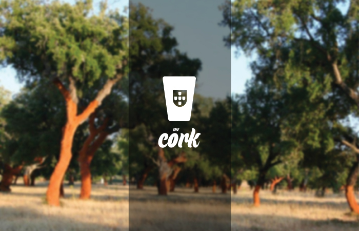
In this logo I decided to promote the portuguese CORK as being the best on the market.
Click here to see where I am representing PORTUGAL in the logo!
This is a clothing store in Angola, They wanted a stylish and modern look to sell high end quality.
This logo/symbol represents both, the coffee bean and the house in one symbol.
This logo has the 2 "M" of the word MultiMind, You can also see a person in between the "M's". This logo was made to represent the multimedia course in my school.
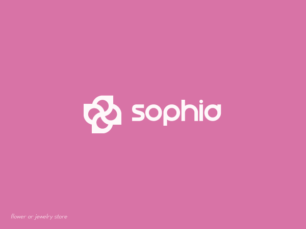
Flower store.
The symbol is the combination of the letter: "S" of the name: "Sophia". One in the vertical reflected and the other rotated 90º.
Using design to enhance communication.
Design project by: Pedro Almeida
-
E: pedro.workdesign@gmail.com
W: pedrobrands.com
-
Design project by: Pedro Almeida
-
E: pedro.workdesign@gmail.com
W: pedrobrands.com
-
Dribbble: pedrobrands
Instagram: pedro.brands
Facebook: pedrobranding
Twitter: @pedrobranding
Instagram: pedro.brands
Facebook: pedrobranding
Twitter: @pedrobranding


