Measure & Control Things (mcThings for short) was a successful kickstarter project that is now in the later stages of development. Their products are focussed around people who are interested in quickly and easily making Internet of Things products for themselves. The main mcThings product is the mc module which is a tiny low-power device that communicates wirelessly to the cloud through a mcRouter. mcModules are designed to be very small, consume minimal power and therefore run for years on a coin cell. They can take various inputs such as switches, temperature sensors or movement sensors then alert other mcModules to what is going on. For instance one of these could be attached to the back of your front door which could sense when you get home, and then switch on your lights. Basically they make it possible to connect anything to the internet making any product "smart". Take a look at their video here.
I wasn't involved in the actual product development, however they needed assistance in creating a modern logo that communicated their brand. Their current logo was purely text, was a little too close the McDonalds and didn't communicate the quirkiness or simplicity of the brand. The process began by looking at what icons could represent measurement & control, and working out how these could be integrated into the logo.
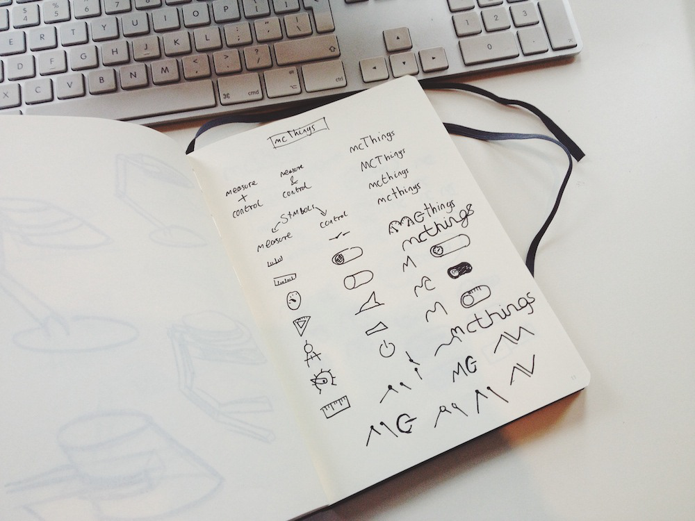
Quick sketches are the best way to play around with Logo's and many, many people make the error of developing logo's on the computer. Sketches are so much faster to do and mean there are no restrictions to what you can do. They also are inherently scrappy which means no time is spent making something perfect or lining something up correctly, it is all about quantity of ideas.
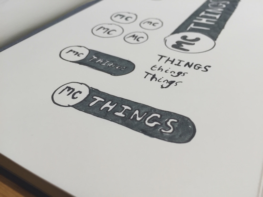
The design we decided to develop was based on a simple UI switch that is used throughout smartphones and websites. These switches are commonly associated with control and users recognise them as a source of input that can affect an outcome. Using this style nicely integrates the idea of a digital and physical switch which is effectively what mcThings are. Splitting the "mc" from the rest of the brand name allows it to be used for different products whilst maintaining a strong brand image.
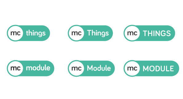
The logo was then quickly drawn up using illustrator and after settling on a appropriate typeface variations were made to try out what different cases would look like. The full lower case solution was chosen as it looked friendly and well balanced.

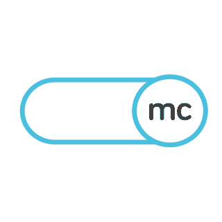
Colour is obviously a crucial part of logo design and here we explored different hues of the 3 colours that seemed to match the brand. Initially the green was used however a light blue was finally chosen by the client to represent their brand. One crucial part of the logo was to ensure that it would work in a monochrome layout as well as in colour. This was because PCB's can only be printed with a single colour and the logo had to be applied to it. So even though the mc things logo will be used in colour in many places, on the physical product it will be monochromatic.
One great aspect of the logo is that it can be animated to show the meaning behind it. This sort of animation is great for websites or perhaps even integrating into the app.
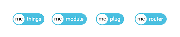
The logo will need to be adapted to all the different products that mcThings produce and, as shown above, this can be done with ease. The final lineup shows a strong brand identity across all their products and means it can be used for any future products as well. This sort of flexibility is great to have and means the brand and name can be applied to literally everything! The typeface is also very recognisable and means it can be used to spell out the full brand name if needed.


The mcModules are now in the later stages of development and the latest prototypes are now using the logo as well. I will do a review once I have received the final market ready products!


