

N A M E
“Lin Lin” means “the shimmery water” in Chinese.
The silvery pronouncing of “Lin Lin” communicates the sound of the flowing water.
The name is chosen to introduce the subtly ever-changing notes of the fragrance and to convey the young spirit.
The silvery pronouncing of “Lin Lin” communicates the sound of the flowing water.
The name is chosen to introduce the subtly ever-changing notes of the fragrance and to convey the young spirit.
The logotype with linear strokes is inspired by the gradual changing movement
of the ripples, enhancing the fluidity of notes of this fragrance.
of the ripples, enhancing the fluidity of notes of this fragrance.
D E M O G R A P H I C S
“Lin Lin” targets young generation around age 21-35.
It is designed to appeal women who live in the urban area but with natural spirit inside.
It is designed to appeal women who live in the urban area but with natural spirit inside.
S T R U C T U R E
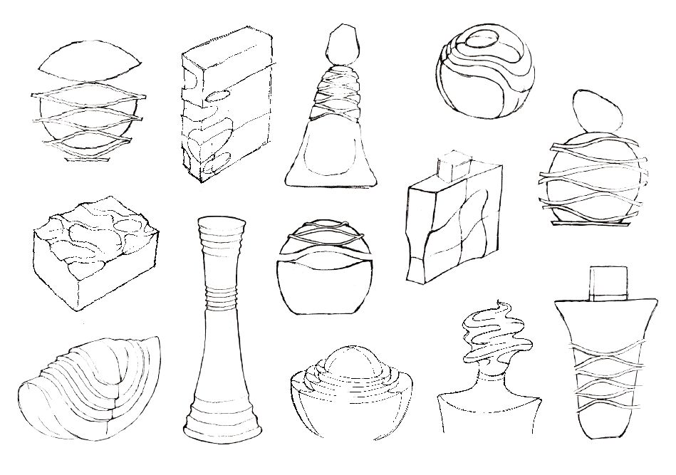
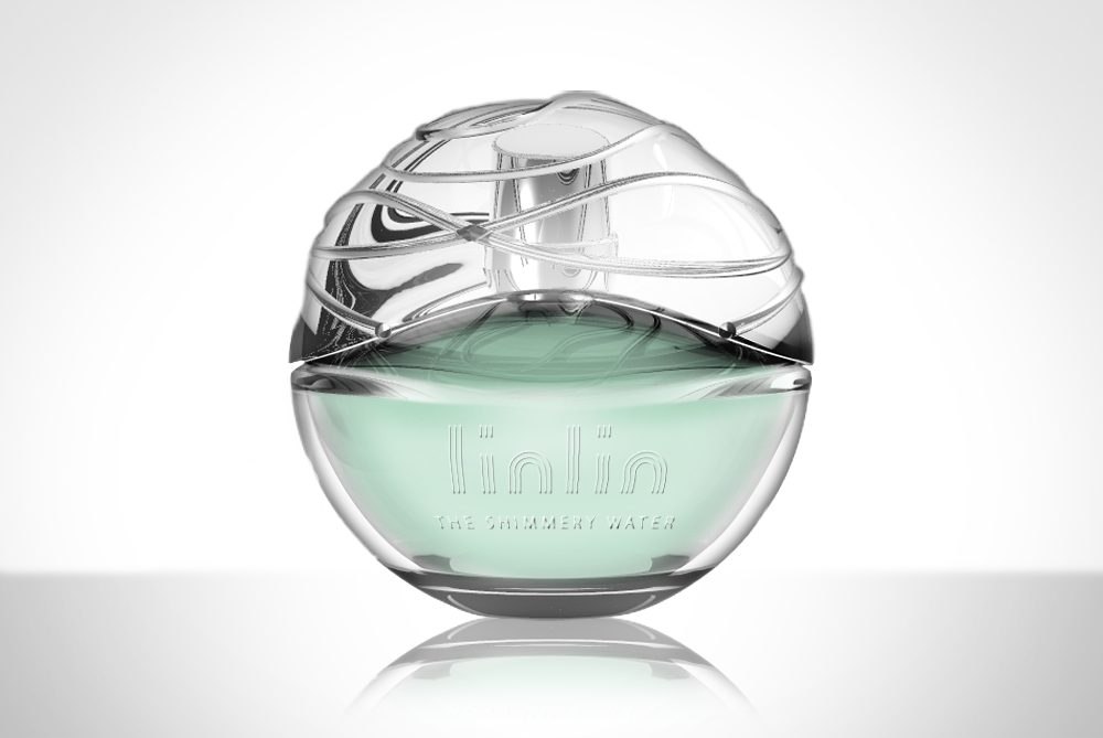
The bottle design started from the idea of using a sphere as a simple base
and then subtly highlighting the cap with wavy details conveying the dynamics of water flow.
It is designed to bring out the picture of gradually moving ripples
being blown gently by the breeze on a quiet surface of the lake.
It is designed to bring out the picture of gradually moving ripples
being blown gently by the breeze on a quiet surface of the lake.
The transparency of the glass reinforces the imagery of clear water.
A R T D I R E C T I O N
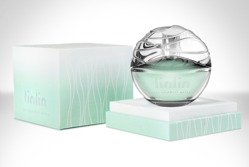
Gradient and the wiggly curves are repeatedly used as main graphic style
to convey the dynamics of changing movement of the water.
The aqua and white colors are used to interpret the freshness of the nature.
Gradient and the wiggly curves are repeatedly used as main graphic style
to convey the dynamics of changing movement of the water.
The aqua and white colors are used to interpret the freshness of the nature.
K E Y W O R D S
Nature / Fresh / Changes / Movement / Fluidity / Ripples / Subtlety / Gentle / Young
S K E T C H
M O D E L

F I N A L C O N C E P T


T H A N K Y O U


