Brand feel
freedom/youth/mobility
freedom/youth/mobility
Starting from its Amazigh roots, the word ‘zeegeez’ translates into ‘moving forward’. I couldn’t agree more about the choice of the brand name and I took it as a starting point into researching the Amazigh visual symbols to find a perfect match.
The ideas needed to be conveyed through the logo were simple yet very complicated to portray in a single symbol. Freedom, youth and mobility are the main components of our research which led me to adopt a widely used symbol by berber women in the high Atlas mountains as a tattoo: the symbol of the bird, or as it can literally translate from Berber to “Between Sky and Earth” is a strong metaphore, showing the fact that a bird can actually choose to be either on earth or flying in the sky and have a third option of being in between. I think there is nothing more empowering than that.
SYMBOL

bird symbol used in berber tattoos
Visual research


Even though the first research path was quite convincing and conveyed the basic characteristics of Zeegeez through its sharp look, I felt that the Amazigh component is misrepresented if not absent.
For this, I have approched the logo from another perspective and I did my best to understand the compositions of Berber tattoos and I thought that it would be very representative and very challenging for me as a branding task to make a logo that is not only inspired by the Berber culture but that would fit perfectly into the spectrum of Berber tattoos and have the contemporary flair to represent a bicycle brand that can sell in Morocco and export itself and its cultural background.
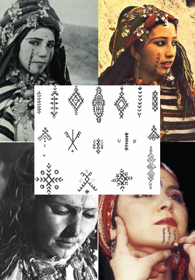
I wanted to keep the original starting shape (bird symbol) and make it look more like a composition of a chin tattoo, and have the word zeegeez incorporated in it in some way.
First thing is first, the symbol should be pointing to the top, sign of moving forward and a way to keep the vertical nature of the berber chin tattoos.

Initial sketches

Development

Touch ups

Final symbol

The letters Z, E and G and prominent in the logo. The shape reminds of a Berber chin tattoo.
TYPOGRAPHY


FINAL LOGO
& language variations

