MOJO yogurt

The Challenge
Backbone was bought to boost yogurt-using culture among 14- to 32-year-old demographic.
Being dissatisfied with the previous design, the client set the task of making the MOJO bottles more appealing to the target.
The Solution
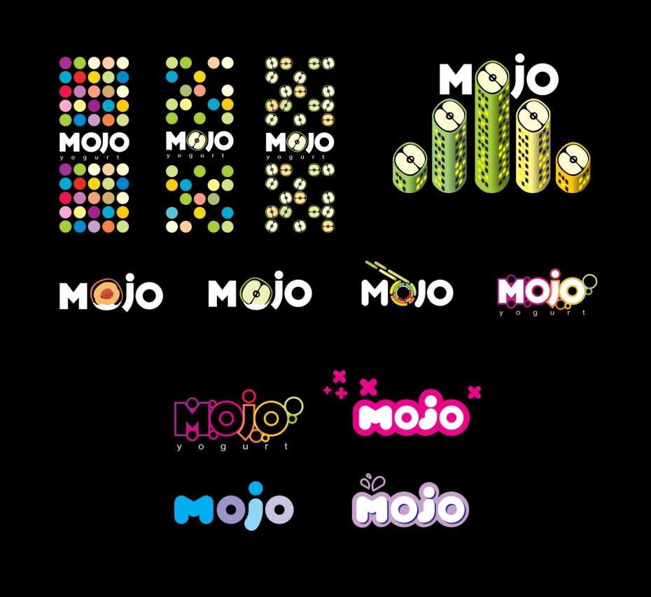
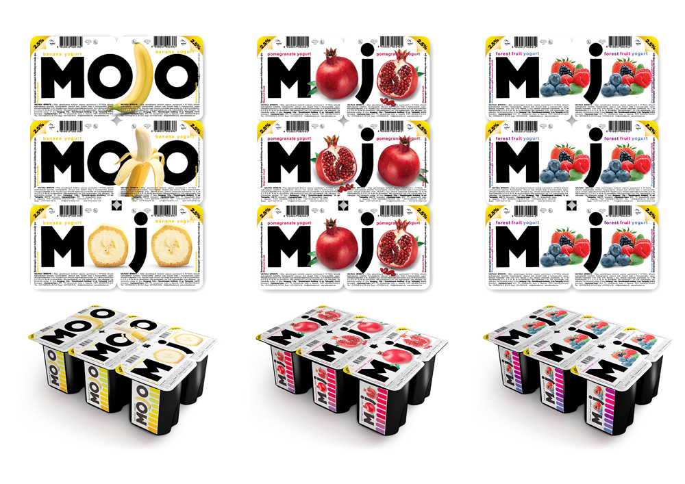
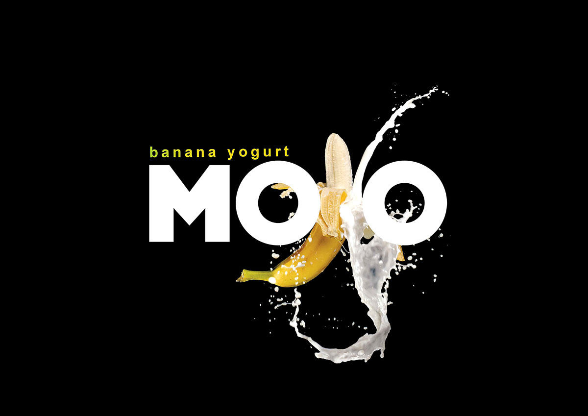
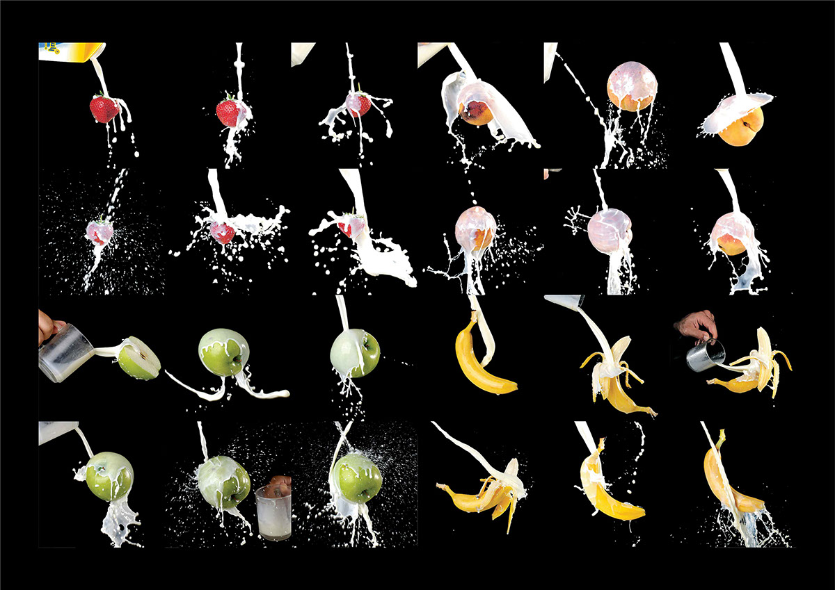
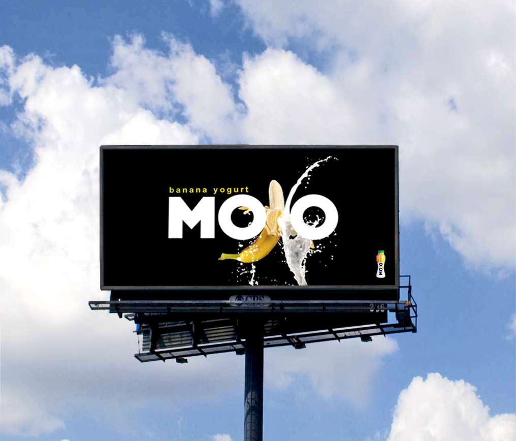
During the first stage of work, the designers concentrated on stylish looking concept and explored ways to express it visually in the slim-shaped fitness body container. With the shape decided, they moved to stage two - designing bold and expressive typography and visualizing product’s flavor range. To convey the natural origin of the yogurts, we decided to use pure photos of fruits and milk. After extensive photosessions the final design was eventually made on the version of mixing brand name letters with fruit photos on dominating fresh-looking white background. Fruit colors drove the design color palette and helped to organize the product range.
The Result
The new “look and feel” of MOJO yogurts immediately enticed the target to the product. Backbone not simply accomplished the task of capturing the young audience through creating distinguished and colorful packaging but executed and drove yogurt market transformation.
It soon became proven market leader in its category and became the client company’s primary marketing vehicle.
Awards
Kiev International Advertising Festival / 2011 / Packaging design / SILVER


Process