My idea is i want to show the way that we now look at type now and the way that years ago. By this I mean the way we see type now is on a website, apps, smart phones and e-readers and many more digital ways. We don’t really see much printed type it’s all digital now ,so I have used metro nova and created a responsive website that can be used round all the platforms(phones, tabs, laptops). This shows the way that type specimens look when you load them on a screen when you scroll right and it shows the experimental type when you scroll left. There is also a set of buttons that show contrast with in the type. The reason for this is that the digital world isn’t black and white it now shows type on all different backgrounds and colours so if this is a type specimen for digital I need to show this also.
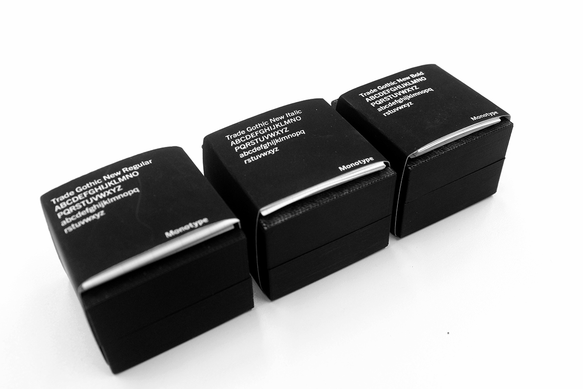
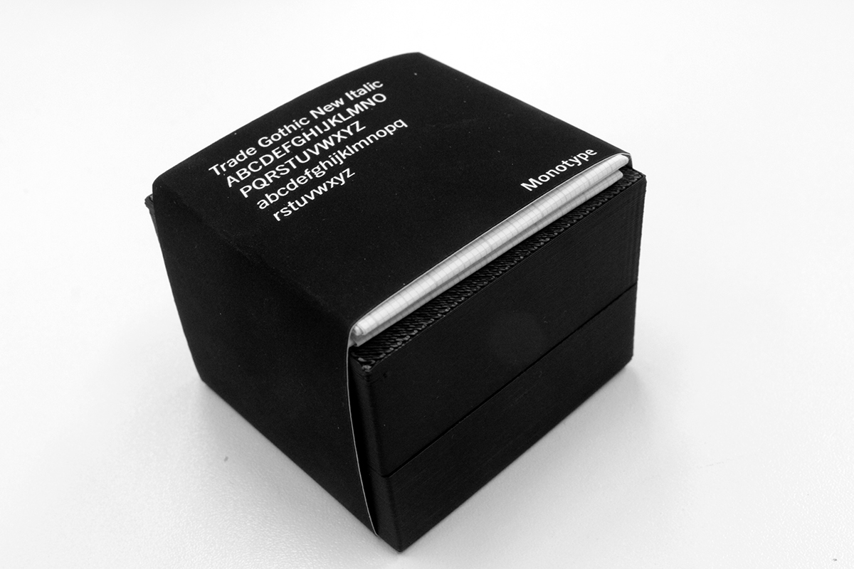
Trade Gothic type I have made with a 3D printer as before the age of digital they always use letter press and these was 3D letters on a wood block that you then print on to anything you like. So my idea is to have a set of fonts that students, Studios and companies can have on their desk to look at and understand the type like you would when you use to print type. By doing this it’s allowing people to touch and feel the font and understand the key parts of the font like Serifs, sans serif, kerning and so on. I have made a box for each weight so if you was to carry this on with other type I can see these on a shelf that people would look though instead of just looking though the fonts on Photoshop or word. Also there is grid paper with each box so then they can understand the way it’s been drawn out.
The main point of my project is that its aimed at students, Studios and companies that use type, So they have a better understanding of how type works across the new age and the old ages but they can be transferred back into both. Looking at the 3D printed type get the feel of it and still use it in digital work but then you understand how it’s going to work and the same goes for the website you could see the contrast of that type on the colours and then turn this into a sign. I just want people to understand the way that types are all different and they all have their own purpose. Also I want people to understand that type is more than just a drop down menu and you select one that just looks nice. This will make people understand that they need to look around before they just use the type face they always use.
Metro Nova Pro

View Website Here
All five different contasts


Trade Gothic Pro

Time lapse of 3D printer


