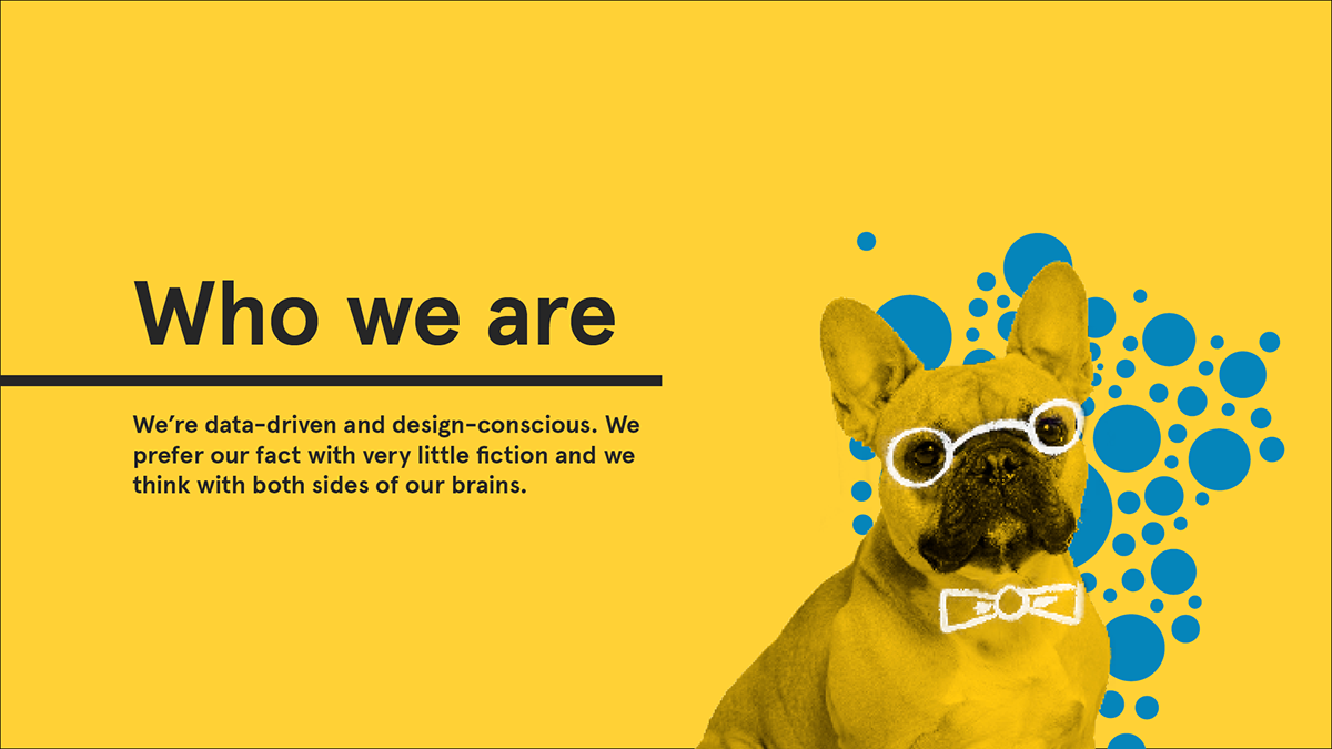
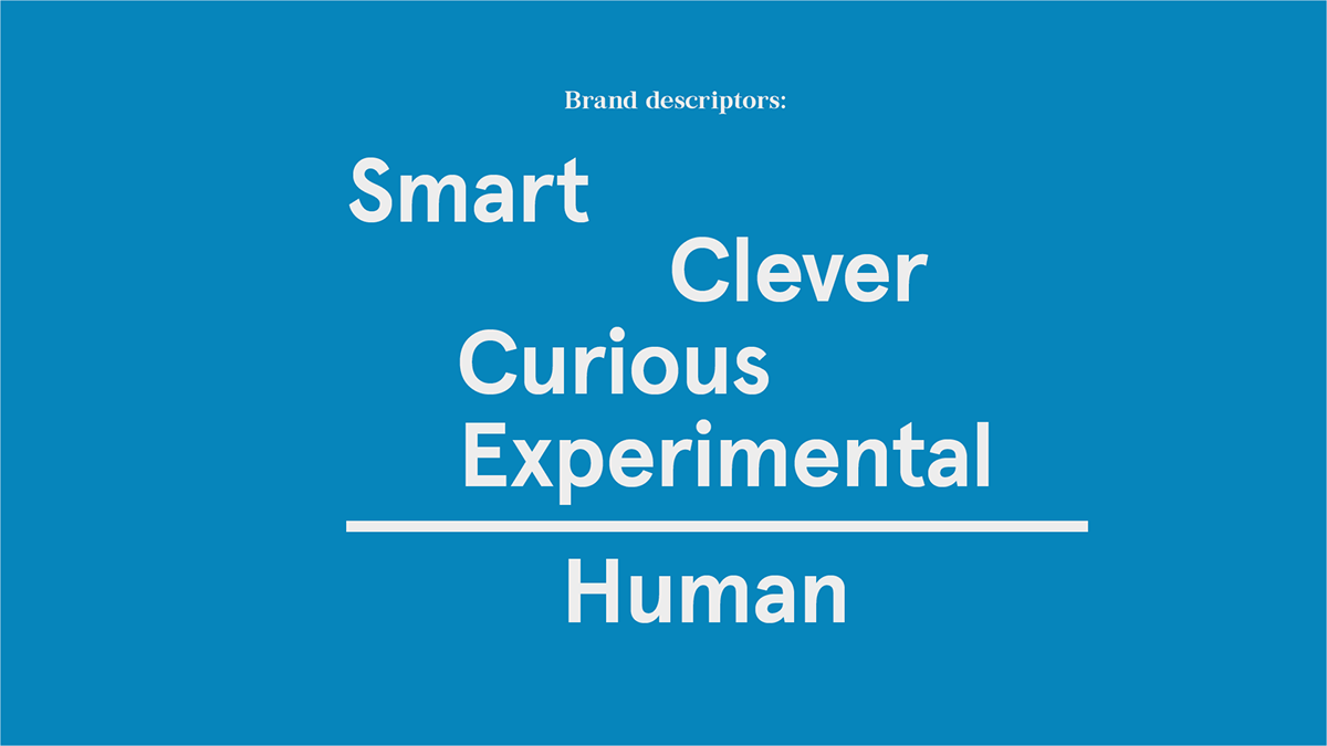
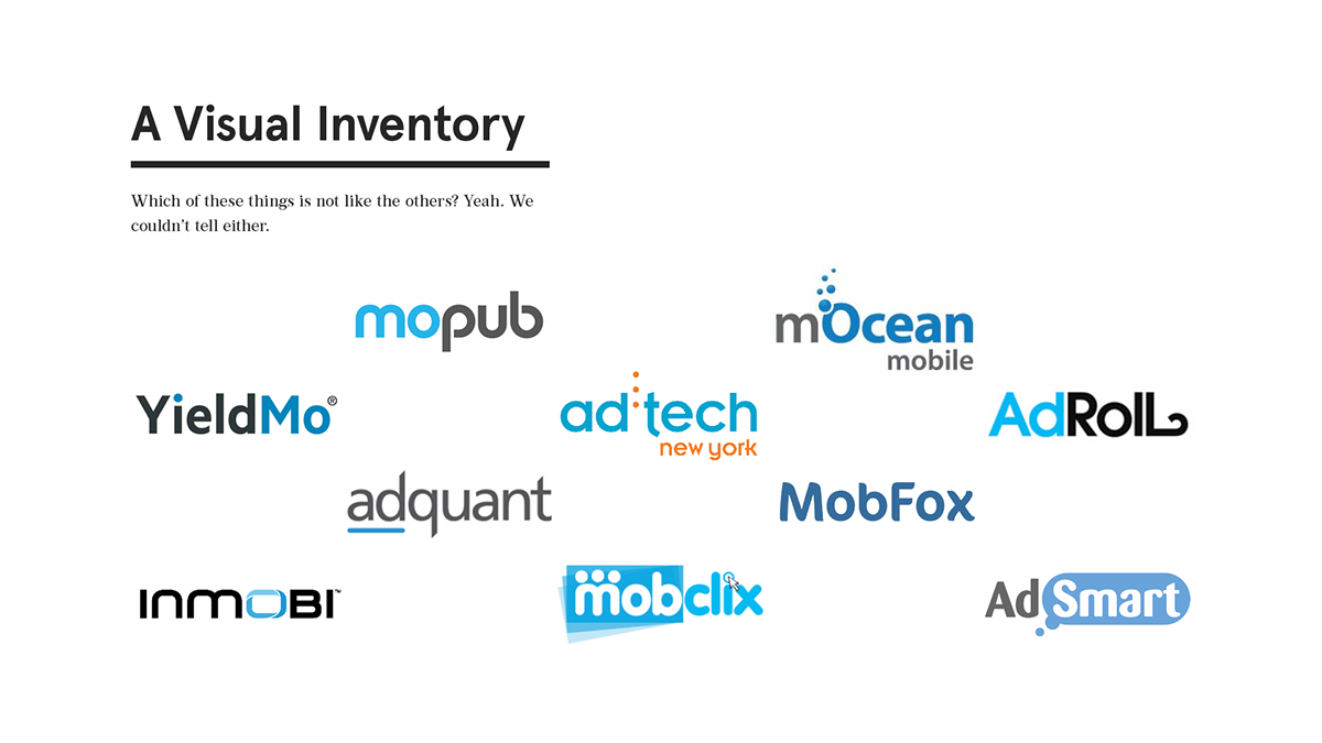
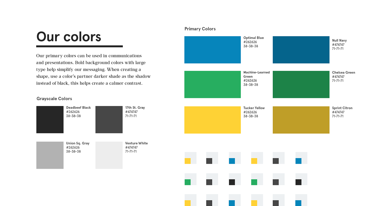
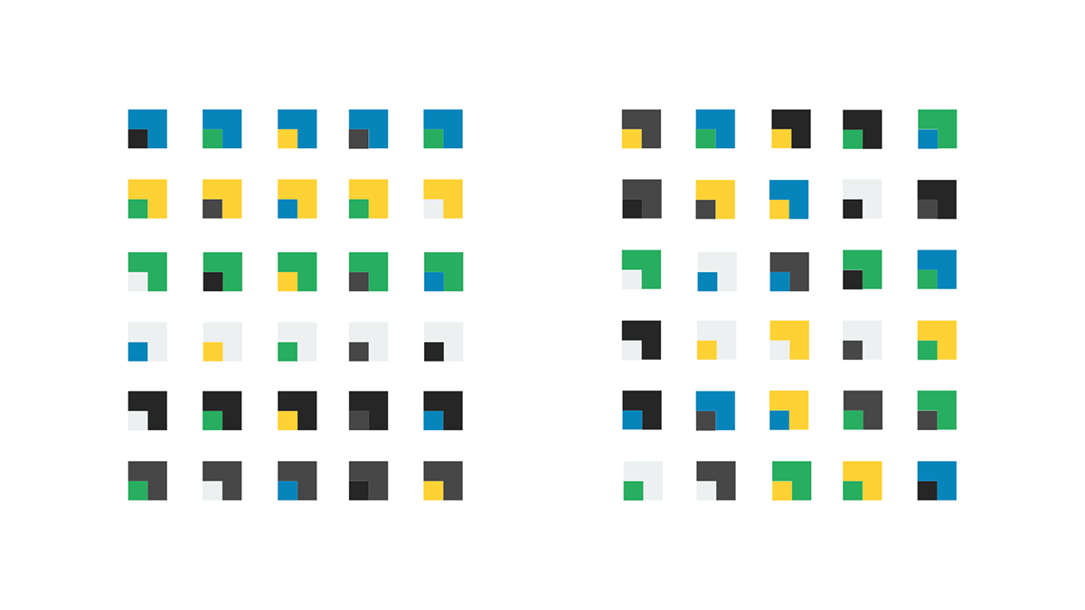
Yieldmo is an ad tech startup in NYC using design and data to make better mobile ad experience. Their original logo suffered from many startup tropes: camelcase lettering, arbitrary color applications, and a generic feel that made the identity blend in with other competitors. I worked with Yieldmo's Head of Design to build an identity that was quirky, fun, and sophisticated.
I made this explainer video to introduce Yieldmo to the general public. The impression needed to paint a stark contrast to the bland nature of other mobile advertising companies, while also conveying complex ideas about design and data in an approachable way.