During my internship at Lust this summer, I worked on the exhibition Death in the City, which was named Death in Venice for the occasion.
I helped with the making of the content for the third room of the exhibition, which contained the infographics
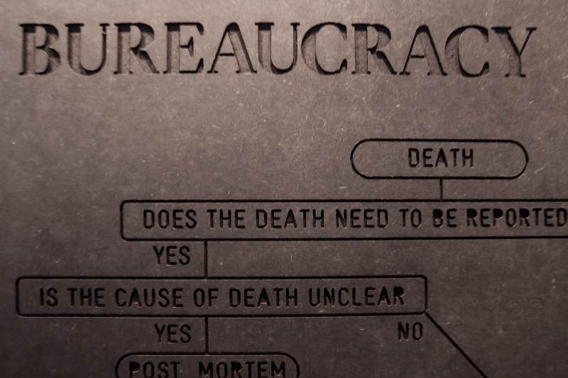
and the postcards with the flowcharts.
Death in the City is a research project and interactive exhibition exploring the relationship between modern architecture and death over the last century. The first iteration of the exhibition was held in Venice in June 2014.
The development of architecture related to death and dying has been, over the past decades, as vivid and significant as the development of other modern ideas that shaped the contemporary city. Nevertheless, it is rarely foregrounded in the architectural history of the 20th century.
Death in Venice shows the changing landscape of death in modern Britain, the site of early developments
in modern western cremation and the modern hospice movement which helped to shape a broader Western context. It examines the changes which have taken place in Great Britain over the last 100 years, taking them
as a point of departure to reflect on the current shape of death and the architecture which offers space for it.
The exhibition is split into three rooms, each offering a different way of interacting with the content.
The first room presents an interactive map of London, where the typical content is inverted: common landmarks are hidden while hospitals, hospices, crematoria and cemeteries are highlighted.
Labels and captions can be uncovered by the user but fade away again with time.


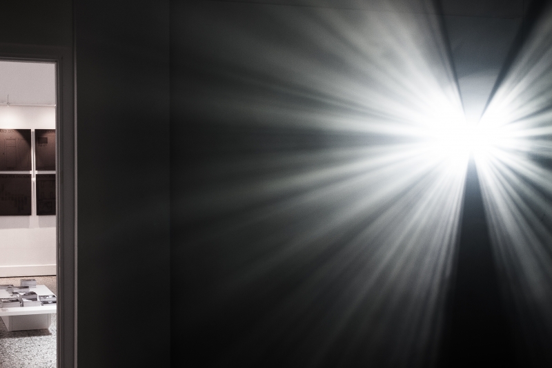
The second room approaches the subject through an emotional experience of sound and space.
The room is periodically filled with fog, so that projected light patterns create an intangible three-dimensional structure. These generated patterns abide by the rules of a custom cellular automata, which focuses on spatial relationships and biological processes.
Sound serves as an additional metaphor for death: sensory and pervasive, yet invisible. Each individual visitor
is assigned a unique sound as they enter, while the projection creates a corresponding blank space surrounding the visitor's body within the fog.
Both the sound and the projected patterns respond to the movements of each visitor, building a generative musical and spatial composition as visitors move through the space.
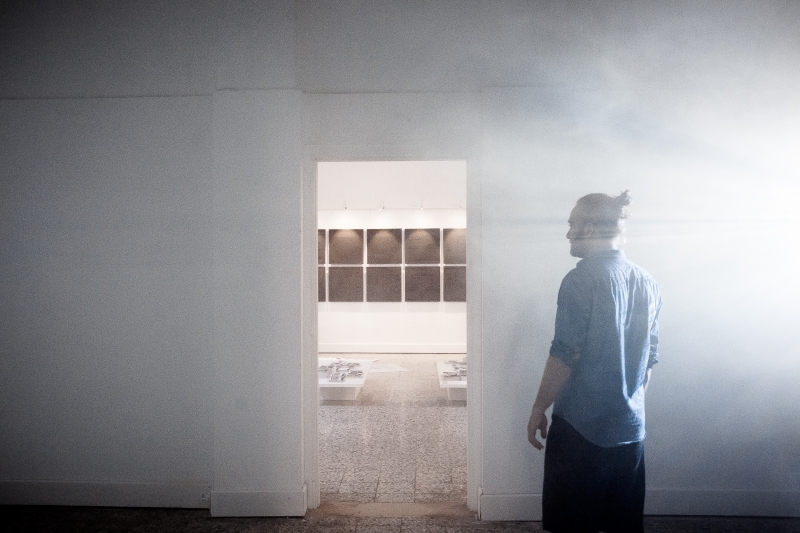
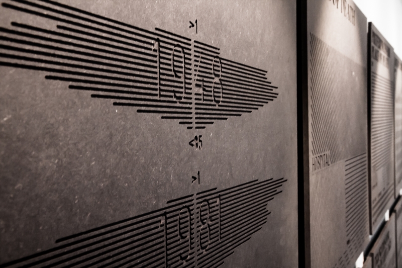
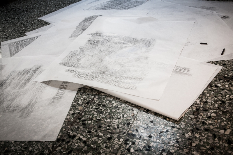
The third room presents the research content in a focused, analytical way. Large-scale flowcharts outline the common scenarios surrounding death during the four sample years, while stacks of postcards with archival photography, statistics and floorplans illustrate the changes in architecture, social attitudes and rituals over time. These are accompanied by CNC-milled infographic panels that show the social and cultural shifts throughout the century. As with the first room, the content of these panels is "hidden" but can be revealed by rubbing them with charcoal.


Credits:
Curation and exhibition concept: Alison Killing and Ania Molenda
Design: LUST with Alison Killing and Ania Molenda
Graphic design and interactive installations: LUST
Exhibition production support: AB Venice
Photo and video made by Lust.
Curation and exhibition concept: Alison Killing and Ania Molenda
Design: LUST with Alison Killing and Ania Molenda
Graphic design and interactive installations: LUST
Exhibition production support: AB Venice
Photo and video made by Lust.


