the project.
Brand identity proposal for the cultural association Casazul.
Initially created as a final project in college, it was later presented at the 5th National Typography Meeting in Portugal, organized by the design department of ESD (School of Design in Barcelos) and endorsed by ATypI.
casazul.
A cultural association based in Barcelos, Portugal.
Created by a small group of people keen on transforming the town into a cultural hub at a national scale.
The association is located in an old building with a blue tiled facade (hence its name, casa azul: “blue house” in English). The house has multipleuses, ranging from co-working space to exhibition centre, workshop area, concert hall, and cafe. It’s an open place for gathering and exchange.
the chalange.
To create a visual identity representing the diversity for which the place stands for.
This association is sustained by continuous hard work, with almost no resources, by a team that tries to add value every day. Understanding the premise of the project and the founder’s ideals was paramount to draw a path and develop the imagery.
The space’s characteristics also had to be present. The building’s unkept walls allow visitors to recognize its authenticity and independent nature,
while the drawings on the walls remind them that this house belongs to everyone who wants to contribute with their creativity.
while the drawings on the walls remind them that this house belongs to everyone who wants to contribute with their creativity.
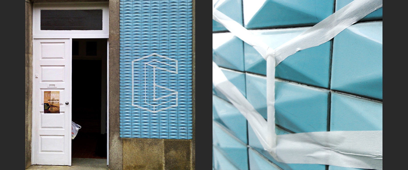
The building’s facade also stands out in the street, due to its shiny blue tiles, so we wanted to give this singular place a unique image. An identity
that represents every single person that makes the Casazul project possible.
that represents every single person that makes the Casazul project possible.
In one sentence, our concept is:
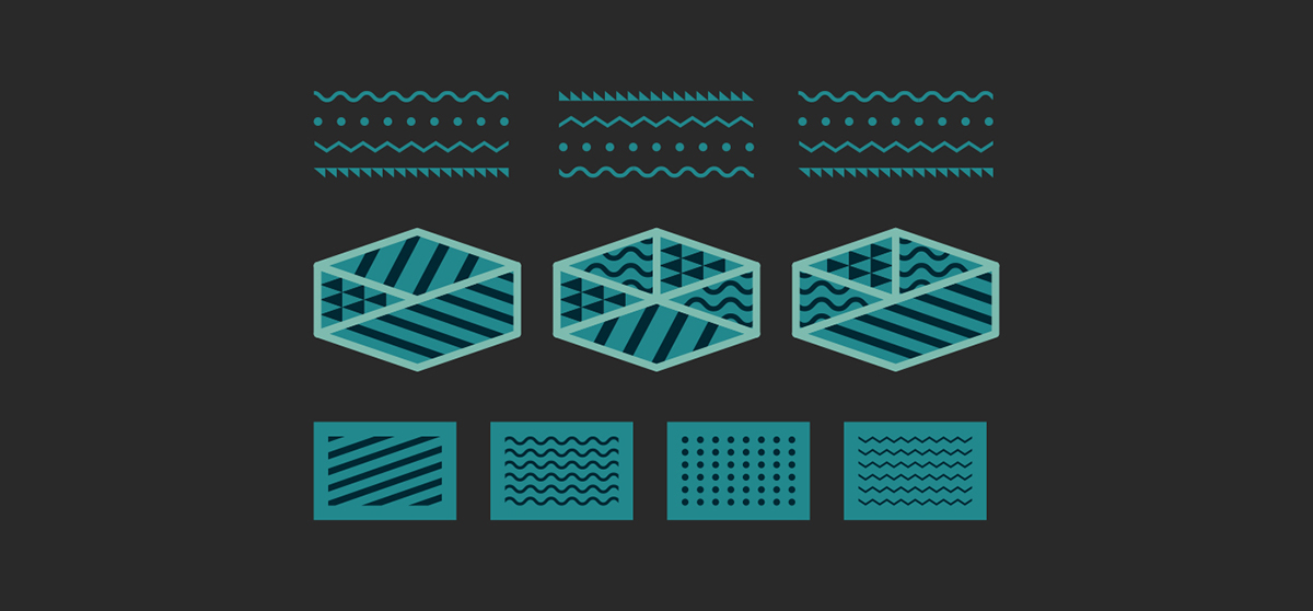
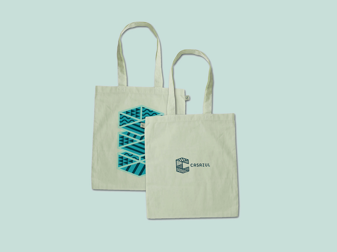
– the whole of casazul is the individuality of each part –
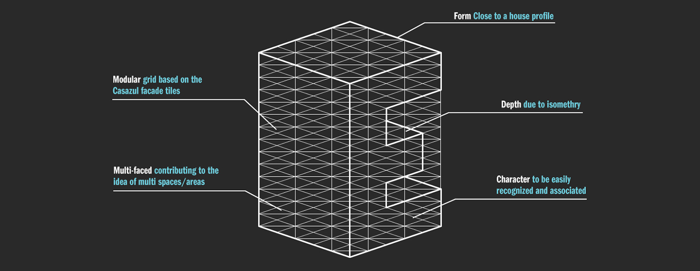
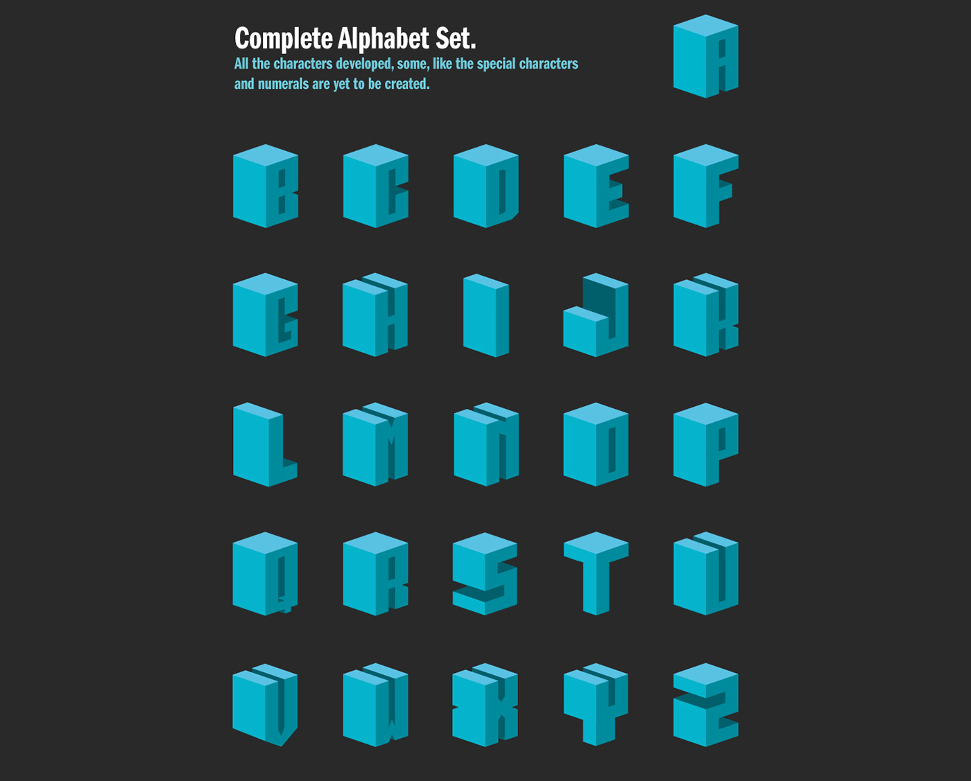
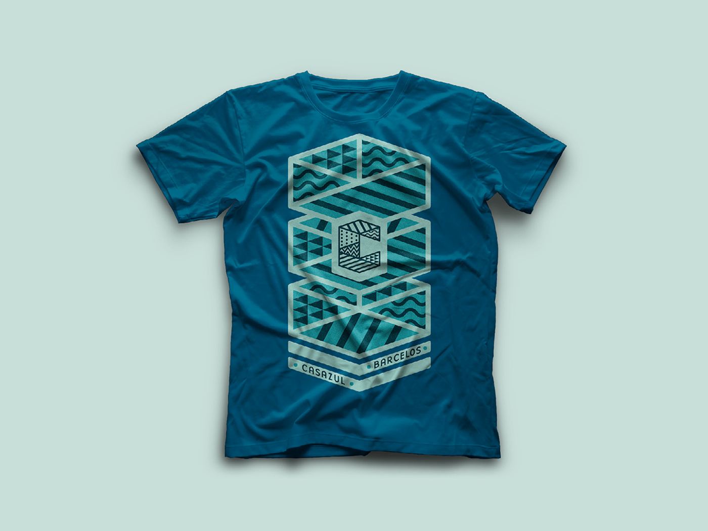
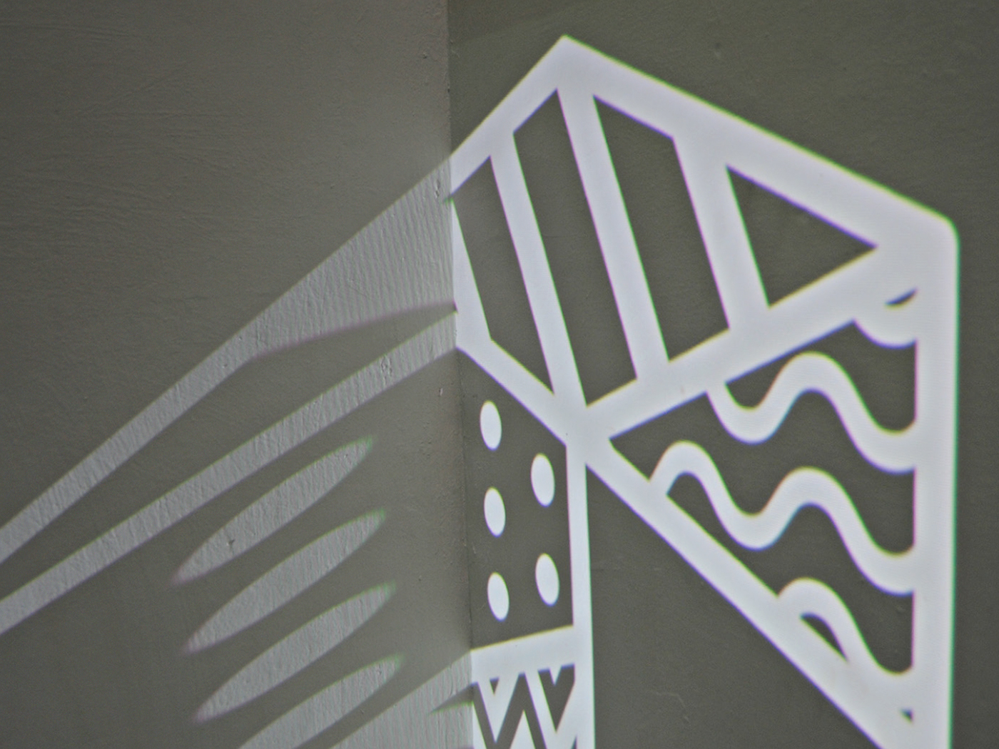
In order to convey this idea we created an element that can be easily recognized and associated to Casazul: a typeface.
We wanted to create typography that could be used as an expressive and iconic element - even if legibility had sometimes to be slightly
compromised - with a genuine connection to the building, almost as an extension of the physical space.
So we decided to create a modular grid based upon the patterns of the facade’s tiles, using tape to explore the geometry of the building. Fromcompromised - with a genuine connection to the building, almost as an extension of the physical space.
there we built a grid that became the base for our typeface.


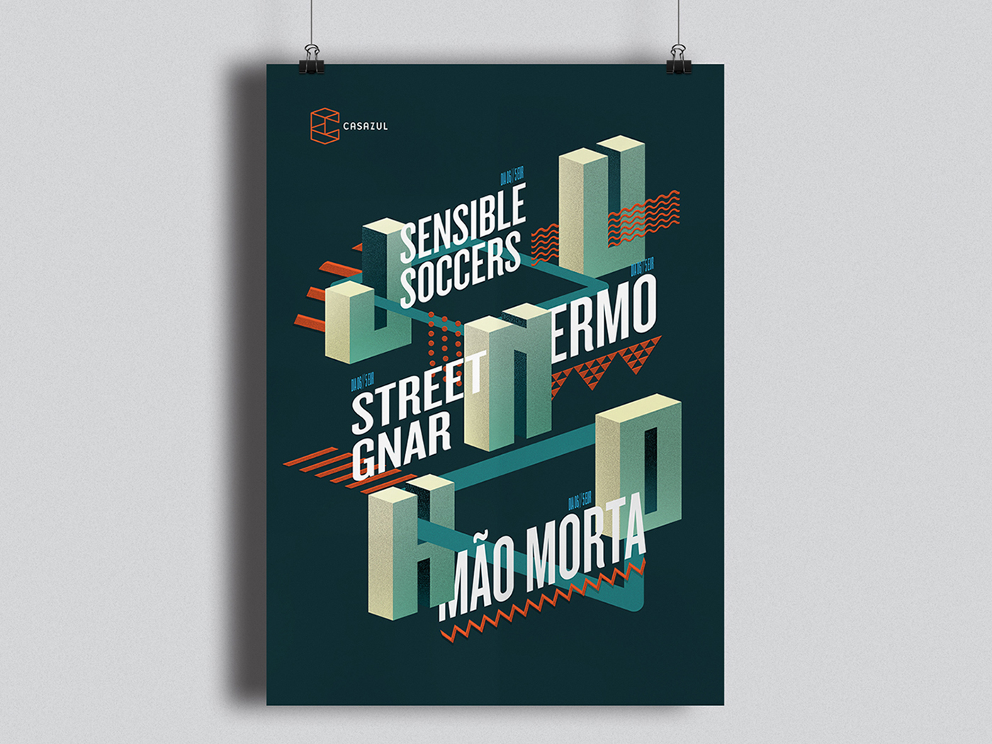
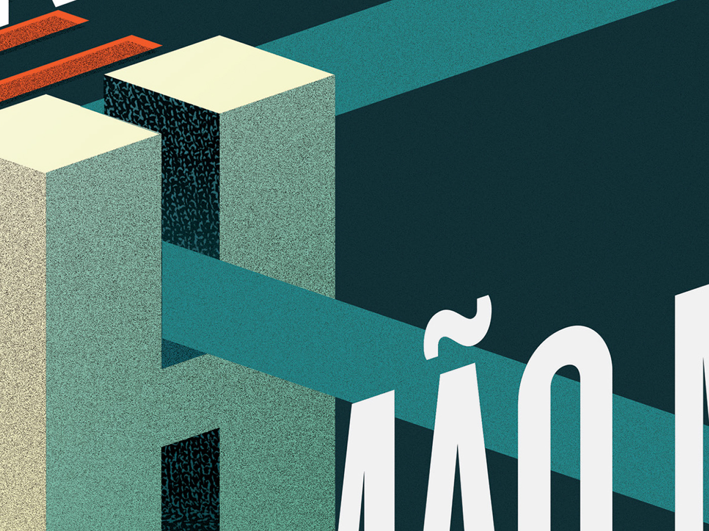
The results have been very positive, and this experience allowed us to disconnect from preconceived ideas that we had at the Project’s starting point. But when we moved to digital we realized that there were some incoherence problems, so we committed to one way and decided to explore it creating a multi-faced type – as the CASAZUL multi-cultural programme – and taking part of isometry to create a block type based as if it’s a building, in a work of impossible symmetry.


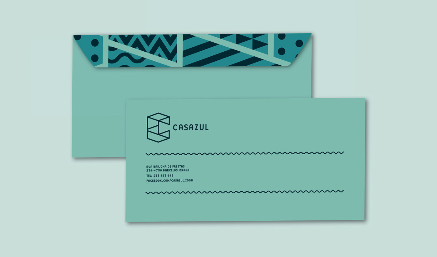
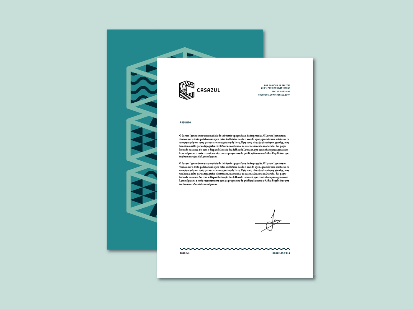
branding proposal.
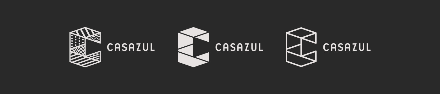
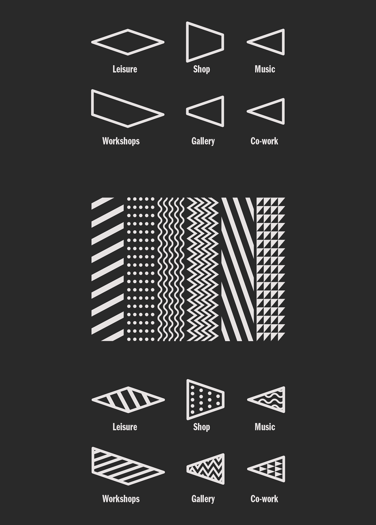
Once this was on the right track, we started working on the logo, returning to the project’s main guideline – The whole of Casazul is the
individuality of each part.
This was the motto to create patterns translating Casazul’s multiplicity, resulting on a subdivided “C” symbol based on the first typographic experiments, so as to represent every area of Casazul with a distinguished iconography.individuality of each part.


events communication.
Casazul is communicating its events essentially through posters. We believe that the poster is still one of the strongest and more immediate communication platforms, especially in small cities like Barcelos where their exposure is boosted. So we kept loyal to this support, while trying to give it a bolder style, mirroring the rawness of the building, through a more aggressive and grungy style, which included the degraded nature of the walls.