Visual Assignment I
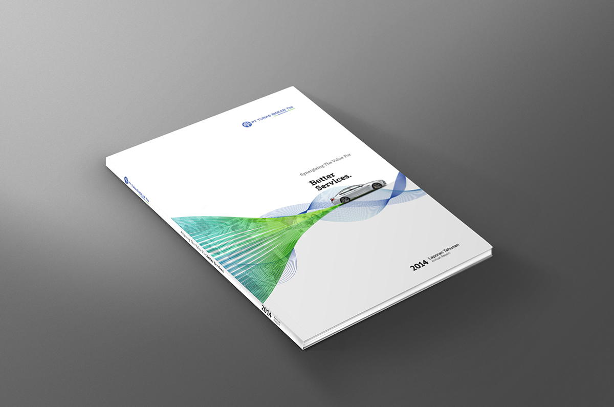
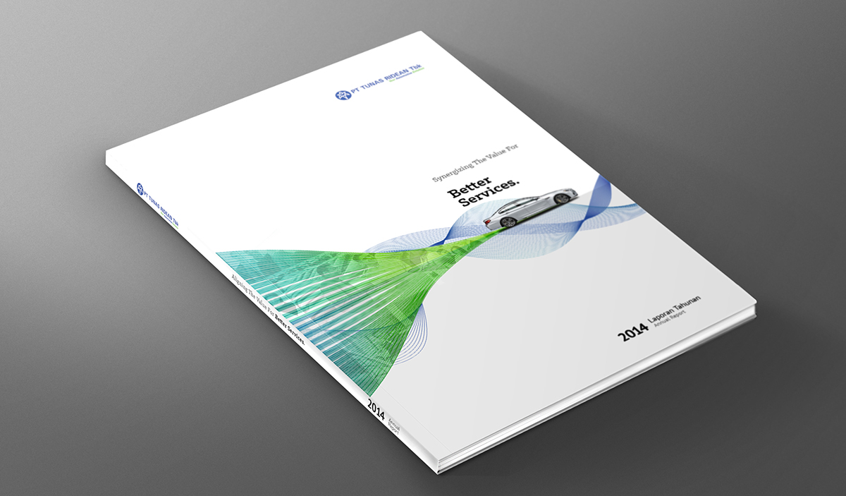
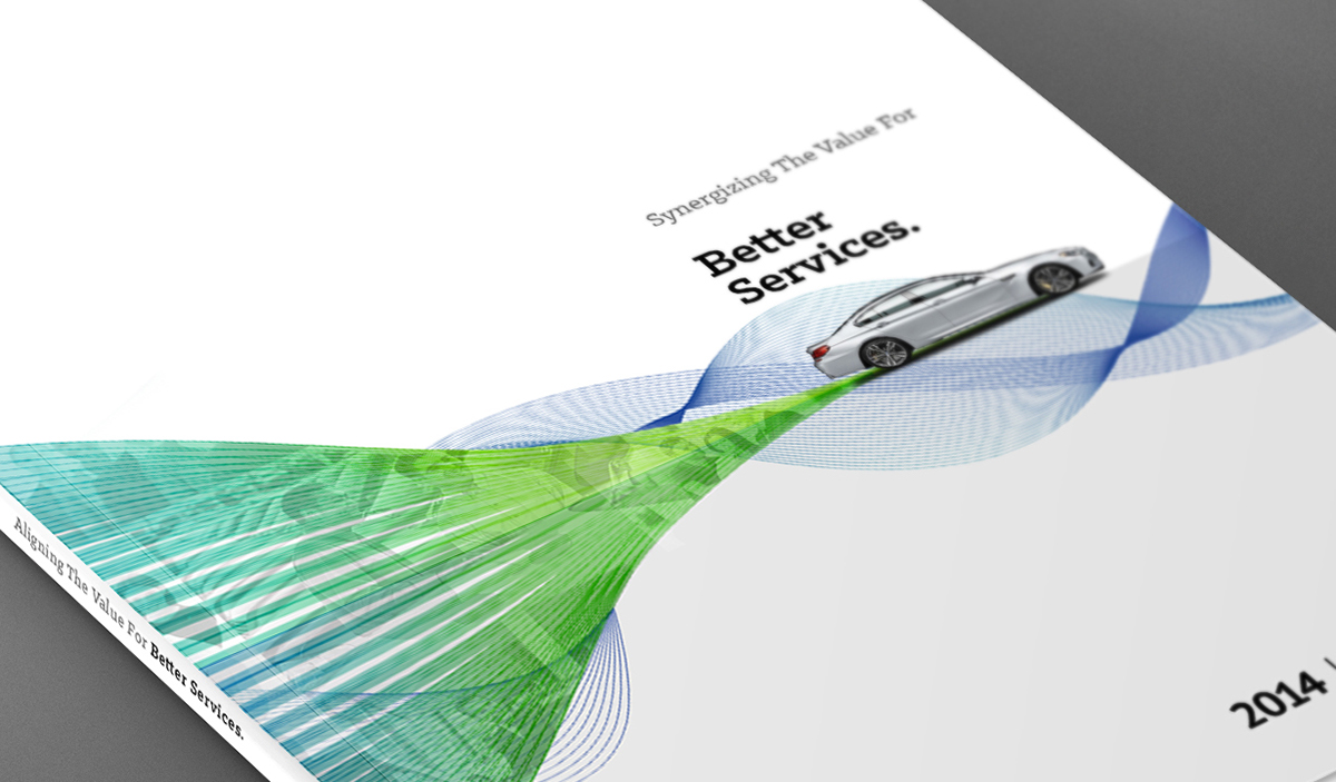
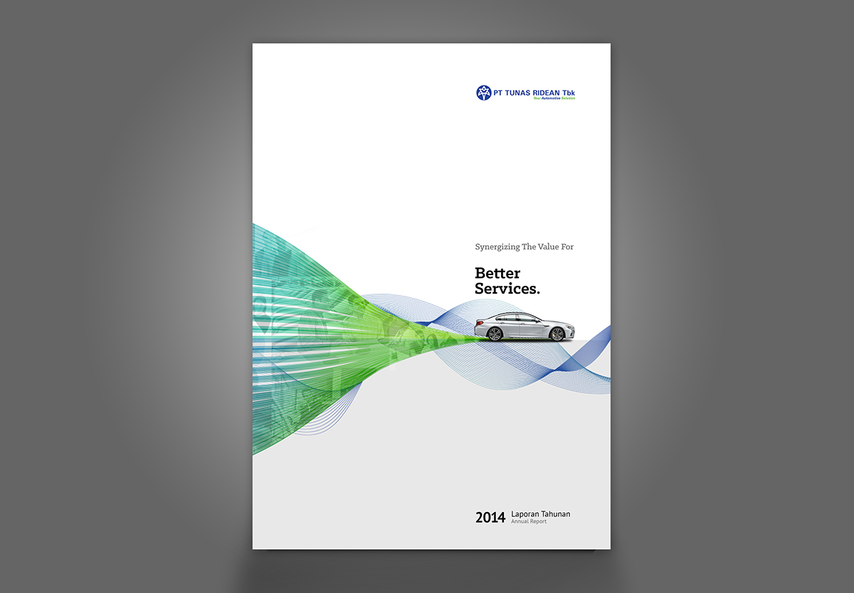
Synergizing the value for better service which means aligning the values of the company for better service.
Visual on this cover has several elements, namely :
A shape-colored shades of blue green and forming a conical flow on the right end represents a process of "harmonization / unification / smelting / fusion ', whereas a photo collage of products and activities contained in the parent shape represent the values or forces companies to be processed through the process of "alignment / fusing / unification".
A little blue line that moves around the shape represents a movement or process, it is explains that the company is always moving, growing and working to innovate every time.
Car visual in the figure represents the "comfort and quality perfection", it is explains that the companies are always trying to provide service excellence and comfort to the customer, this visually associated with the word "for better service" at the tagline that carried.

Annual Report of Tunas Ridean Tbk. Print, Editorial Design, Graphic Design.
CDS Worldwide was assigned to design Annual Report for Tunas Ridean Tbk.
Art Direction:
Ramanda Hadi
Graphic Design:
- Galih Wicaksono
- Yayang
- Mahardika Surya Atmadja
- Ryanda Bramantya
- Feriansyah Bonauli
copyright @ 2014
CDS Worldwide
Branding Partner
http://www.couplewishes.com
- Feriansyah Bonauli
copyright @ 2014
CDS Worldwide
Branding Partner
http://www.couplewishes.com

