

As part of the optional module named 'Digital Media: Web' for my university course, our brief set by Sky was to redesign the Sky Sports Video website, and iPhone and iPad app - producing a landing page and a video landing page for each. Part of the brief was to focus on UX design. You can view the current Sky Sports video page at http://www.skysports.com/video
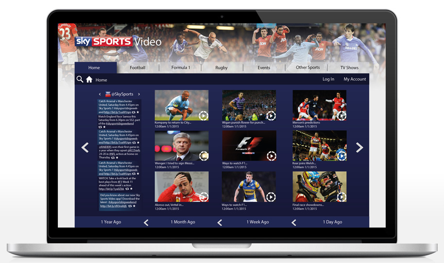
My design for the desktop version of the site contains it all in a widget, so that it is easier to navigate - on the home page you can view the most popular videos and also keep up to date with the latest tweets from @SkySports and other Sky twitter pages (you can change which twitter it is via the arrows next to the twitter name). The bottom bar lets you view content from 1 day ago to over 1 year ago. The navigation focuses on which section of the website you have open, for example 'Home' is blue as it is the selected section.
In terms of my navigation, in my research I found it would be difficuilt to group the sports into the top 5 - so I decided to do it seasonally. This design shows how the website would look in January, in which football, formula 1 and rugby are the top sports - and other sports can be accessed through the other sports tab. I find this is a lot easier as people are more likely to be searching for these sports at this time, and it majorly de clutters the navigation. I have a chart for which sport will be in which position (1, 2 or 3) per month.

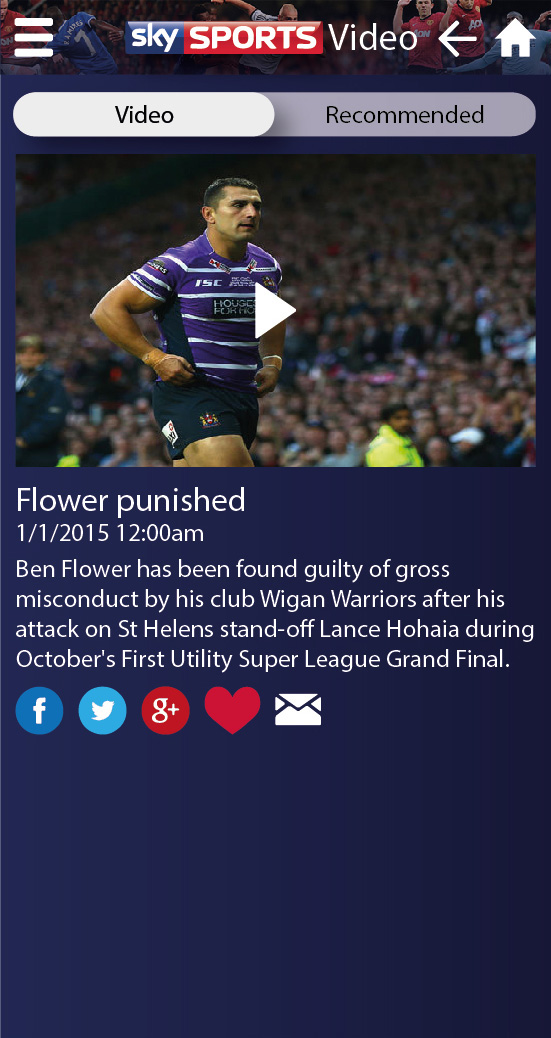
My video landing page features the main video the user has selected, as well as social media links, recommendations, a comments section and related profile links for further information.
Showing how the further links for each section will be accessed.

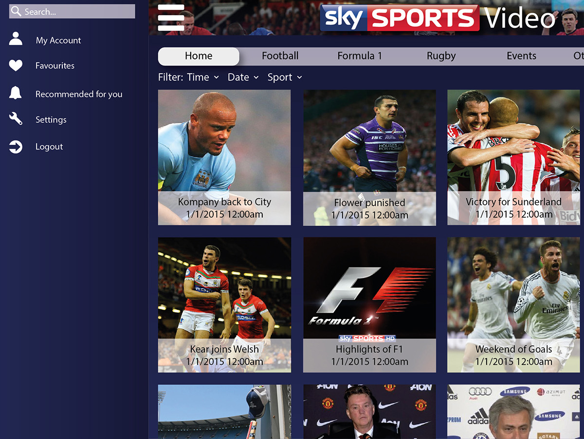
iPad Version, the iPad must be turned 90 degrees in order to view the desired way. This version is similar but adapted for the iPad, for example the navigation is swiped across and the selected section is highlighted white. To get to sub sections of the main categories, there is a filter option underneath the main navigation for each category.

A touch on the arrow next to filter will open the full filter menu for each section and these are grouped alphebetically.


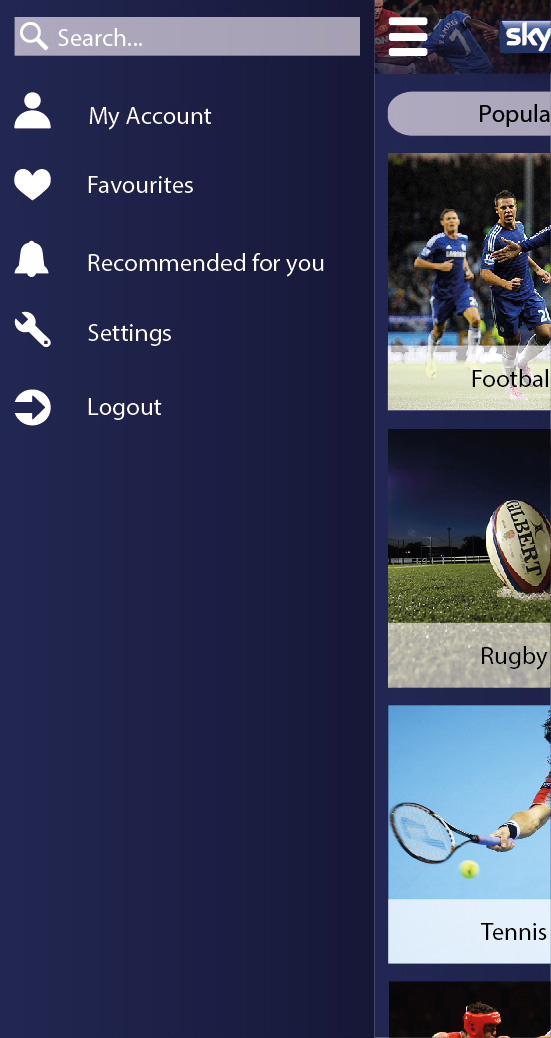
This is the menu which appears on the left once opened.
Video landing page. When you tap on the video it will appear in the iPhone video viewer. When the comment box is touched, the iPhone text tool will pop up and a Submit button will be shown on there.

iPhone App. Simpler version of the app due to the smaller screen, this time the home page is the most popular videos as people on the move prefer to see the most interesting videos for example.


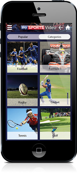
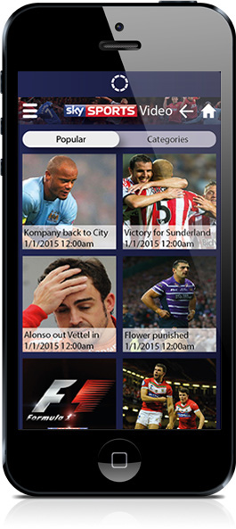
Categories section is how users will access content they desire. These are grouped in order of most popular at that current time.

Similar to the app menu.
On the video viewer page, a recommended section also appears which you can swipe over to, showing you videos you may also like to watch. You can use the back button on the iPhone and the iPad apps to go back at any time, or the home button to start at the beginning.
Loading screen.

Pull down to refresh the most popular sports and the loading icon at the top appears

I have thoroughly enjoyed this module, and learnt a lot about UX design. None of the images used in the making of these are owned by me, all found on Google images from sporting websites. Sky also provided us with a pack including icons, logos and fonts to help us create this.


