HAPPINESS VILLAGE
2013
2013
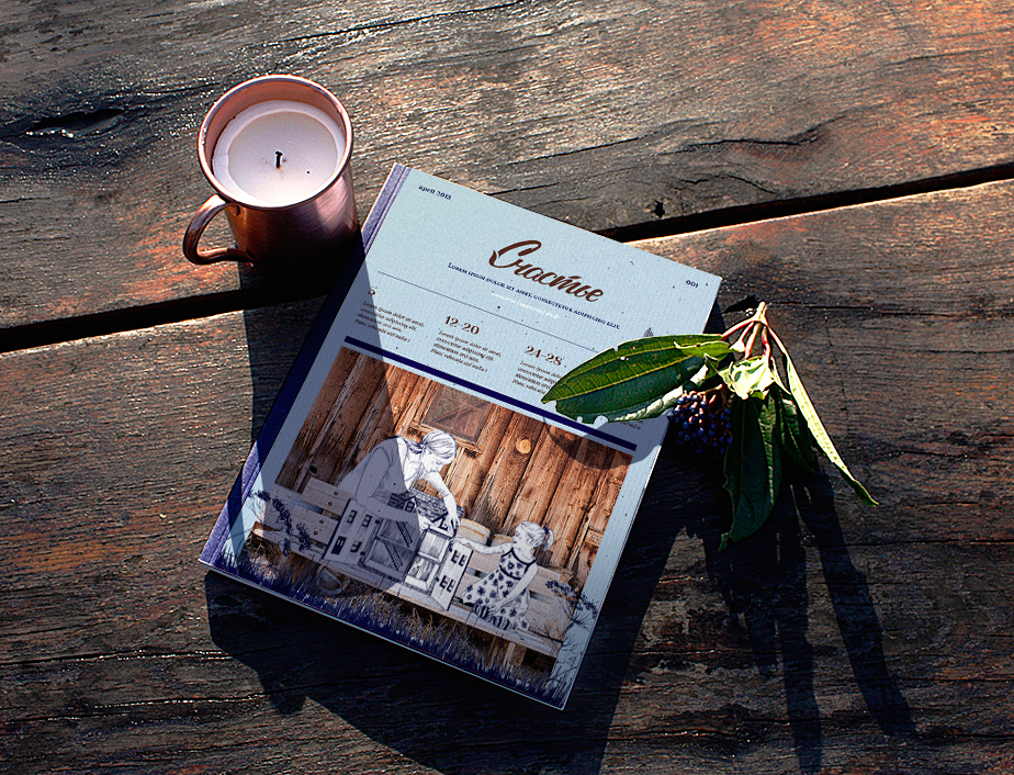
Happiness is a village of cottages in Russia.
Located far enough from big cities and close to the Ethnic Park, it affords a great ecological environment.
Only Eco-friendly materials are used in the construction of the homes.
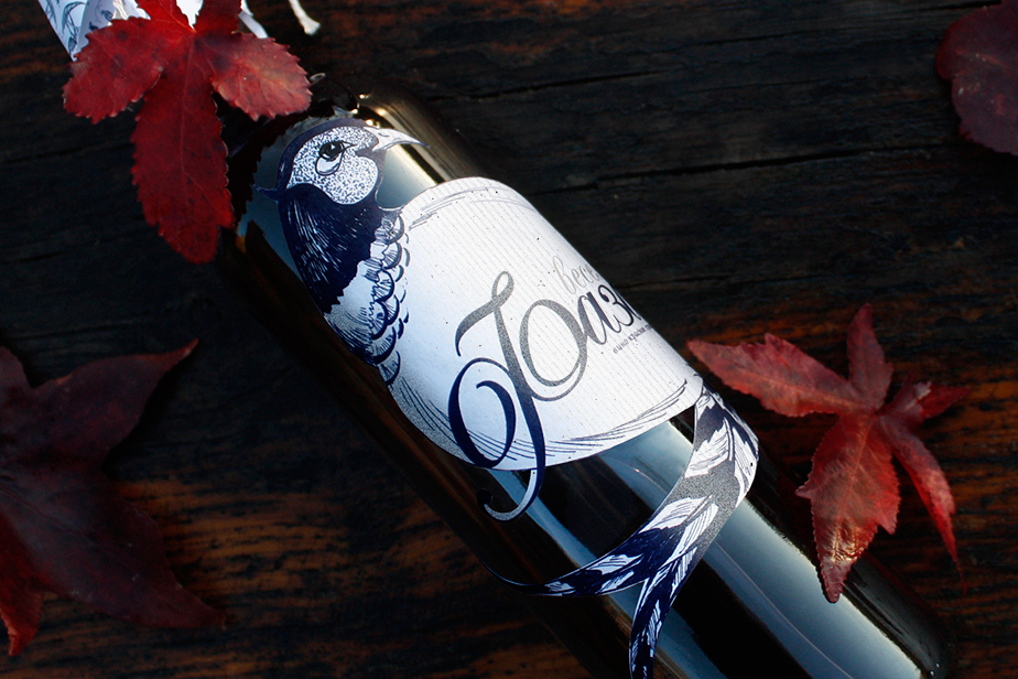
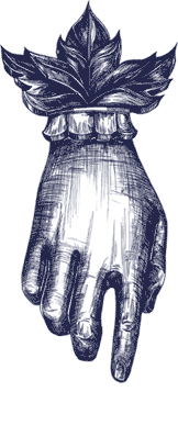
The 'Happiness‘ brand uses hand drawn patterns with floral and fowl motifs.
The patterns and colours are not only stylish, but are also appropriate for the region's culture, nature and environment.
The logotype is custom-made to look like handwriting and depict floral motifs.
The patterns and colours are not only stylish, but are also appropriate for the region's culture, nature and environment.
The logotype is custom-made to look like handwriting and depict floral motifs.


_______________________________________________________________________
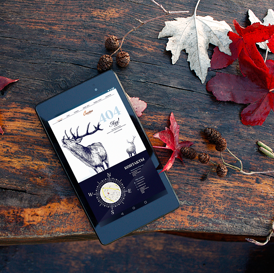
Sky Blue colour is the main brand colour that represents the sunny sky in the morning
and the true insouciance.
There is no black colour used on the website and most of printed matters.
Navy blue is used instead to complement Sky Blue.
These colours work well with natural materials such as green grass,
white snow and all shades of wood and stone.
and the true insouciance.
There is no black colour used on the website and most of printed matters.
Navy blue is used instead to complement Sky Blue.
These colours work well with natural materials such as green grass,
white snow and all shades of wood and stone.
_________________________________________________________________________________