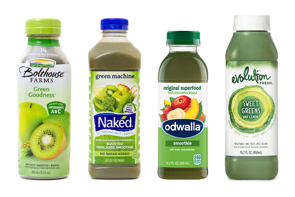
Naked Juice is one of the most well-known commercial producers of natural juices and smoothies. Unfortunately the brand's current packaging suffers from its similarity to that of its top competitors.
Reenvisioning the Naked Juice brand began with what it means to be "naked." The brand promises natural ingredients, no preservatives, and no added sugars. This stripped-down approach harkens back to simpler times.

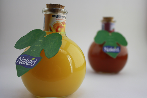
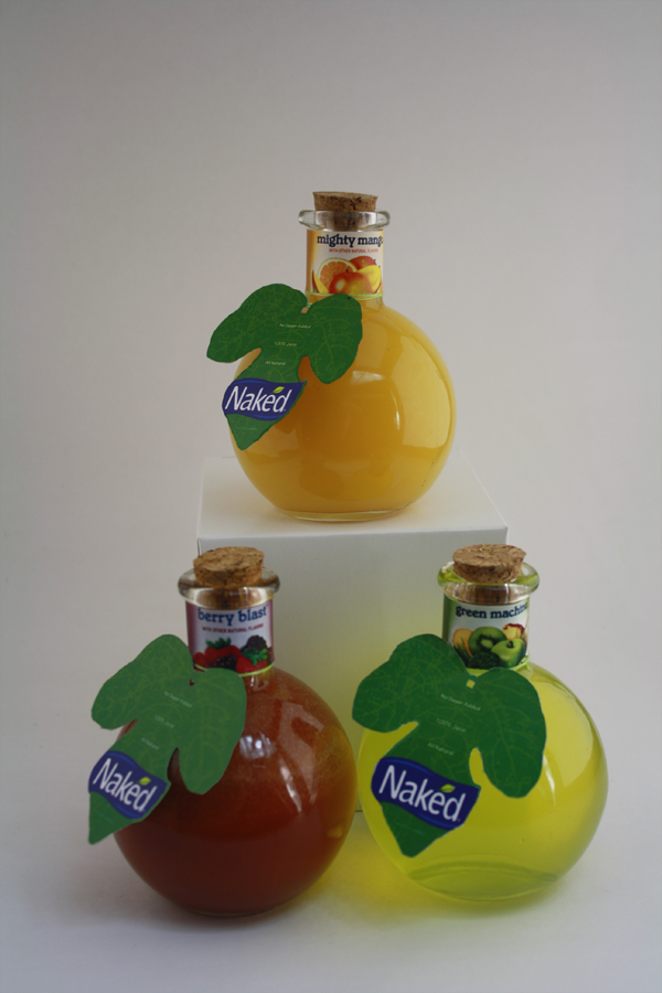
The fig leaf is a classic artistic symbol of nakedness. This compliments a simpler, fruit-inspired package design.
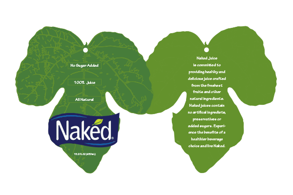
New neck labels convey important information and spirit of the original design, without the clutter.

Results: