A designer contacted me recently to create a logo for her business. The two words that form the identity intrigued me, although I could see immediately that there would be some difficult challenges. Two short words, both starting with i. A mathematical symbol, which comes from another planet. How to integrate the words and concepts, and how to make the meaning clear?
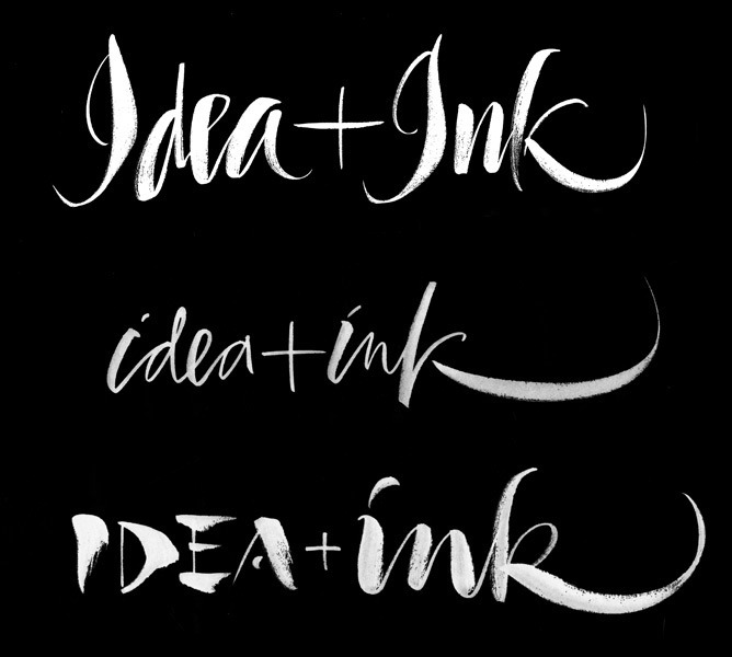
In an age of font-everything the eye expects to see two repeated letters look identical. In designing a unique calligraphic mark I want the repeated letters to look just enough different from each other to be clearly hand-made, yet not so different as to be distracting. One solution is to change case. But which word should be emphasized, and how?
Is 'Idea' sketchy and light and 'ink' the actualization, or are they an even team, smoothly flowing in the same style and weight?
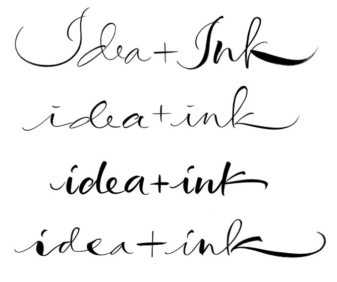
And what kind of ink? Marker-ink, printer-ink, brushy-ink, watery ink?


And then there is the idea of letterpress ink, and the logo looking like a stamp. These are just some of many variations locking up the two words and testing the legibility of the I.

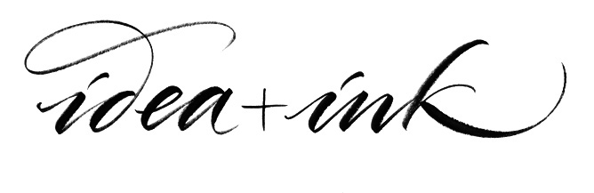
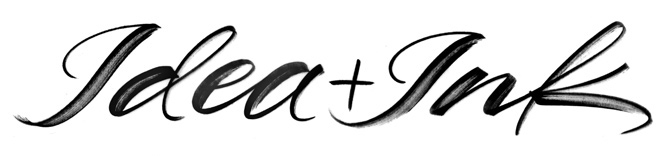
This was the designer's final choice. Brush and guache on mystery paper for a certain amount of interior texture and sparkle.

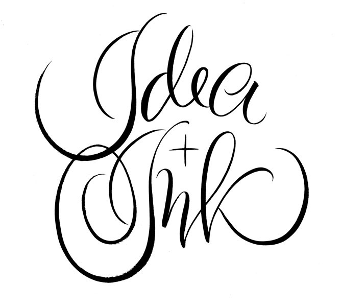
P.S. These edgy ones above were my favorites.


