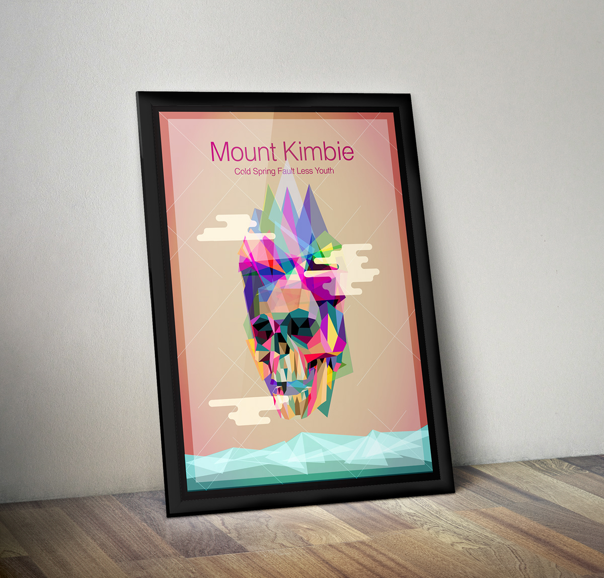
This is a packaging and redesign proposal for Mount Kimbie's CD Cold Spring Fault Less Youth for my editorial class. My goal was to make a play on both the band name and CD name for a more interactive and visually appealing design.
I decided to start with an interpretation of the existing CD cover. I then applied this graphic to a carrousel-type book which forms a mountain (a pretty obvious but still attractive play on the band's name). On the hard covers of the packaging you can find the booklet with song lyrics and the CD itself, which starts playing with the image of an old woman as a reference to de disc's name.
This graphic was also applied to concert tickets and promotional poster, which, without logos and concert information, also doubles as a band poster. The poster follows the same graphic rules of the packaging but contains a new, yet related, illustration.
I had to cut each page by hand, so please forgive any imperfections.
I hope you like it,


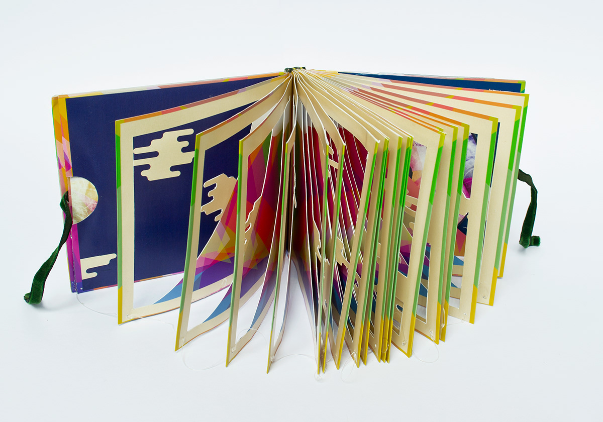


First and last page of the song booklet, so you can see both the layout and graphic application.

First and last page of the song booklet, so you can see both the layout and graphic application.