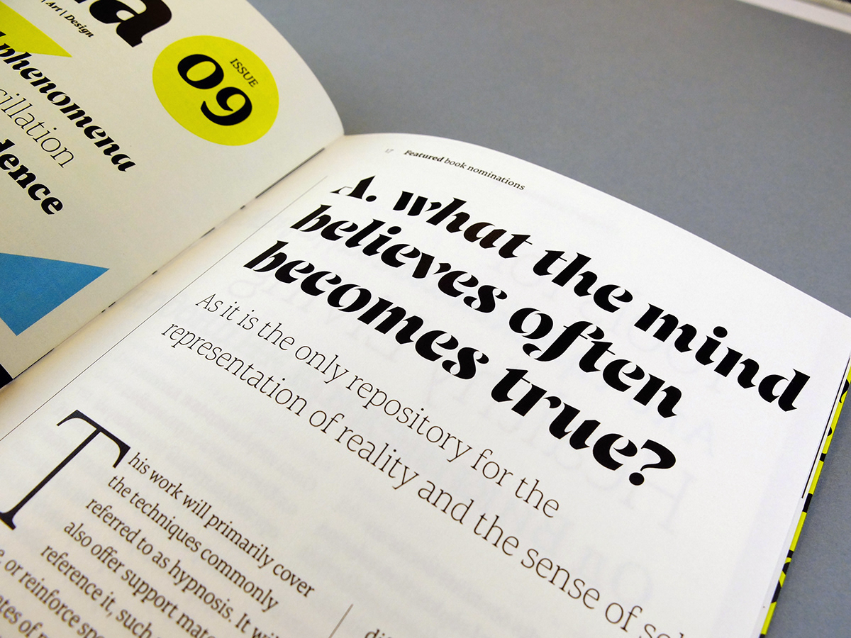
Mirna is a text typeface for continuos reading with a playful stencil display style. It was designed during a MA Typeface Design course in Reading, UK. Complete specimen is available here
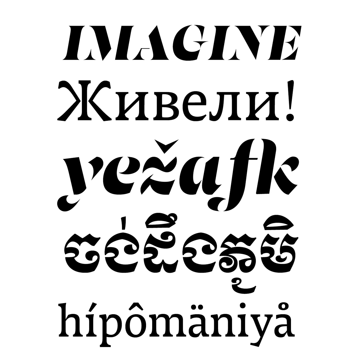
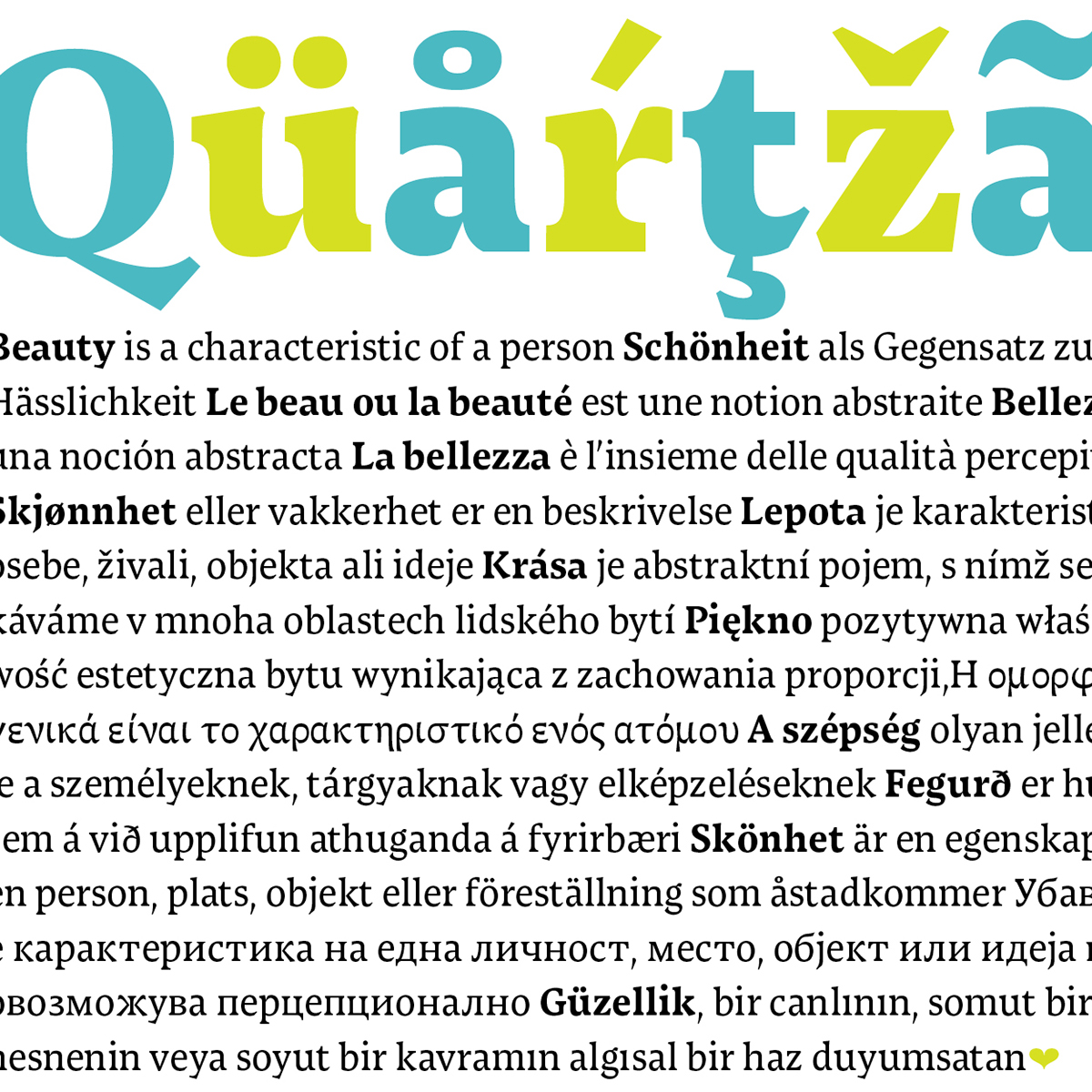
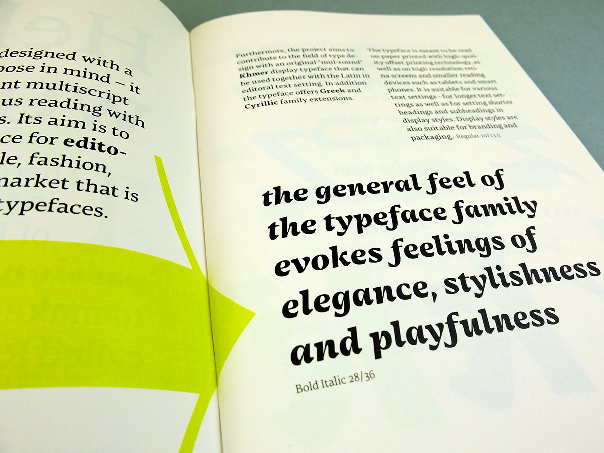
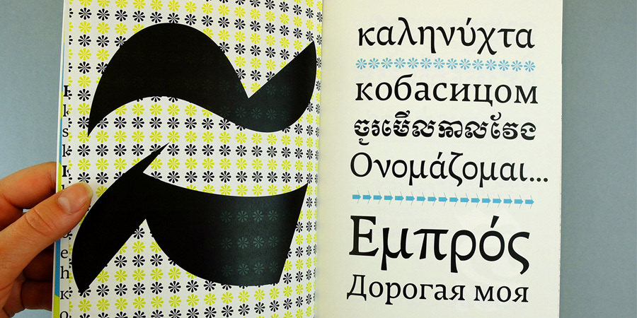
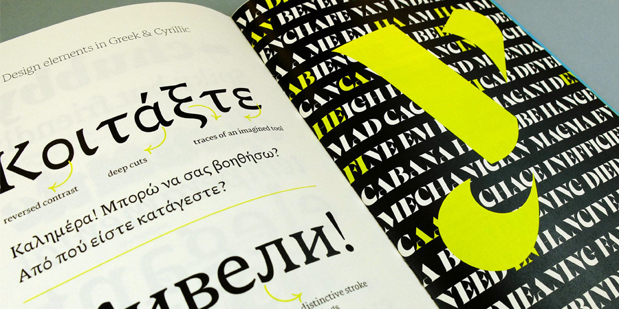
Mirna is suitable for editorial text settings in lifestyle, fashion and health magazines. Display stencil style is suitable for branding and packaging. It is is meant to be read on paper printed with high-quality offset printing technology, as well as on high resolution screens and reading devices. Mirna has Greek, Cyrillic and Khmer family extensions.

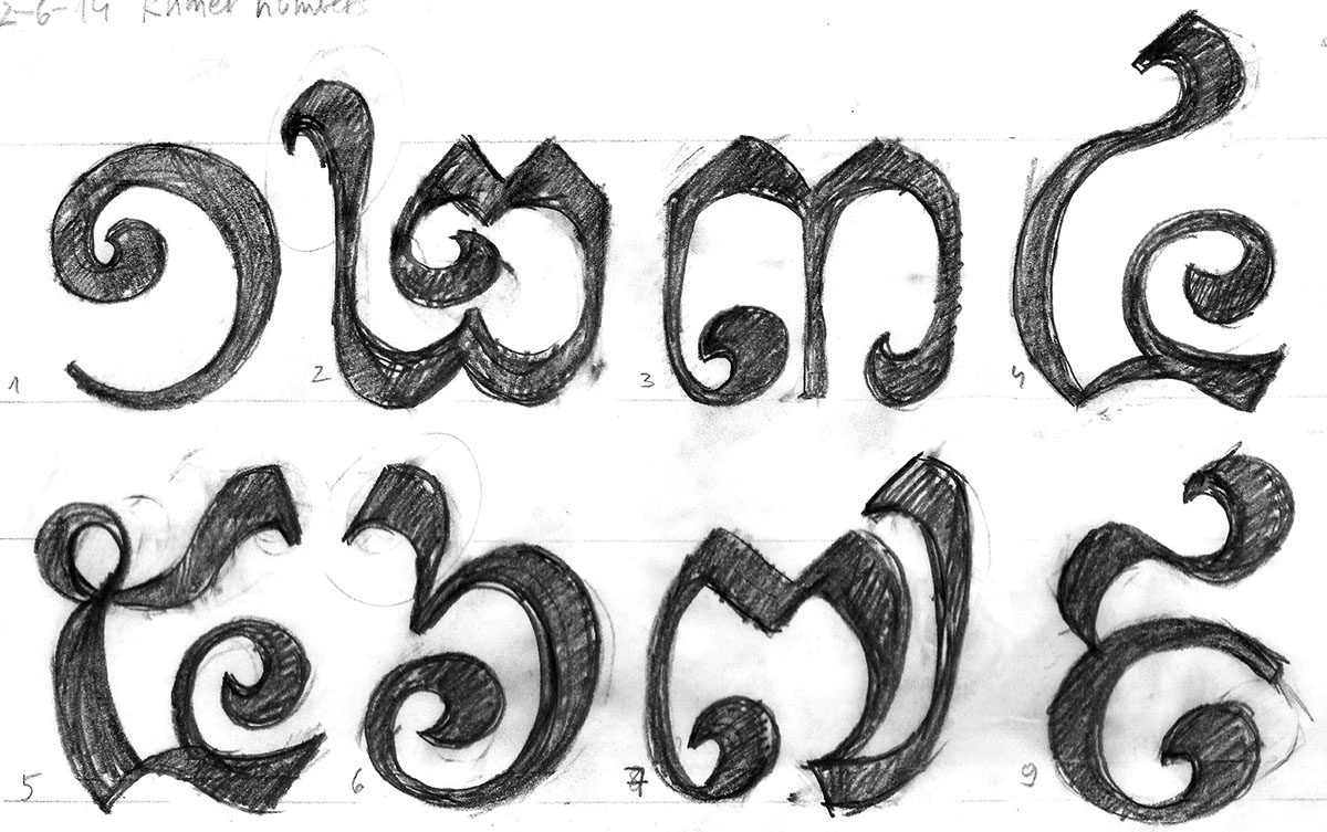
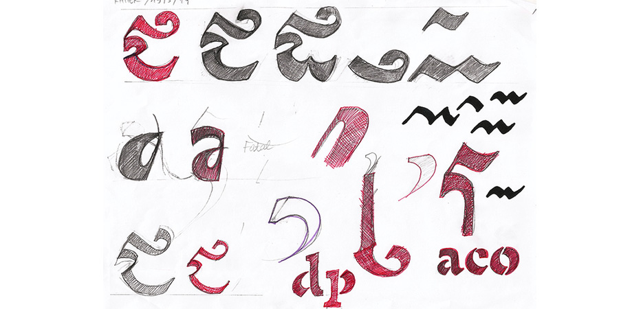
First sketches and printed pdf's from the process of designing Mirna:

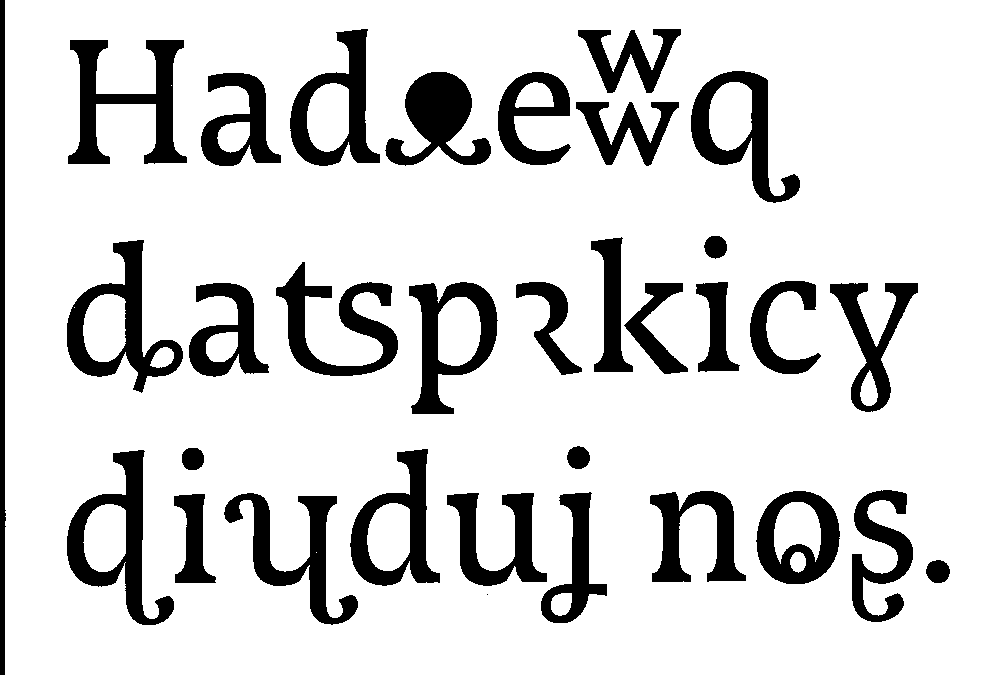

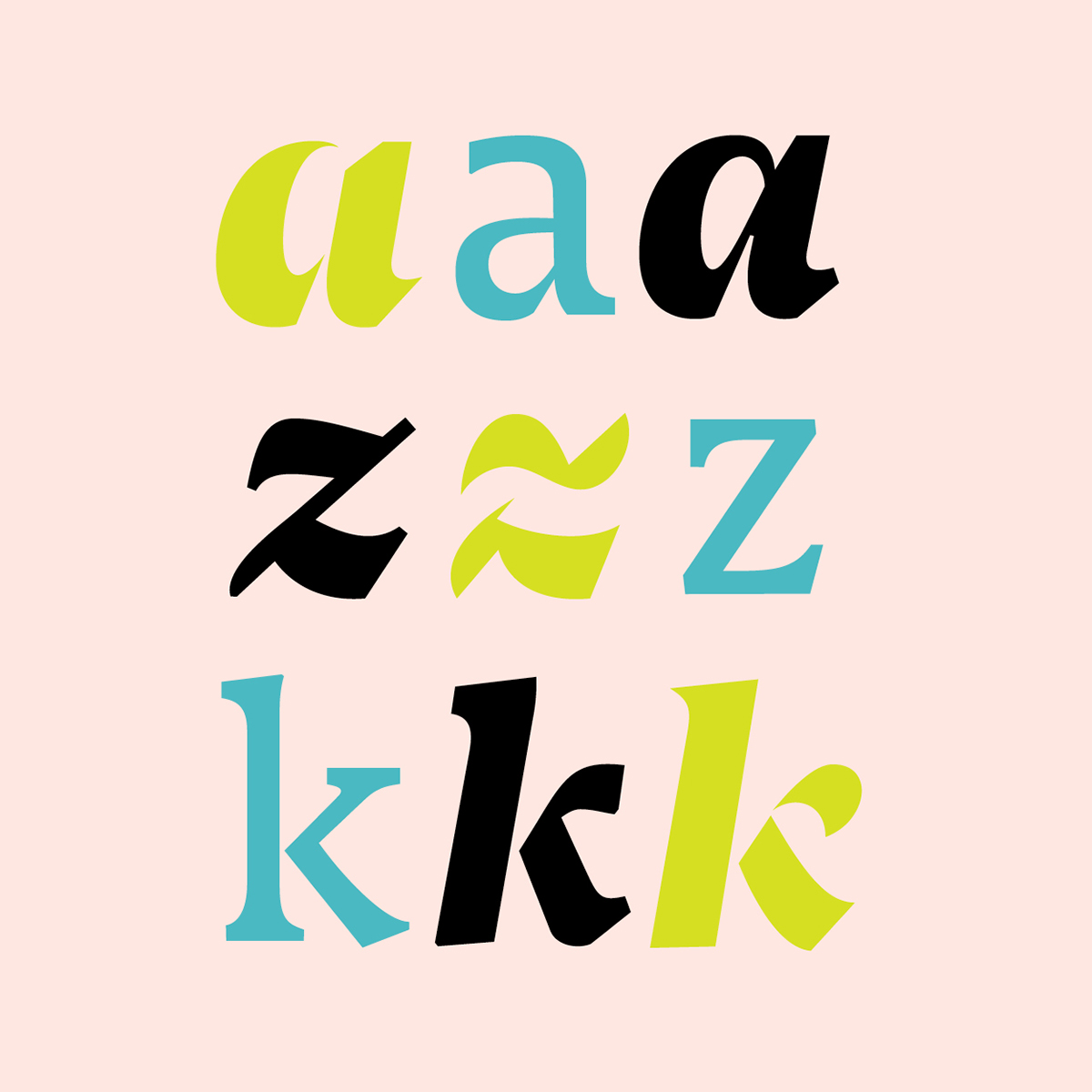
Characteristics of the typeface family:


Different weights have different appearances and are intended for a specific use; contrast is applied and adjusted accordingly to a specific use.
Thin: elegant appearance; suitable for headings and shorter texts, Book, Regular: highly legible with a distinctive character; suitable for longer text settings, Semibold, Bold, Black: suitable for headings and shorter texts; more character; suitable for overlay–setting text on pictures, Stencil: fresh spin on Moderns; elegant, seeks attention, like a playful typographic pattern, fast movement of strokes.


The typeface family is under development. If you are interested in the project, feel free to contact me here: smrekar.teja@gmail.com and here http://tejasmrekar.com.


