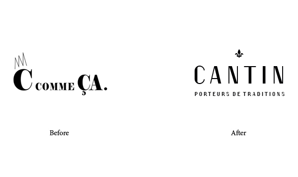
Known for her innovative use of traditional Quebec materials in creating her high-quality bags,
designer Cindy Cantin is changing the name of her company C comme Ça to her own family name.
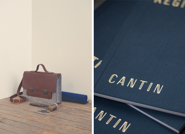
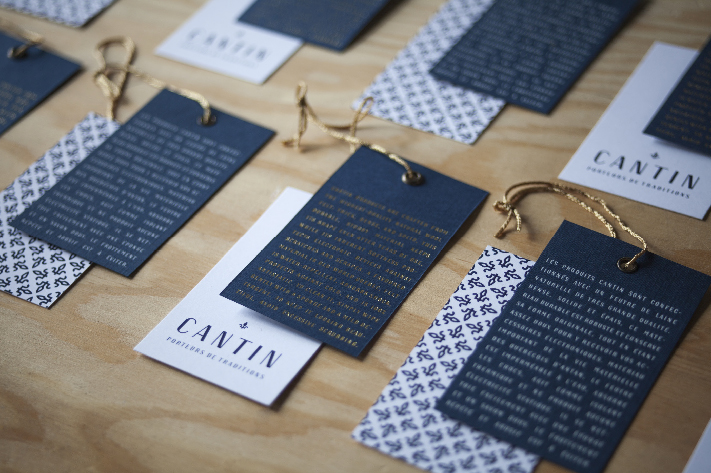
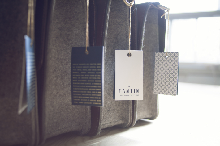
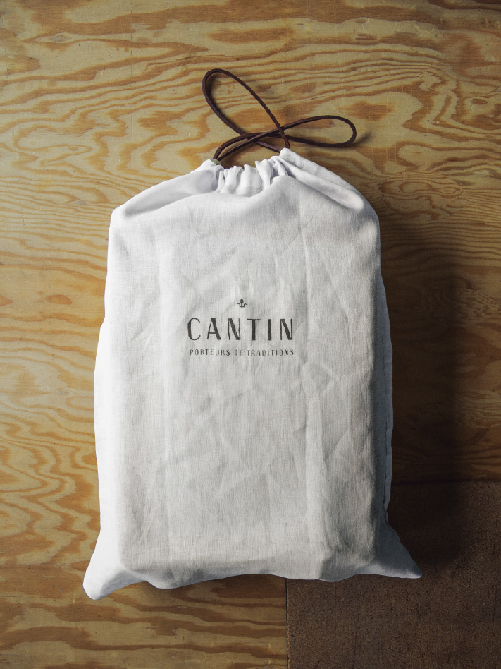
The new image of CANTIN bags is now instilled with tradition and family heritage.
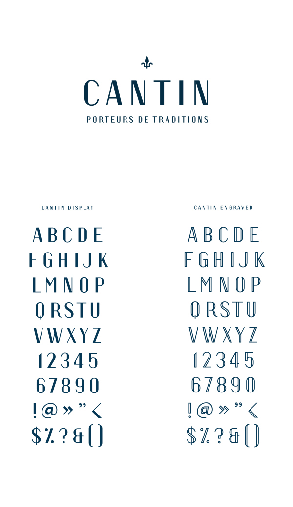
Every creative aspect of Cindy’s work—from the brand and product names to typeface design,
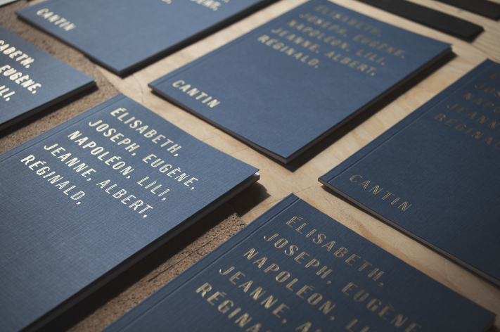
imaging and the fleur de lys symbol—recalls some elements of the Cantin family tree. The descriptor
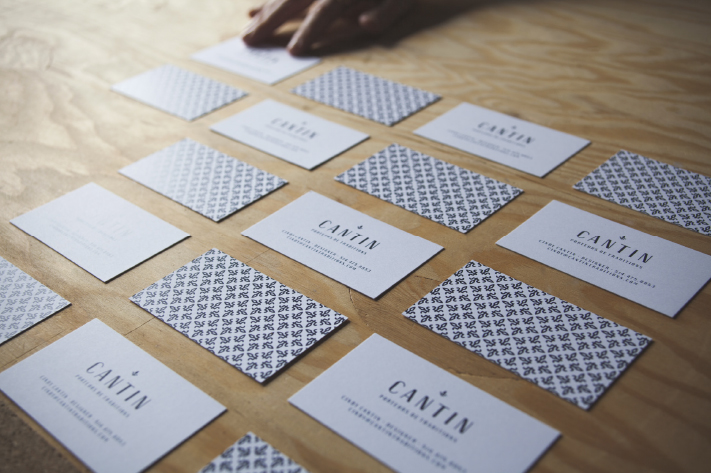
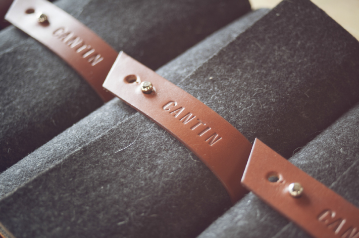
Bearers of tradition reflects the link between the brand history and product use. All brand contact
points now reinforce the unique legacy that is so apparent on first contact with CANTIN products.
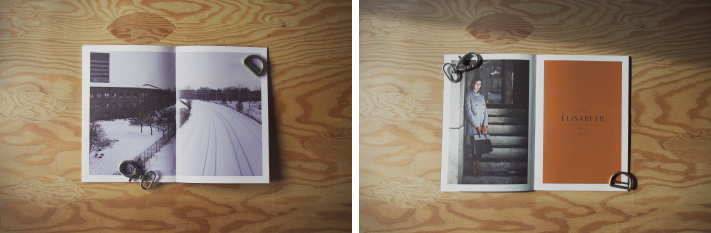
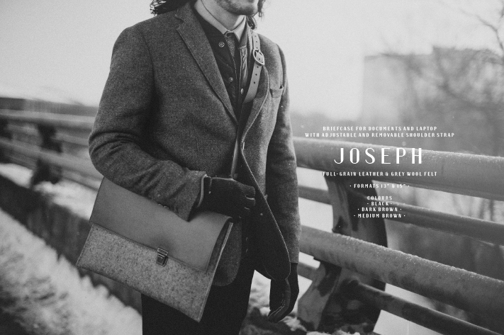
The new identity pays special attention to copy and photography in order to do justice to the unique
look of the bags. Like all CANTIN products, the new image is classic and timeless, with a feel for Montreal’s historic Mile-End district where the company’s workshops are located.
The new name marks the official entry of CANTIN bags onto the American and European markets,
while proudly remaining a truly local brand.


Naming and copywriting: Rachel Lecompte
Art direction, graphic design and typography: Gabriel Lefebvre
Lifestyle/products photography & video: LM Chabot
Printing: L’empreinte


