EL BORN CC
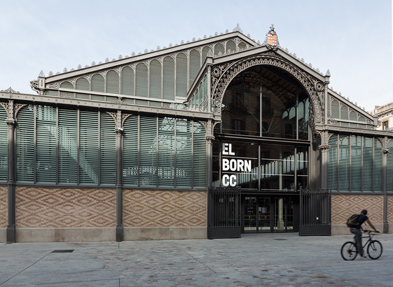
El Born CC is a unique cultural center as it lays on top of the old Born Market and, at the same time, over a historical site discovered after construction works took place on the spot, and that represent an important part of how Barcelona was — the city and it’s life — in the eighteenth century.
El Born CC is a unique cultural center as it lays on top of the old Born Market and, at the same time, over a historical site discovered after construction works took place on the spot, and that represent an important part of how Barcelona was — the city and it’s life — in the eighteenth century.
It’s big dimensions (8.000 m2) and the overall good state of preservation, make it unique in Europe.

CONCEPT
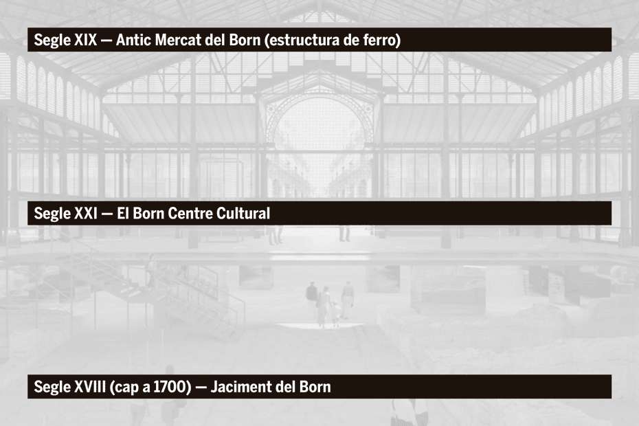
The starting point was the space itself, being remarkable in that it combines three very different moments in time; something like overlapping historical layers:
1. The metal structure that covers the building, by Josep Fontseré, which belongs to the time of Catalan Modernism.
2. The site, with the remains of Barcelona city around the year 1700.
3. Finally, the cultural center itself, contemporary, a space of the 21st century. This dialog of eras, past and present, was our point of departure and what we used as base for our proposal. Instead of creating a new concept for the center, we decided to graphically interpret this aspect.

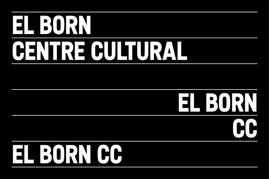
STRATUMS
From the combination of the layers from the three periods came the idea of creating stratums that would identify and solve the communication needs that the center might need: presenting text contents, act as a container for images or illustrations, as the hierarchy structure of information, etc.


TIPOGRAPHY
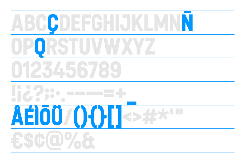
For this identity project a corporate custom typeface was designed. An alphabet created to solve the logo and at the same time used as the main typeface of the center, mostly valid for headlines.
The typeface, named as the center itself, has one unique weight and uppercase version, together with a condensed structure that helps in saving space. The typeface was designed and developed by Joan Carles P. Casasín.

TYPOGRAPHY + STRATUMS
Some typeface characters as the “Q” or “Ç”, or the graphic elements that act as accents, umlauts, etc, have been carefully designed to snap correctly with the lines (stratums) that accompany them.


SIGNS
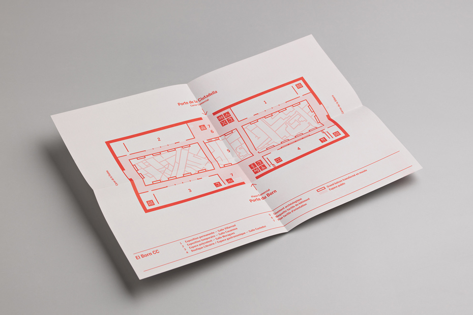
Another part of the project was the signaling the center, 8000 m2 in total. Work consisted of outside and inside identification: information point, exhibition spaces, multipurpose rooms, etc., including a complete system of pictographs.
That the proposed design was in total harmony with the previous architectural approach, and dealing with the multiple reflections from glass surfaces that make the rooms, were the main challenges.


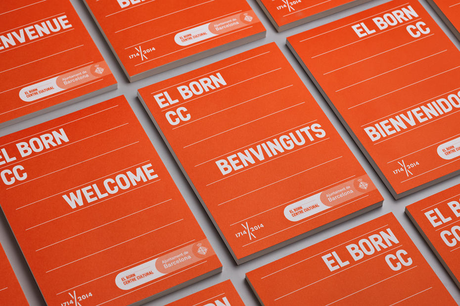
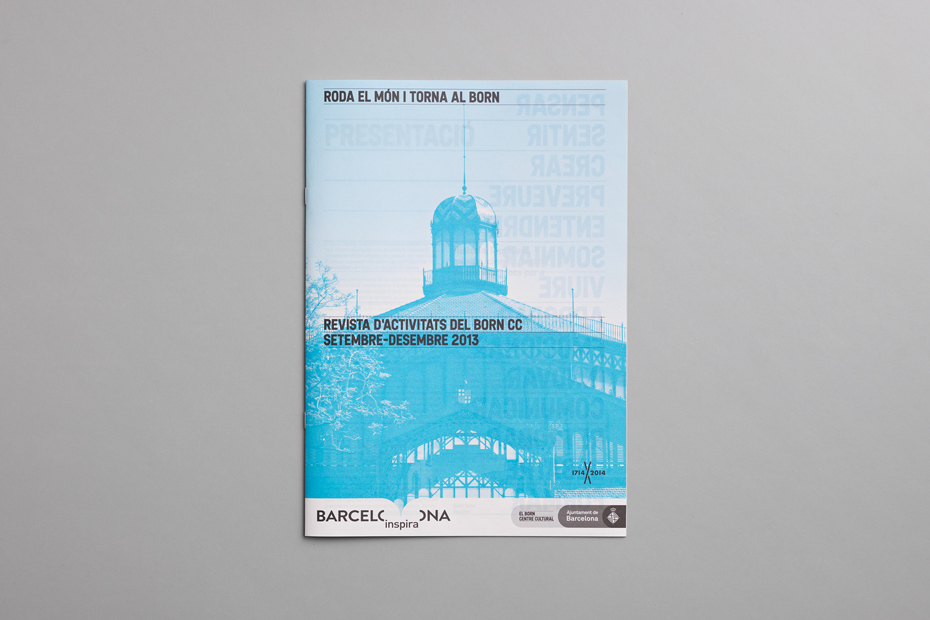
COMMUNICATION
Within the identity project of the Born Centre Cultural the definition and design of the graphical communication line has been created, taking into account the multiple needs and supports for a center as this: paper pieces, physical elements in the space, on screen designs, etc.
Here is a compilation of some of them.


PICTOGRAMS
For the signaling of the center a specific graphic system was designed. We generated a library of over fifty pictograms, created from modules extracted from the design of the custom typeface made for the visual identity of El Born CC.
The pictograms had to be iconic signs that transmitted their meaning clearly and with simplicity, and in the most universal way possible.
The square base of the pictograms was produced with the core material mostly used in the center: gray 'Trespa'. This helped them integrate perfectly into the space. The illustrated area was made in matte white lacquered aluminum, to boost the visual contrast and give the necessary relief so it could be read with fingers by people with visual impairments.


EL BORN CC
Graphic Identity + Tipography + Communication + Wayfinding + Pictograms
+ info: http://www.forma.co
Follow us on Facebook and Instagram
+ info: http://www.forma.co
Follow us on Facebook and Instagram


