
This project was an experiment in order to work on more complicated graphical elements and interaface for the Dragon's Gold exercise. A new layout and graphical language was adopted in order to make the game look like a strategy game and give a different feeling to the user.
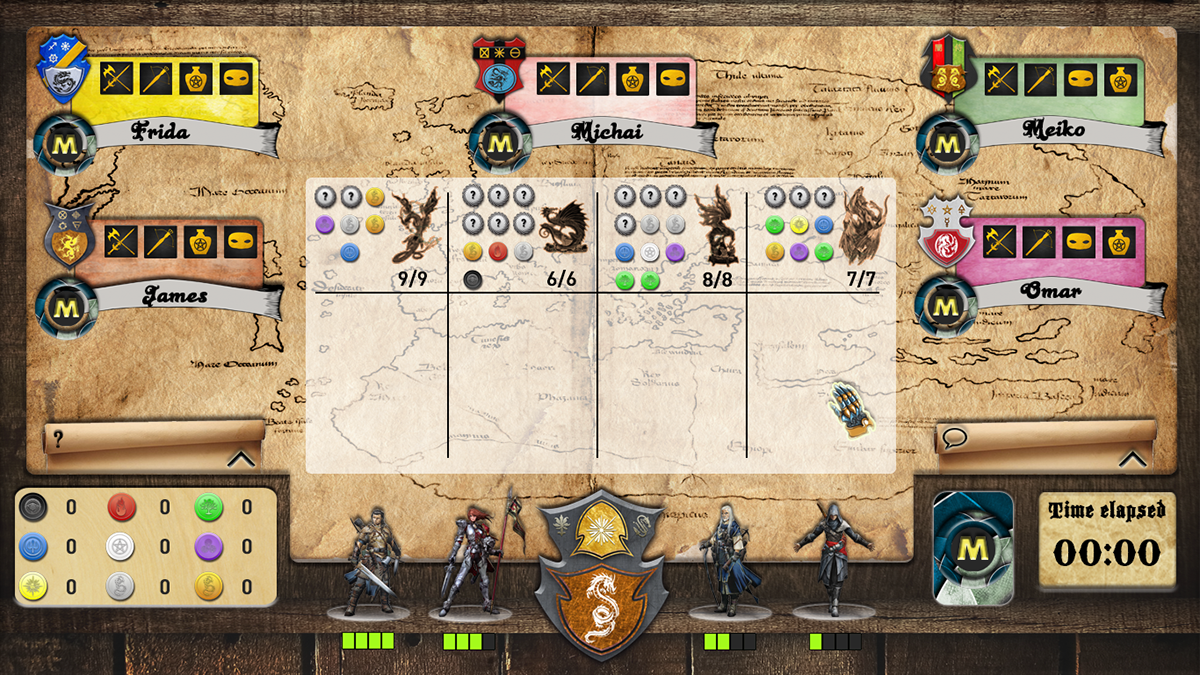
The following 3 screens demonstrate the layout of the interface. At the bottom is the user's units, treasure chest, magic cards and the player's crest. At the center of the screen is where the dragons are killed.
There can be maximum 5 opponents and for each one is visible which warrior is available, if there are magic cards available, the order's sign and the player's name and a timer showing the time elapsed since the game started.
At the left and right of the screen there are 2 folded papers. The left one is the help and faqs and the right one is the chat, a function that was prohibited in the initial exercise but in order to make the game an internet multiplayer capable platform the chat functionality was addded.
In the following screenshot the help paper is unfold

In the following screenshot the chat paper is unfold.

Note that this was an experiment regarding the graphical identity of the game. Most graphics are designed from scratch except the human figures used for the player 1 units (shown in the bottom of each screen 2 on each side of the crest. Credit for these figures goes to the respective designers/artists.
Below are the graphics used for the valuable units gathered in each player's treasure chest. The same colours of the original tokens of the board game were used. An icon was added on each token in order to make it more appealing and mysterious.

Black Token

Blue Token

Golden Token

Green Token

Purple Token

Red Token

SIlver Token
White Token

Yellow Token
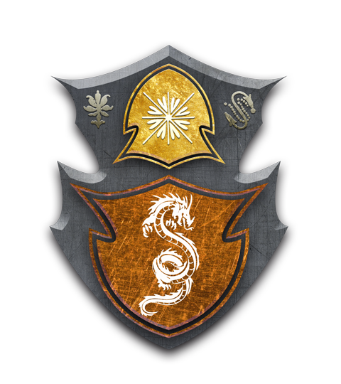
In order to follow the dark ages look and feel I decided to design come crests for each player. All of them have a dragon's sign on them and are decorated and painted in various ways.


The following icons were used in order to show which units are available for the other players to use in the game. A darkened icon means that the player has already used this unit.


The avatars below were initially used for representing the player 1 units (instead of the human figures).


This was just an experiment and fun work with graphics and layouts.


