


SHINSEGAE Simply Juice
Brand eXperience Design Project
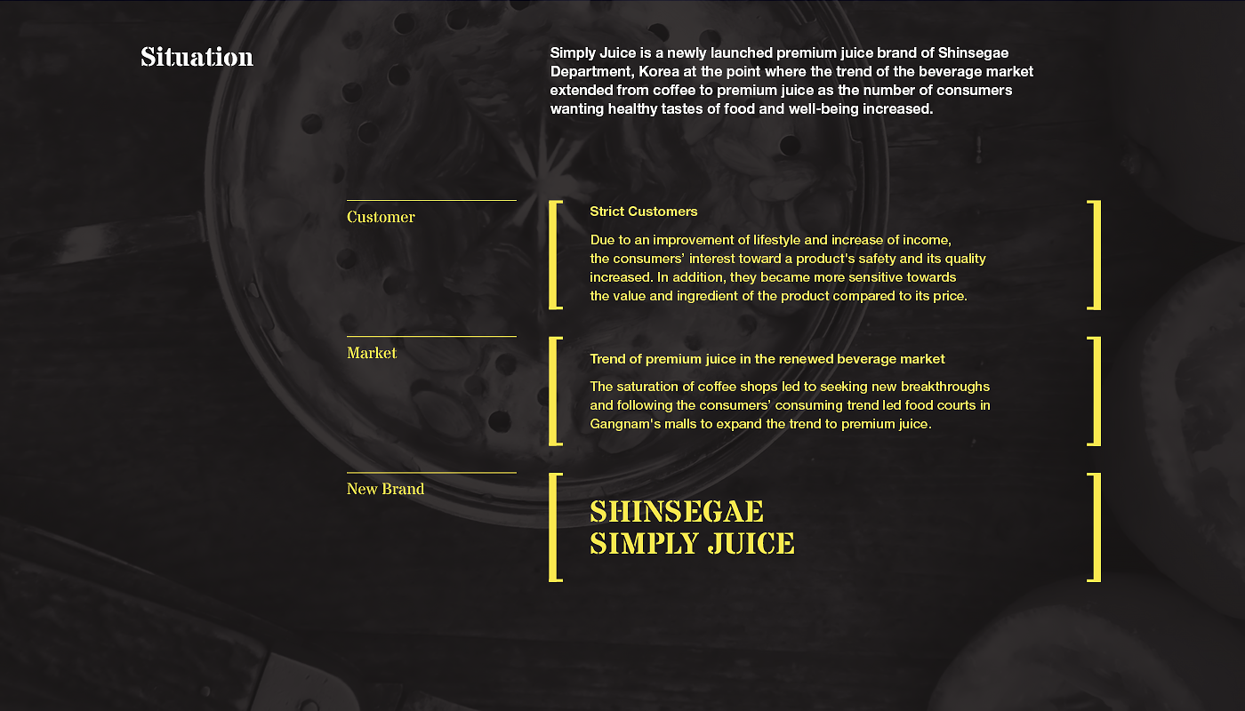
Situation
Simply Juice is a premium juice brand of Shinsegae Department, Korea. As the number of consumers wanting healthy tastes of food and well-being increased, the trend of the beverage market extended from coffee to premium juice. A quick movement along the flow to create a distinctive feature of Simply Juice was required in order to make it a leading juice brand.
심플리주스는 신세계백화점의 프리미엄 주스 브랜드입니다. 고급스러움과 건강한 맛에 대한 소비자들의 수요가 늘어나면서, 커피에서 프리미엄 주스로 식음료 시장의 트렌드가 확장되었습니다. 시장의 흐름에 발 빠르게 움직이고, 대표적인 착즙주스 브랜드로 자리매김하기 위하여 심플리주스만의 차별적인 브랜드 이미지를 만들 필요가 있었습니다.
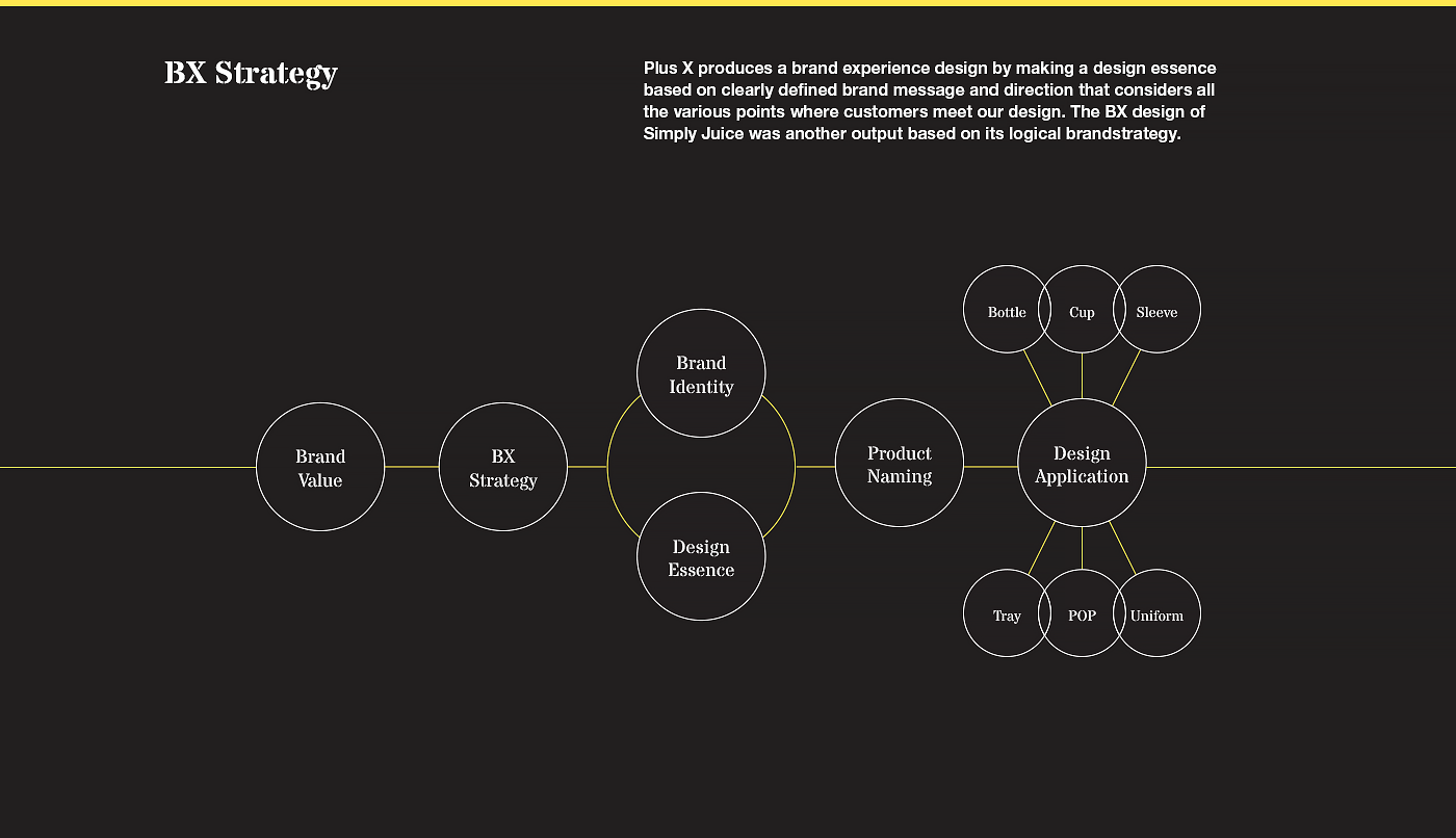
Strategy
In order to build up a differentiated brand image of Simply Juice, the brand identity was newly designed to convey the feature of brand for organic food, to reflect sophisticated and minimal features of Shinsegae Department and to clearly and intuitively deliver product identity. Based on the idea, we deducted four main design keywords: ‘Fresh’, ‘Organic’, ‘Minimal’, and ‘Intuitive’.
심플리주스만의 차별적인 브랜드 이미지 구축을 위해 자연본연의 것을 추구하는 브랜드 특성과 신세계백화점이 지니고 있는 세련되고 미니멀한 이미지, 제품의 정보가 명료하고 직관적으로 전달될 수 있도록 브랜드 아이덴티티를 디자인했습니다. 이러한 것을 바탕으로 Fresh, Organic, Minimal, Intuitive를 디자인 에센스 키워드로 도출하였습니다.
Graphic motif development
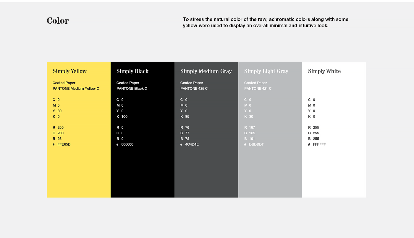
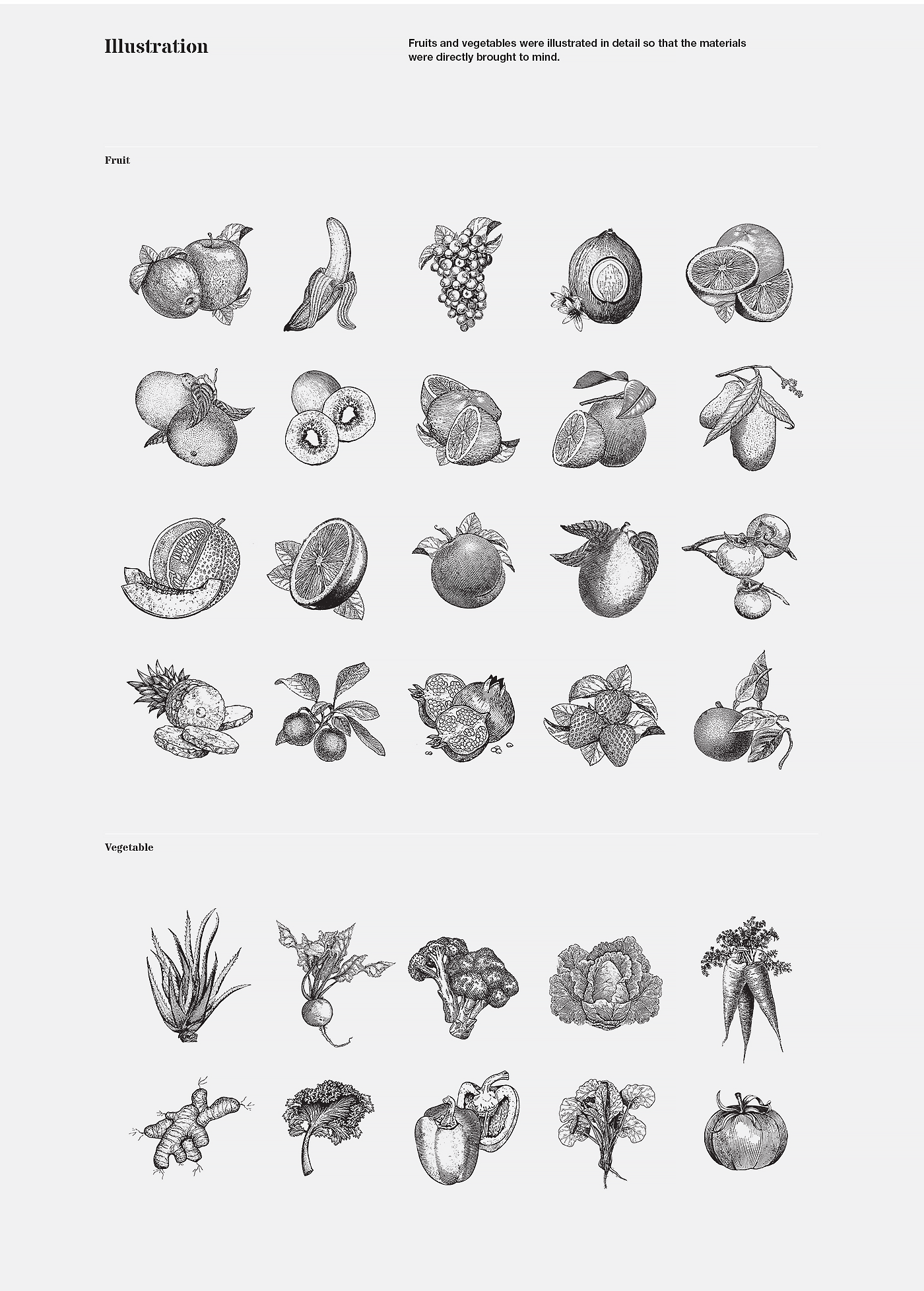
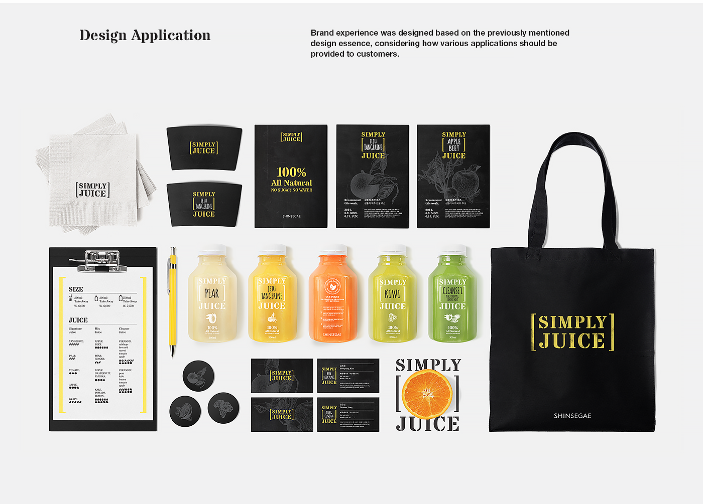
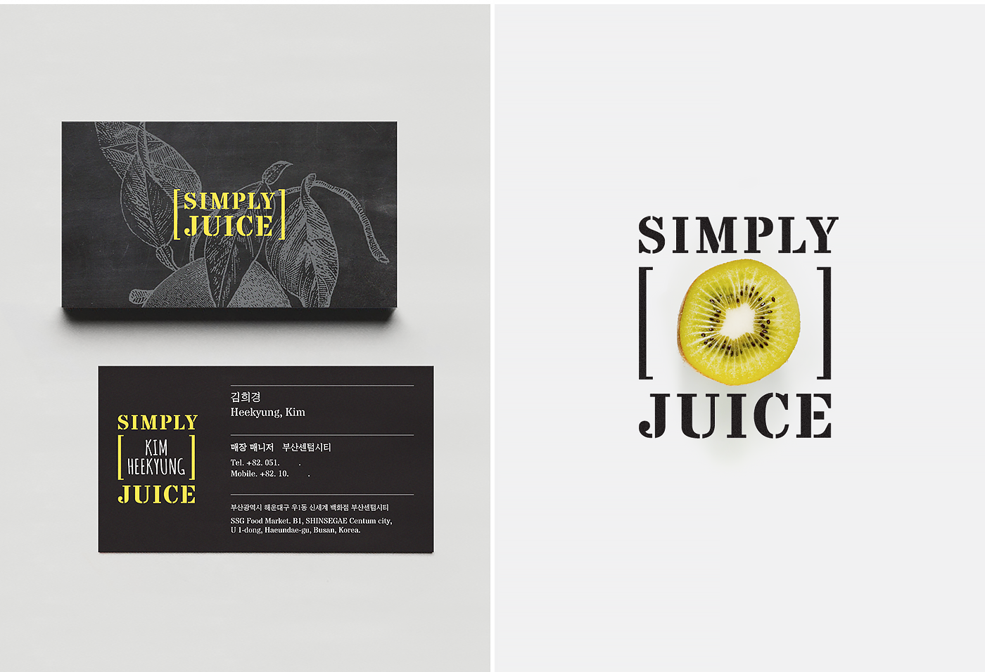
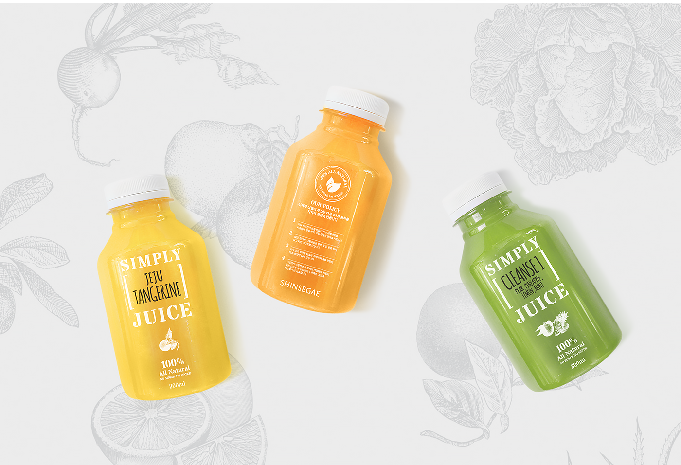
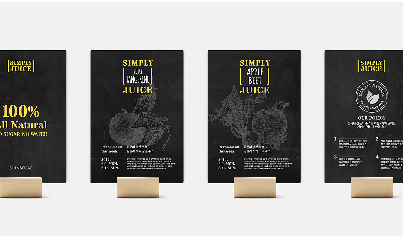
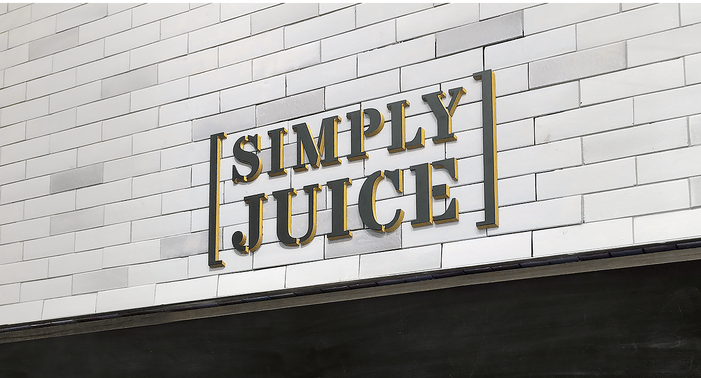
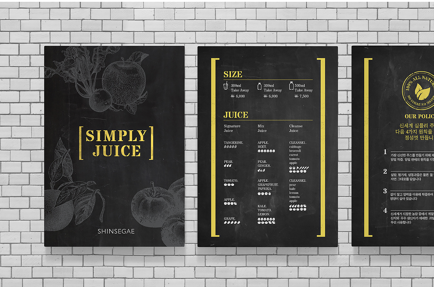
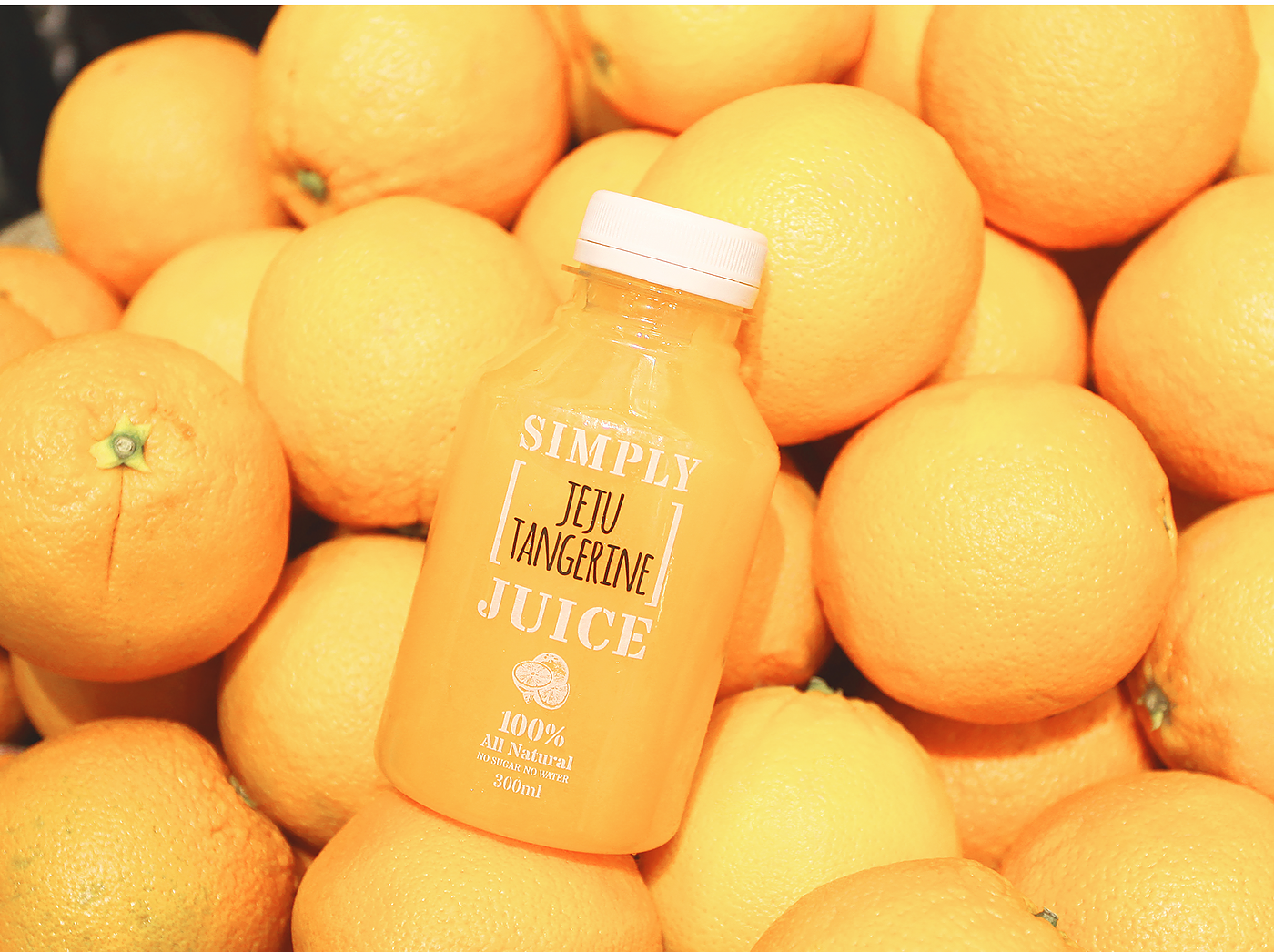
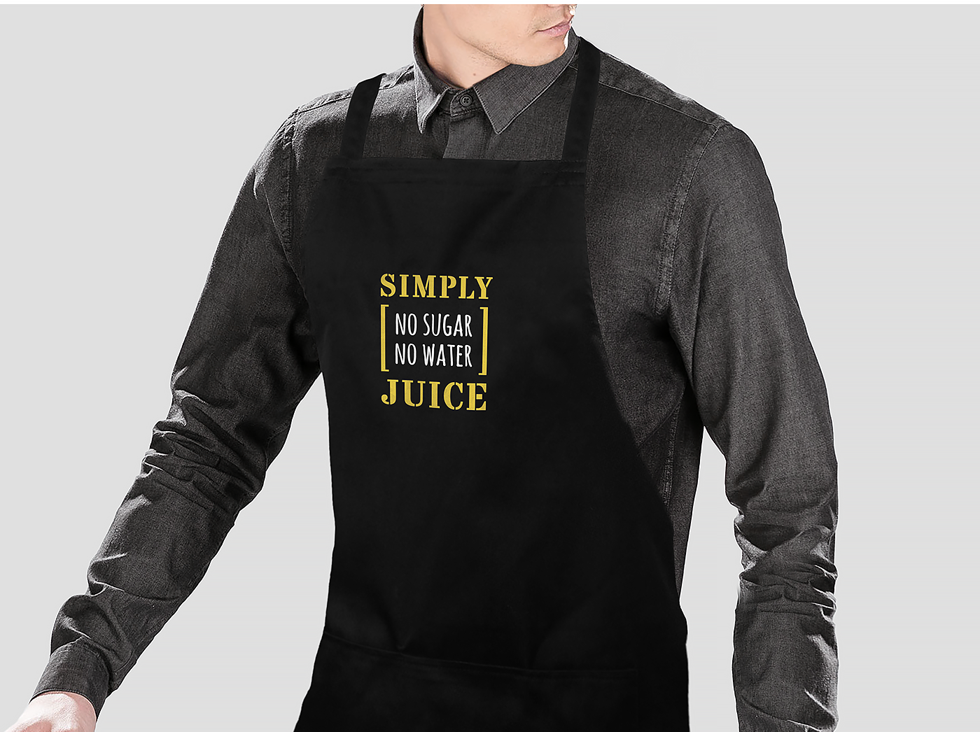
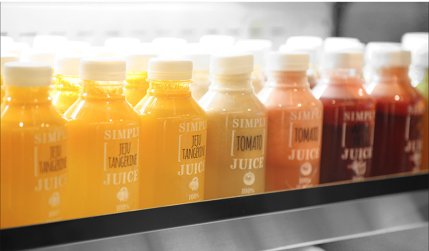
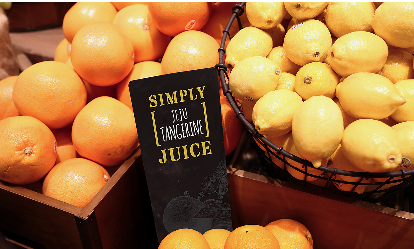
The concept of a fruit box to suggest various raw materials contained in Simply Juice was delivered through ‘parentheses’ with flexibility, the main graphic motif of the design. The handwriting and line drawing enable consumers to feel the fresh and organic nature itself. Fruits and vegetables were illustrated in detail so that the materials were directly brought to mind. In order to stress the natural color of the raw, achromatic colors along with some yellow were used to display an overall minimal and intuitive look. Consisting of these elements applied on all cups, carriers and signage with consistency, Simply Juice provides a special brand experience to customers.
과일 박스 모티브를 괄호로 디자인 하여 다양한 원재료들이 심플리주스안에 담겨는 것을 플렉서블하게 보여줄 수 있도록 표현하였습니다. 손글씨와 라인드로잉은 소비자들이 신선함과 오가닉한 자연 그대로의 느낌을 느낄 수 있게 합니다. 과일과 야채 등 원재료들이 직관적으로 연상되도록 세련되고 디테일한 일러스트레이션 스타일로 표현하였습니다. 원재료 본연의 색을 강조하기 위해 다양한 컬러를 배제하여 모노톤을 메인으로 하고, 노란색을 포인트 컬러로 활용하여, 전체적으로 미니멀하고 직관적인 룩을 유지합니다. 이러한 요소들을 컵, 슬리브, 캐리어, 매장 등에 일관되게 적용하여, 고객들에게 심플리주스만의 특별하고 일관된 브랜드 경험을 제공합니다.
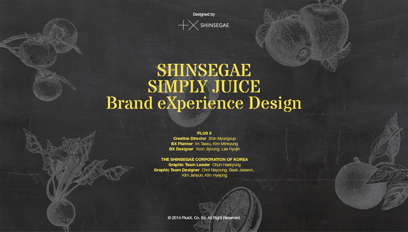
Designed by Plus X + SHINSEGAE
Plus X
Creative Director : Myungsup Shin
BX Planner : Taesu Im, Minkyung Kim
BX Designer : Jiyoung Yoon, Hyojin Lee
SHINSEGAE
Graphic Team Leader : Heekyung Chun
Graphic Team : Nayoung Choi, Jeewon Baek, Jahyung Kim, Hyejung Kim


