After some changes in their business model, Cervejaria Capa Preta could no longer continue to produce their bottles with the matte black cover that gave the company its name (in portuguese, Capa Preta = Black Cloak/Cover)
Along with Lucas Godinho, owner and brewmaster, several options for the brand's redesign were analysed. The name pointed to a variety of possible paths, tough most of them lead to the same direction, with associations with something dark/ misterious
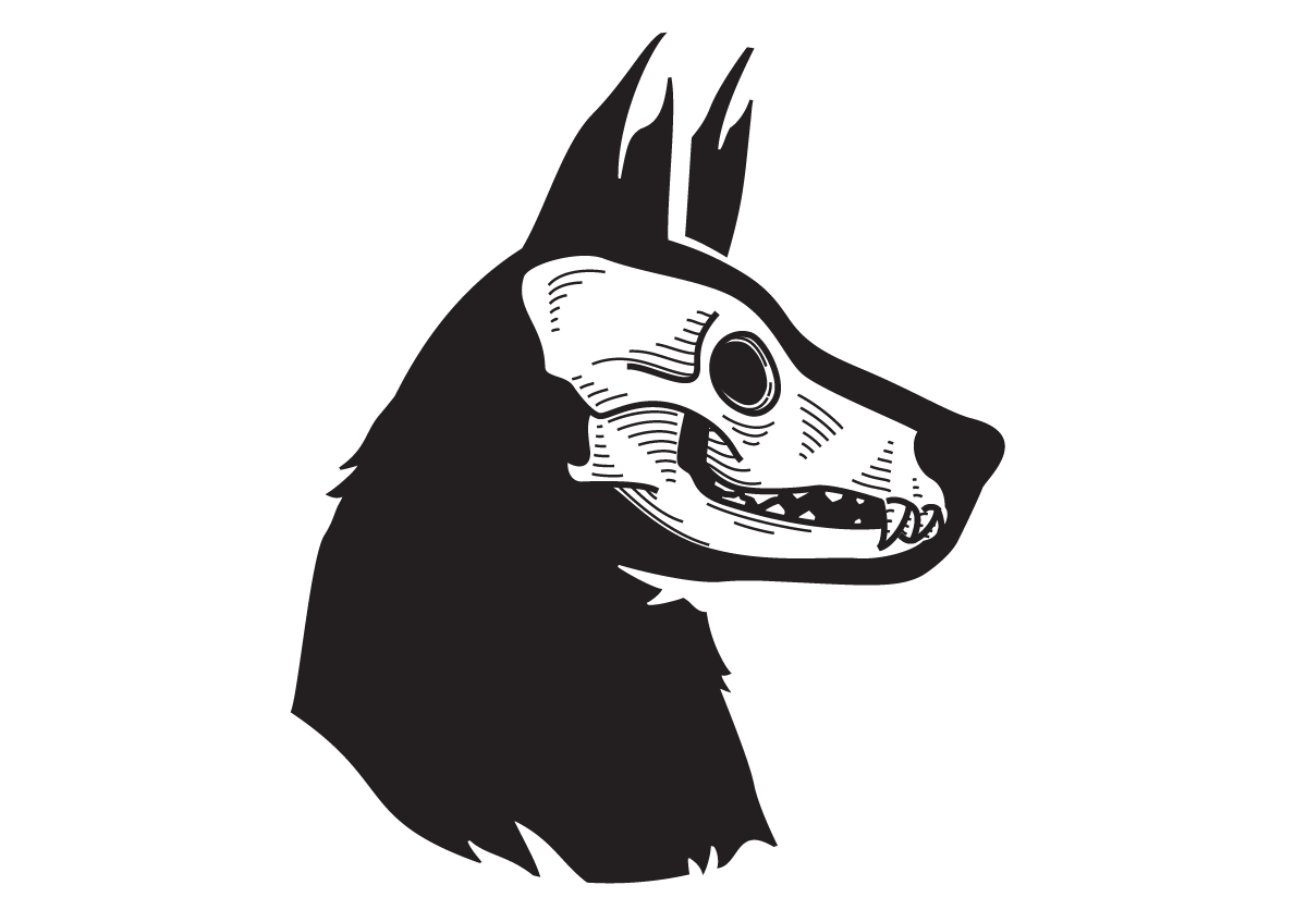
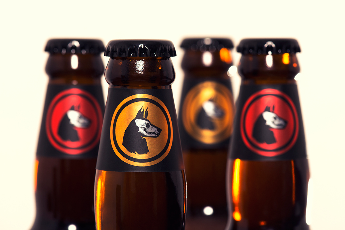
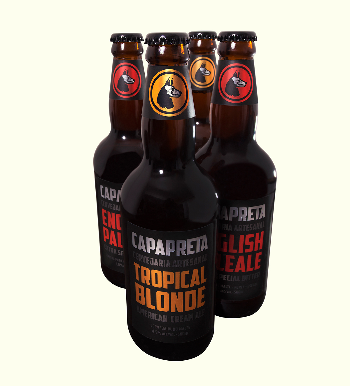
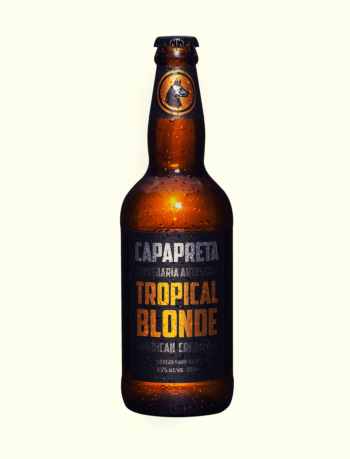
The solution was to combine the image of Death with that of the German Shepherd, creating a symbol that was both powerful and unique. (Capa Preta the name for a type of German Shepherd, in portuguese, and The Dog is also a nickname for The Devil)
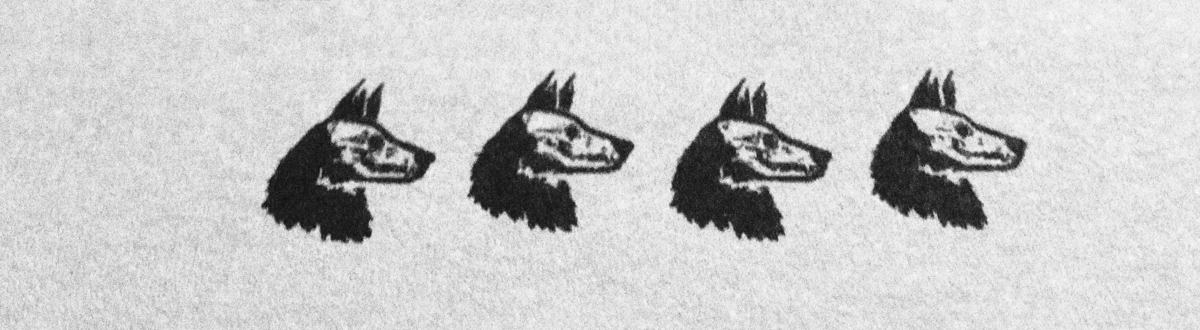
A number of tests were made in order to find the ideal line thickness, that wouldn't disappear in small sizes, and line spacing, that wouldn't clog in small sizes.