


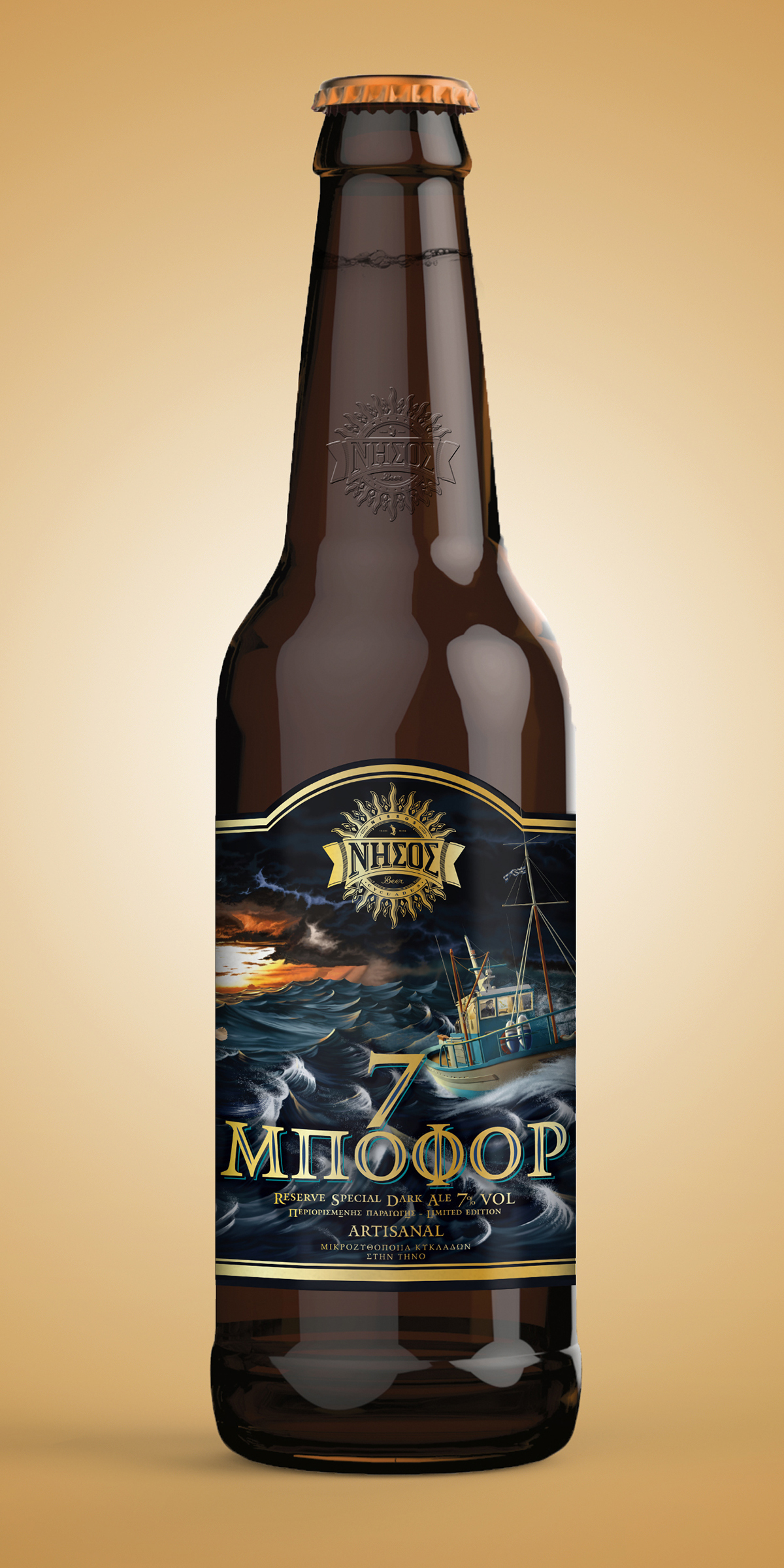
In mid September, 2014 Cyclades Microbrewery at Tinos island, a small island brewery on Tinos Island in the Cyclades, producing craft beer under the brand name "NISSOS beer", contacted me regarding an illustration commission. In the early stages, the project was about an illustration for a beer label. To be achieved in my photo realistic style (found by the client through my animal artworks). After some discussion with the owner, it was suggested and agreed to make an illustration that could serve two eventual purposes; the label itself, but also as an illustrative piece for advertising purposes; and later a suggestion that the artwork itself could be sold as a print, to gain awareness of the brewery.
THE BRIEF
The outline of the brief was a simple idea to create an illustration for the latest beer label, for a dark beer; called "7 Μποφόρ" (7 Beaufort). The brewery is set in the Cyclades region of the Aegean sea, and so there was a defined emphasis to include the sea.
Specific requirements for the project were; dark, stormy and sea.
THE CONCEPT
The basis behind the illustration was to emphasis the power of the elements; especially that of the winds that cause the rough seas around Tinos islands. From the early starting point of the name; "7 Μποφόρ" (7 Beaufort), it was evident that the image needed to show the connectivity between wind and water. So a design was initiated that would draw together those elements, but at the same time bring in the human aspect that would be the draw of the customer, and the people who appreciate the simple, but fascinating life of villagers on these small Greek islands.
As the product was a dark beer, the request from the client was to have a dark and moody scene. The resulting concept was to have a contrasting element of the sun (in the form of a sunset) which is well know in Greece, combined with the approaching storm. It was obvious a lot of working out had to take place to make the artwork work in a way that complimented both elements. The lighting on the elements, from the sun, etc.
DETAILS
Client
Client
Cyclades Microbrewery at Tinos island
Illustration (Photoshop CC)
File size: 316.2Mbs/3.03Gbs (open)
Layers: 271 uncompressed
Dimensions: 7000x5773px/300dpi
Hours (Preparitory): 20hrs
Digital rendering: 126 hrs
Layers: 271 uncompressed
Dimensions: 7000x5773px/300dpi
Hours (Preparitory): 20hrs
Digital rendering: 126 hrs
Beer Label (Illustrator CC)
File size: 58.6Mbs
Layers: 7
Dimensions: 593.97x341.98px/510x245.67px (artwork)
Hours: 17hrs
Layers: 7
Dimensions: 593.97x341.98px/510x245.67px (artwork)
Hours: 17hrs


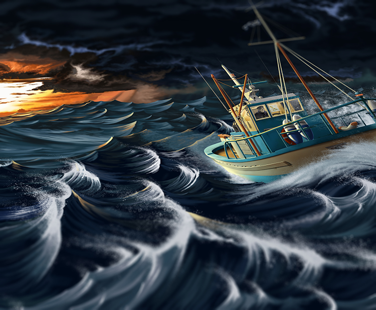
Even though the design of the illustration was intended to be the main focus of the label. There was a call to request a more detailed version, as this could then be employed in necessary advertising aspects of the promotion of the new beer. Therefore, as the image was created, it was set at a high resolution aspect ratio to allow for close element detailing.
This image shows one of those parts; the cabin of the boat. The detail is so extreme that a detailed shipping map of the Tinos area of the Aegean and a full rendering of the Captain was included to make the ship as life like as possible.

As the 3d Warehouse model was not exactly to the requirements of the concept of the boat, certain aspects were changed and others rendered on the fly as the illustration was developed. The client sent an image of a Tinos fishing boat, so a mast was added to give it a more island feel, as well as the obligatory Greek shipping flag.


In the original rough sketch that was approved by the client, an albatross was pictured soaring over the waves. It was suggested by the client that the idea was good, but as albatross do not frequent the Cyclades, then it should be replaced with a seagull.
The process of painting the bird was more complex than thought. Even though a reference image was found to help with the shape and form, there were no real references of bird flying at sunset. So the colouring and shade were all referenced from a single image of a gull sitting on a bay dock, as the sun went down.
The process of painting the bird was more complex than thought. Even though a reference image was found to help with the shape and form, there were no real references of bird flying at sunset. So the colouring and shade were all referenced from a single image of a gull sitting on a bay dock, as the sun went down.


This detail shows the minute detailing added to elements of the illustration during the painting process. The square on the left is a zoom to a small portion of the cabin area.


To add some extra detailing to the label, the initial background colour was sampled from the actual main blue colour in the illustration. To avoid a plain solid colour, and to enhance the sea aspect of the project, a simple repeat pattern of waves was created, in order to give a gentle background behind the text.


A short animated gif showing the process by which the illustration was built up. As you watch, note that many times a new part is implemented maybe some 2-10 layers are added to make the piece work.
As this was a full scene, the decision was made to begin at the back and move forward. Spending some 5 days alone to make the boat work as well as it was needed.


Like most of the projects, this one began it's first day as a a process of developing 'inspiration' and 'mood ' boards. These are vital in the development process, as it enable the brain to start formulating ideas and develop concepts from seeded ideas.
Mood boards and inspiration boards are not actual ideas in development, more they are things that have caught your attention during the research process, that have been visually noted. Here are the boards presented to the client for the Seven Beaufort project.


As part of the development, the client sent through the specifications for the label. They used their original label design as a guide. Mainly as the specifications for the label needed to be the same on the horizontal and vertical dimensions.
That said, as set of new designs for a die-cut label idea were produced, so that there were options to the shaping and form of the illustration.


A selection of Unicode fonts were presented to the client in order they choose an appropriate one. This was narrowed down to serif based fonts, and from that the design chose to use the Parachute Font - PFMonument. There were some modifications made to the font, as can be seen in the final logo design.


The font, although providing the basis of a strong characteristic needed for the logo element of the label, needed some modifications to make it suitable. The number seven on the character sheet proved to have a pretty thin body stem, which didn't tie in with the remaining letters engraved look, so had to be hand modified to look more like the stems of the other letters and allow for the engraved element to fit in as the others. Also, it proved that certain letters had a smaller body size due to their design, and this unbalanced the logo. So these too had to be modified. This consisted in the 'M' having some adjustments made to the right angle element. Finally the 'Φ' in Greek, had to be made out of an adjacent 'O' and the manipulation of an 'I'. That was extended down it's body to make the correct length.


The client selected between concepts two and three. With the final decision down to the art director, the notions of the tradition and scenario of sea and village/island life, it was thought best to go with the concept three approach and giving a virtual traditional frame to the illustration.


Based on concept three design for the label, all the elements were brought together, and the logo was modified to be compatible with the logo design (regarding colour and print effect). The plan was to have the illustration break the invisible verticals left by the virtual frame, so the whole label would appear to be a continuous illustration design.


One of the aspects I consider when designing something is the grid layout of elements in the design. In the case of the label, the grid structure was an important aspect of the need to fit all the required information into a small space. What we see here is the guides placed in illustrator to set those grids into play. Luckily the Greek and English aspects correlated quite well, and the whole design develop a good symmetry.


Sometimes things happen when the product goes to press, and this occured with the label. After receiving the sample prints, there was some issues with the smaller texts on the page.
It was decided that the label elements had to be modified to allow for several factors for readability.
These consisted of; Raising the main logo to allow the enlarging of the under-text. The resizing and recolouring of the barcode, expiry date area and QR Code. It was thought best to maintain the colour scheme (instead of white) so these were created grey. Test for readability, and OK'ed.
Two lines of text were cut, and all text was increased in size. Finally, to allow the panels to accommodate all this, the panels themselves were raised in height, and made to follow the line of the main frame. Overall, the changes are noticeable, but don't distract from the overall affect.


Once the initial research and development was completed, the next stage was to draw up some ideas to show the client. On this project, the element of sea was a crucial factor, and as the client mentioned the story of the triangle on the Cyclades sea, the concepts were narrowed down to the local views of fisherman and boats at sea. To help the client with visualising, and mock-up was put in place, on the label template. These are done very rough usually, to not make unnecessary effort as far as time goes.
The design above was approved by the client, with notes taken regarding the bird and the need to lose the sun, in the sunset. There were some comments made about the boat, but as time was a factor, the design was changed 'on-the-fly', as far as modifications go.


photograph by George Rigoutsos 2014

photograph by Athanasis Papadopoulos 2015


