Design Team:
Lead Designer: Yong Jieyu
Design Principals: Donn Koh, Lee Tze Ming
Design Team: Cheng Siew Ming, Yin Loh
Designed and developed in Jun 2012 - Dec 2012
Launched in Jun 2013
Design Team: Cheng Siew Ming, Yin Loh
Designed and developed in Jun 2012 - Dec 2012
Launched in Jun 2013
Please do not reproduce in any form or post on blogs without the expressed written consent from STUCK.
CHAMPS
Youthful Modernization for Champs Brand Identity, 2012
Branding / Logo / Graphic Design / Icon / Packaging / Brochure

A rebranding of Champs, a water heater brand that targets the lower-end market. Rather to focus on being price competitive, STUCK worked with Champs to identify their target crowd of no-frills, down to earth and usually younger market group. We cleaned up the previous logo and established guidelines for both marketing as well as product application, with a digital brand guide that can be distributed easily across the company.

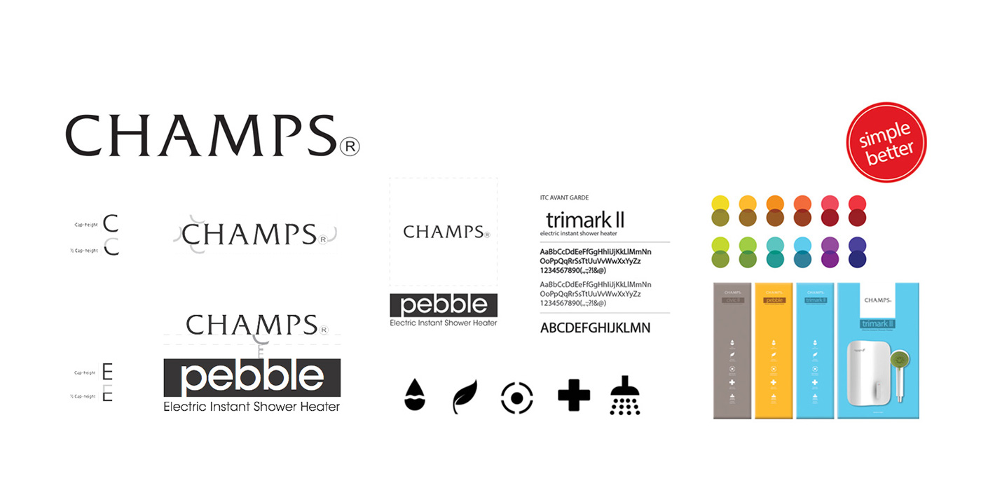
Simple, Better.
Establishing Basic + as the brand's main mission - to create simple, yet better joy, STUCK worked with communicating the meaning across the collateral. A Simple Better sticker was designed to drive the message across but am printed rather than stuck on to reduce cost to the brand.

We created collateral that had concise information that you will need in choosing a heater. The brochures were designed to be stacked and easily compared against the different heater models, making the comparing and selection process easier. The communication focused on thoughtful gestures and clear concise graphics to demonstrate that being simple is a virtue.


As part of the process of designing the actual heater forms, a reinterpretation of product graphics helped to project a more playful and contemporary mood.


Youthful colour blocks are used, with the product image taking centre stage to help communicate that the brand is all about the product and no other fluff.


