Okome_Studio Brand Identity & Logo Design
CLIENT
Taro Sato
RESPONSIBILITIES
Brand Identity & Logo / Business Card Template Design
CREDITS
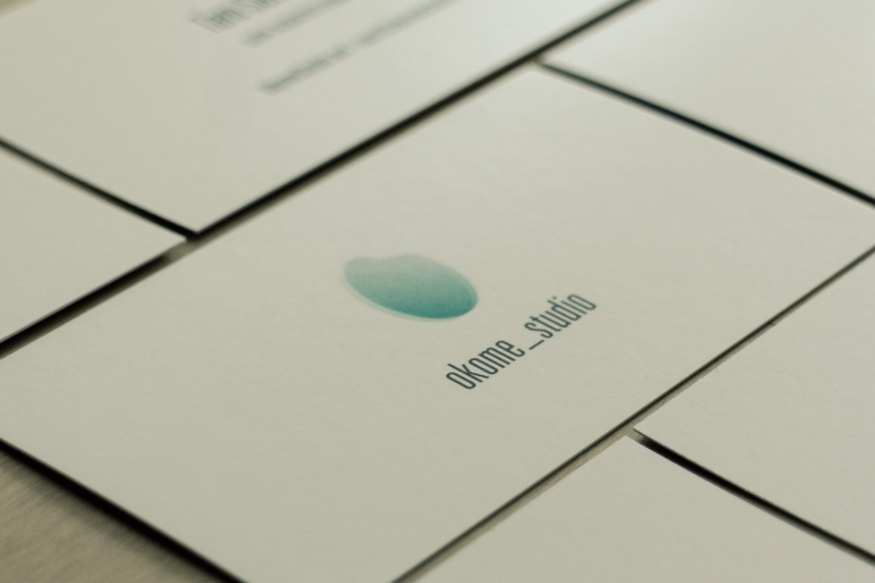
Personal Brand Identity / Logo Design & Print
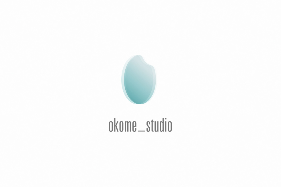
THE MISSION
Okome is a software technology consulting firm. The client wanted a brand identity system that would communicate the firm’s progressive approach to information technology. We guided the design process and distilled the brand essence into the concept of a single grain of rice. This inspired the brand’s logo identity, while a crisp typeface and underscore symbol echo the origins of computer language.
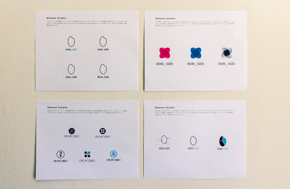
FINAL CONCEPT
OKOME + ARTISTIC + SCIENCE – お米のビジュアルをベースにデーターサイエンスのニュアンスを他のコンセプトと比べより強調。 同業者やターゲットによりメッセージ性の高いものを追求するため、数字、サイエンスなどの要素をお米のビジュアルと融合させたコンセプト。
BRANDMARK
—

TYPOGRAPHY
—
VARIETY
—
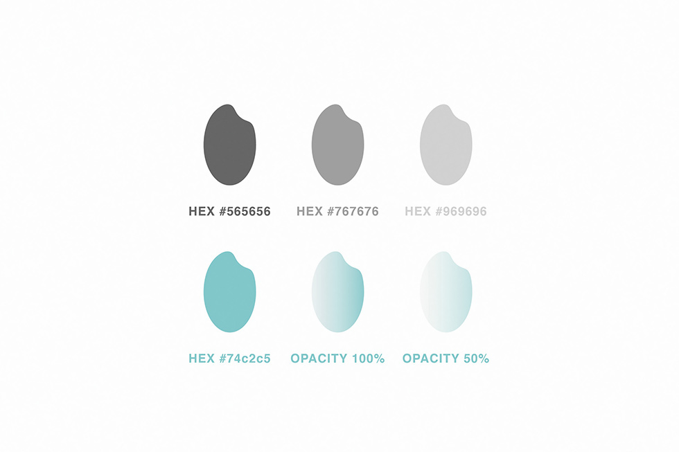
COLOR
—
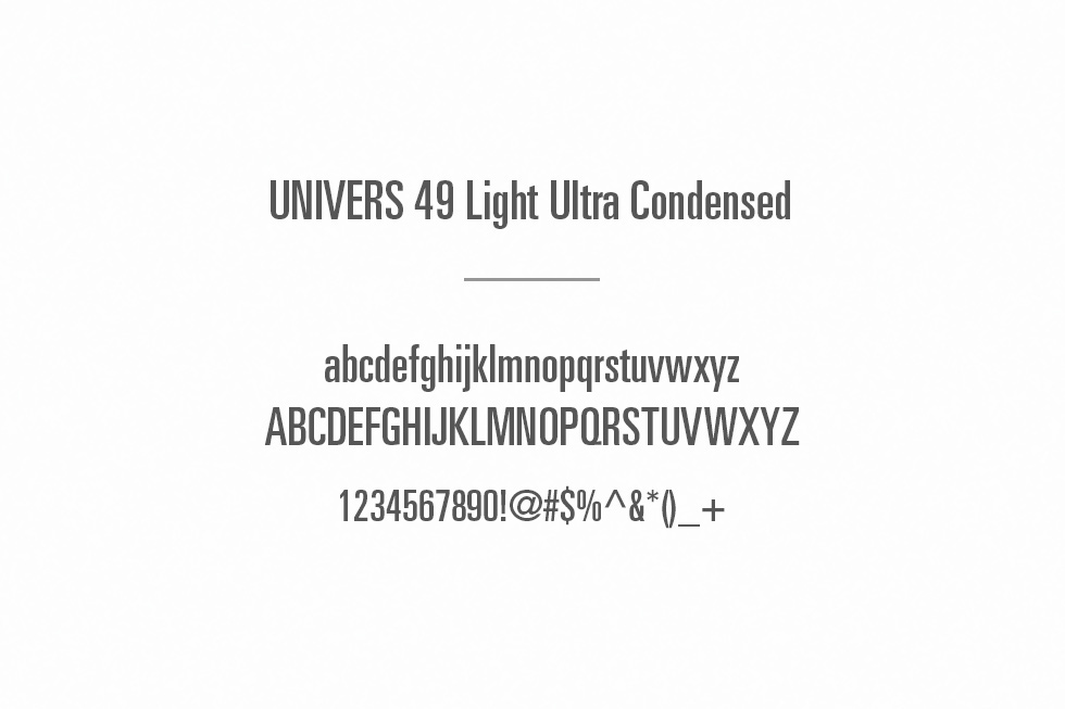
TYPEFACE
—