App Concept & Icon Development
Fitness Link came to me to develop a set of icons that could be used on the Fitness Link wellness app. The goal was to create icons that represented a sense of strength, simplicity and movement.
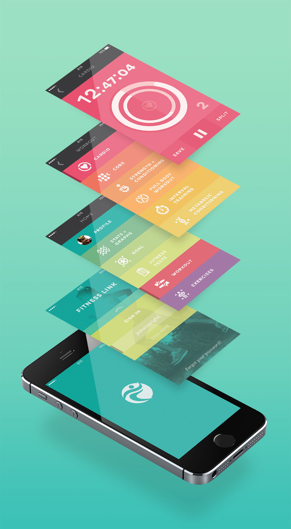
The iOS app concept shown below is just that; a concept. The live app was executed much differently so I decided to give a shot at designing a more simplistic and beautiful interface. The colors represent the different sections and each corresponding app tool is color coded respectively. The brightness of colors is used as a way to activate and excite the user; feelings that would hopefully transfer into the user's actual exercise routine.
Time to get moving.