ALGO FY
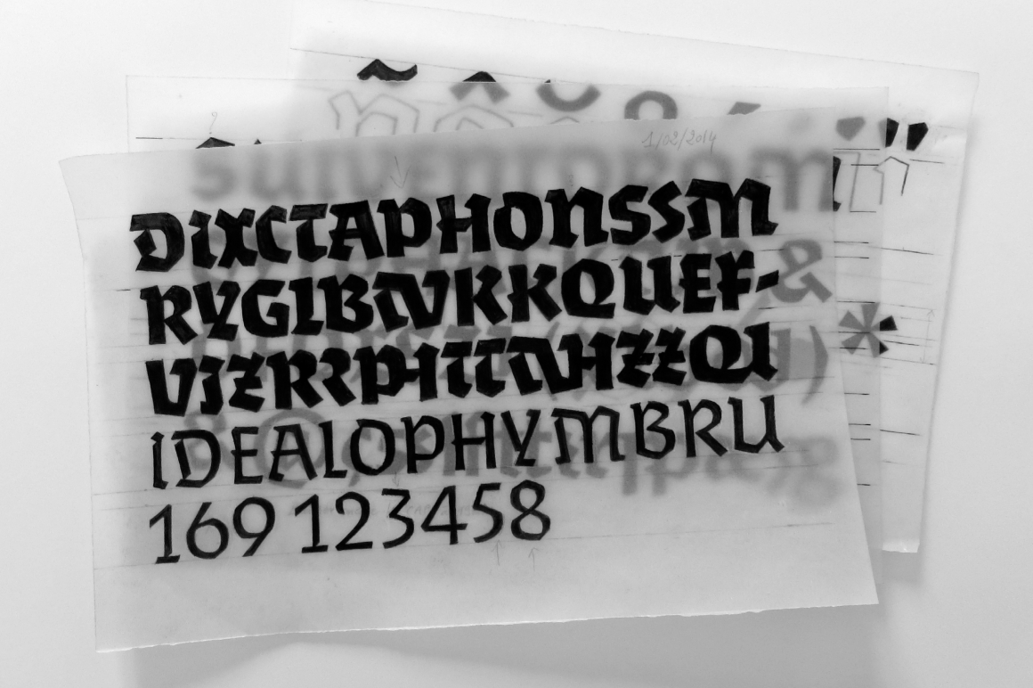
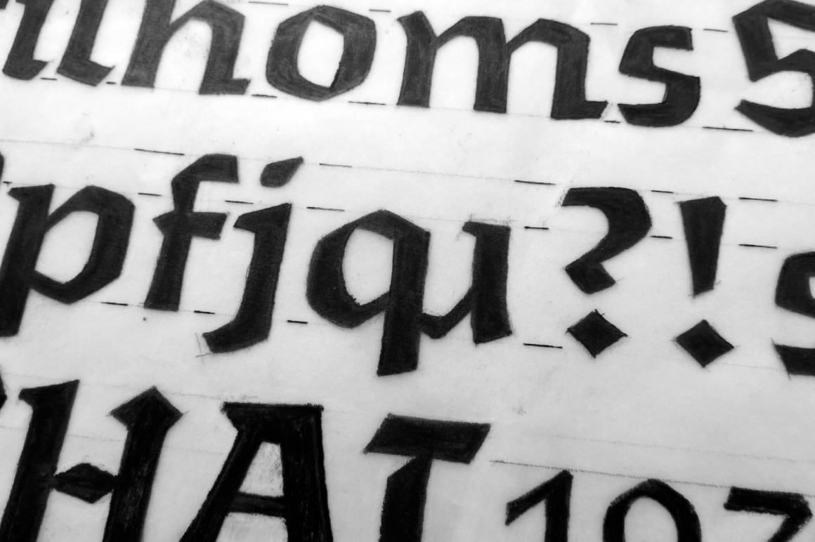
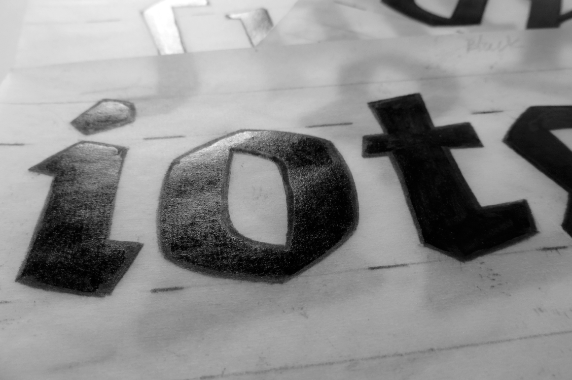
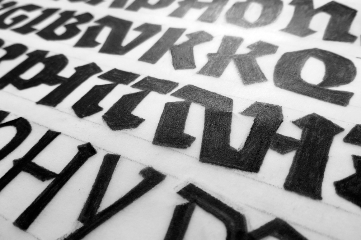
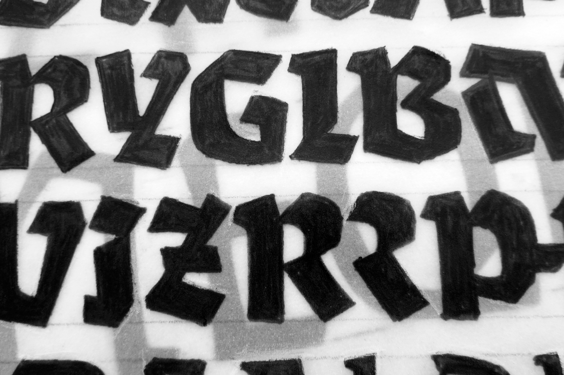
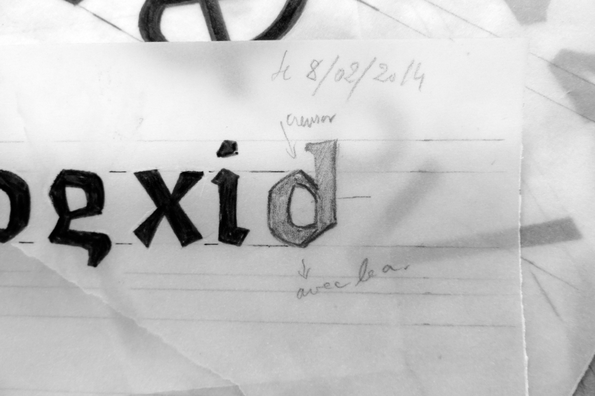
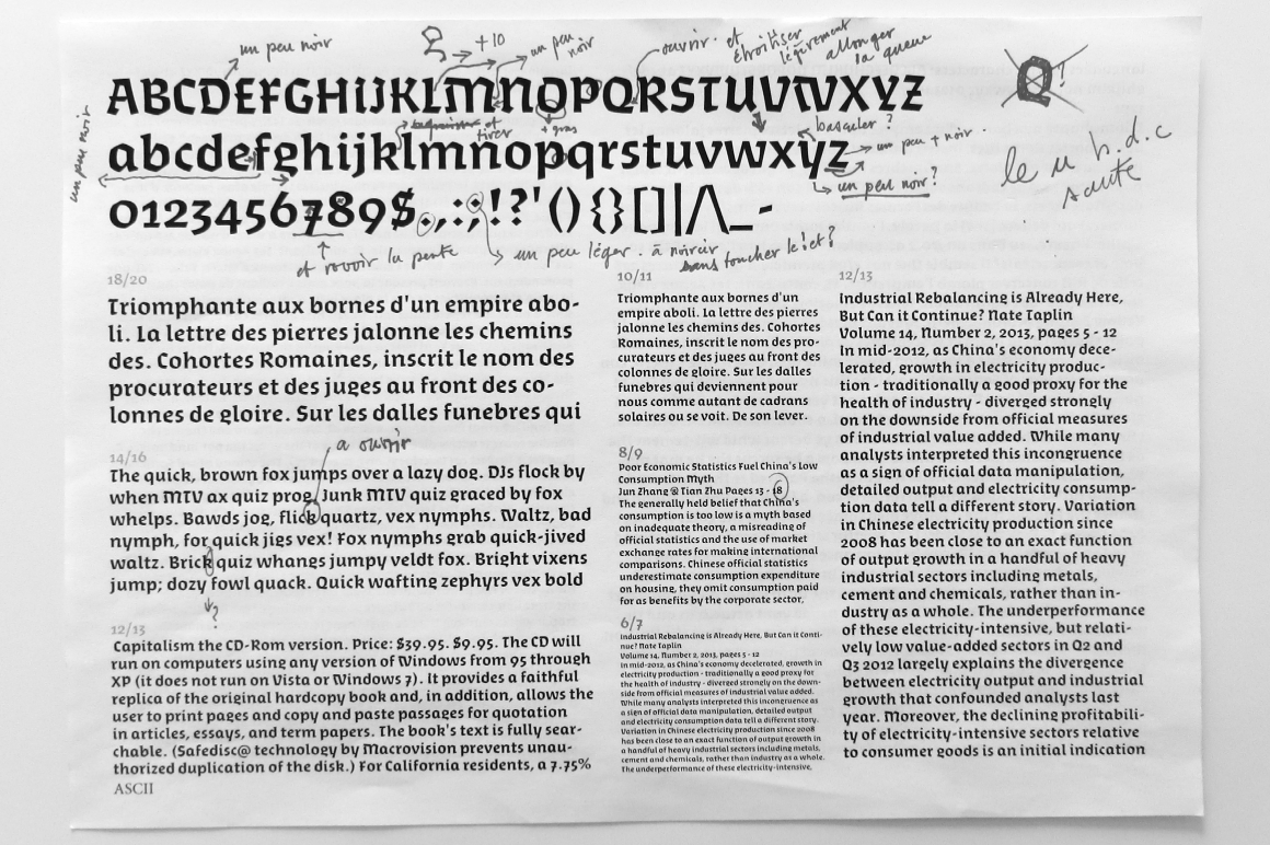
Algo FY is a singular font family with broken ductus and blackletter aspect. Clearly inspired by calligraphic shapes, each of the three weights have been especially designed as if the tool has changed. With its special articulations and its differentiated instrokes and outstrokes, Algo FY is a sculptural, rustic, primitive and dynamic font family. The alternating game between concave and convex shapes gives this typeface a spontaneous and unpredictable style, with a strong personality.
—
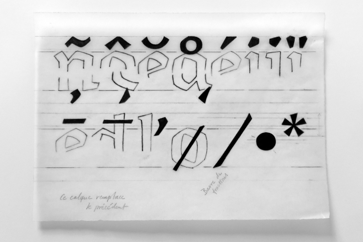
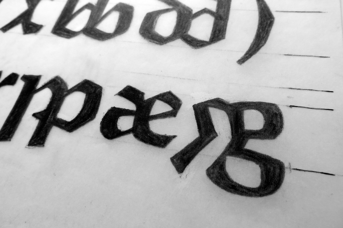
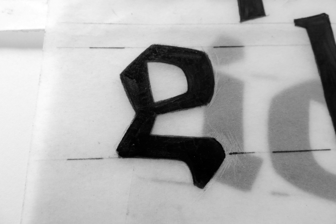
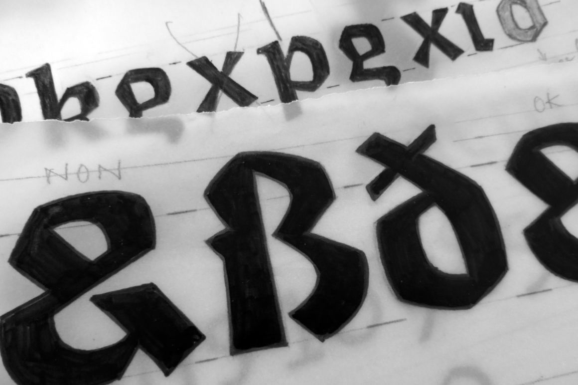
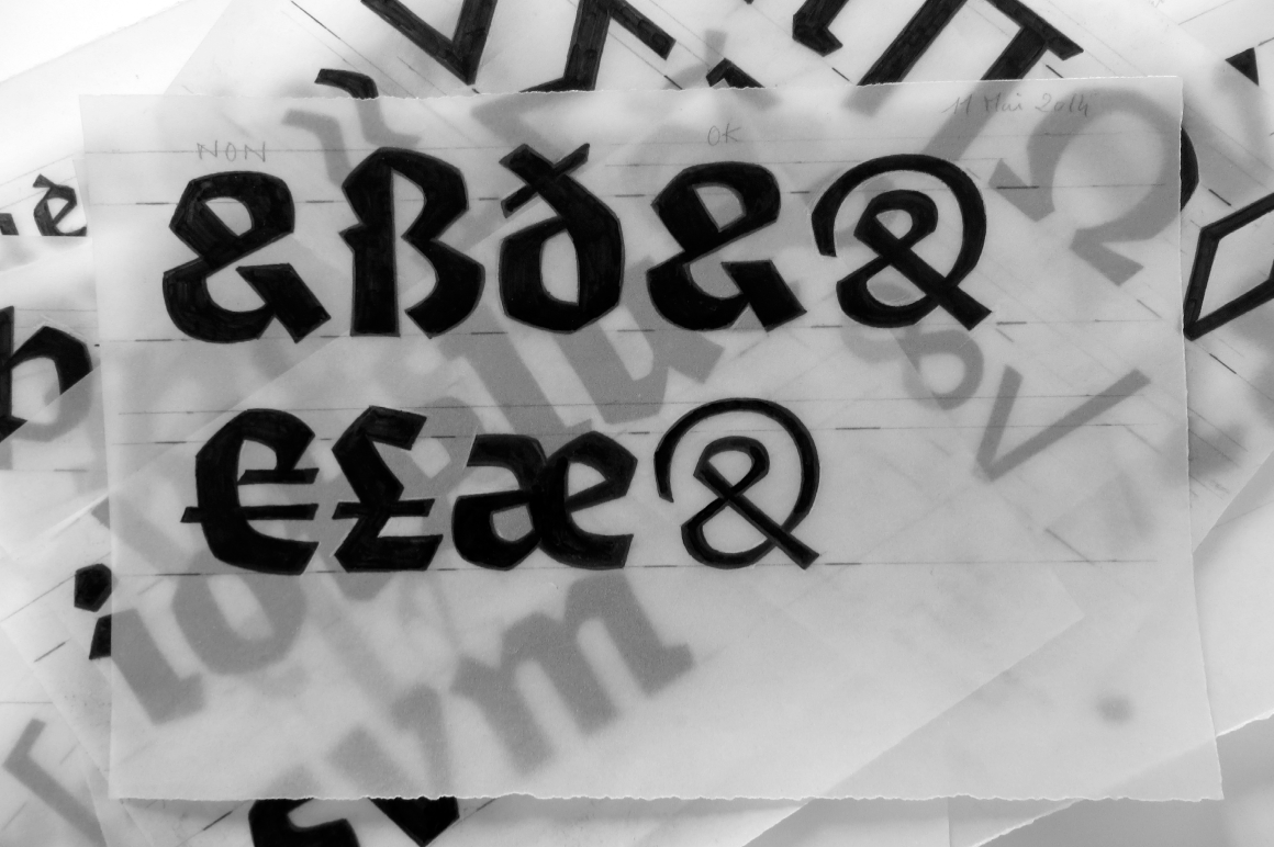
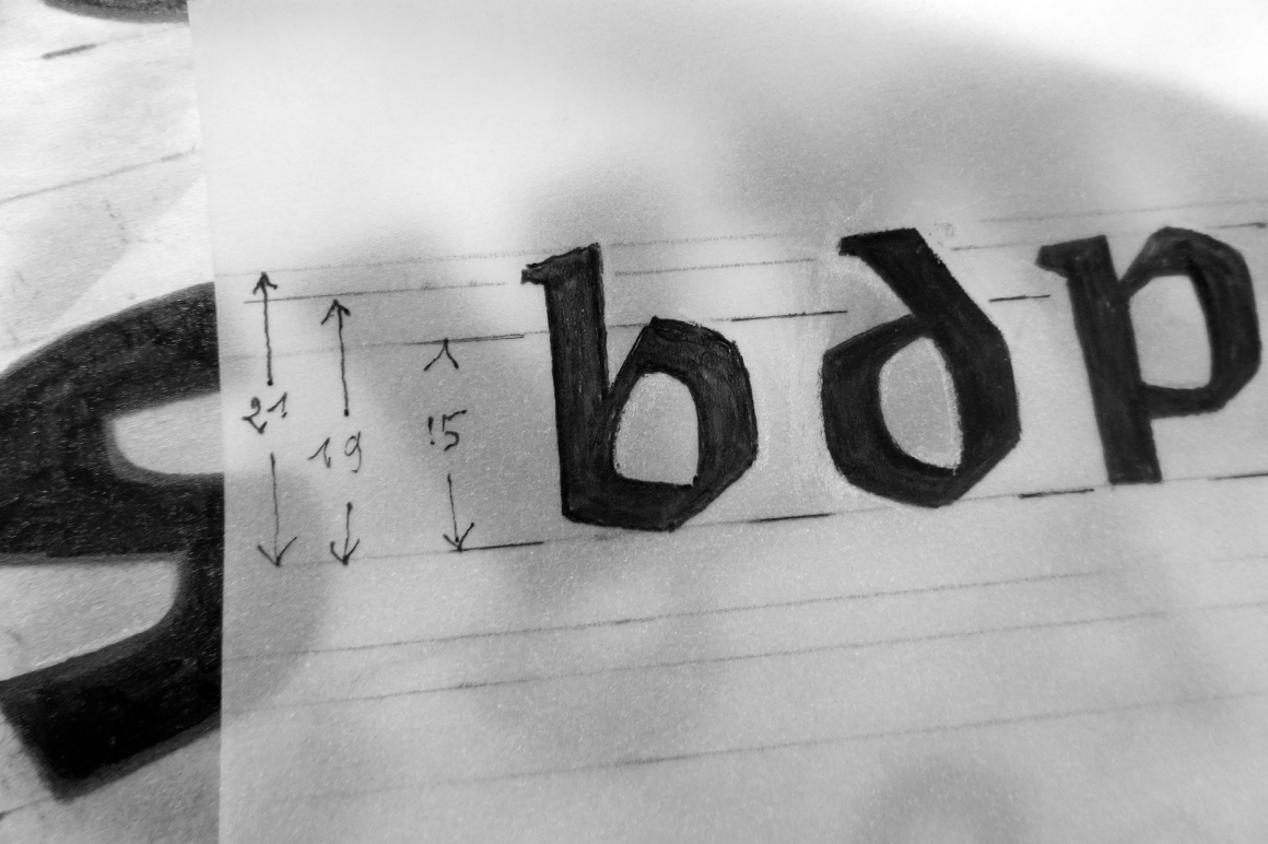
Each weight shows finest details on each part of the letters. If there exist letters which are even more notable than others, you should have a look on the g with its short final curve or to the Black Q with its beautiful junction of its main part and its tail. Also the dots from i and j are different.
Light and Regular are for text setting, while the Black style should be used for titling and headlines. Algo FY will fit with every project you want to give a strong and singular personality.
About Michel Derre
Typographer, graphic designer and letterer at the begining of his carreer, Michel Derre practices and teaches calligraphy since the eighties.
After six months of tenacious collaborative work, we are proud to release his first font family!
Algo FY was co-created by Michel Derre & Fontyou Team on co-create.fontyou.com, the first collaborative type foundry.