


convenient solutions
in architectural space
in architectural space
An architectural office that was established as a result of a common passion for architecture, run by the Błażkos - Agnieszka and Andrzej - hence the abbreviation AA. They focused on strong values that guide their design, i.e. on convenient solutions in space, to be functional and aesthetic, and on the compatibility of buildings with the surroundings - the natural and sometimes the historical. The decision to rebrand resulted from the need to take care of the company's visual image.

challenge
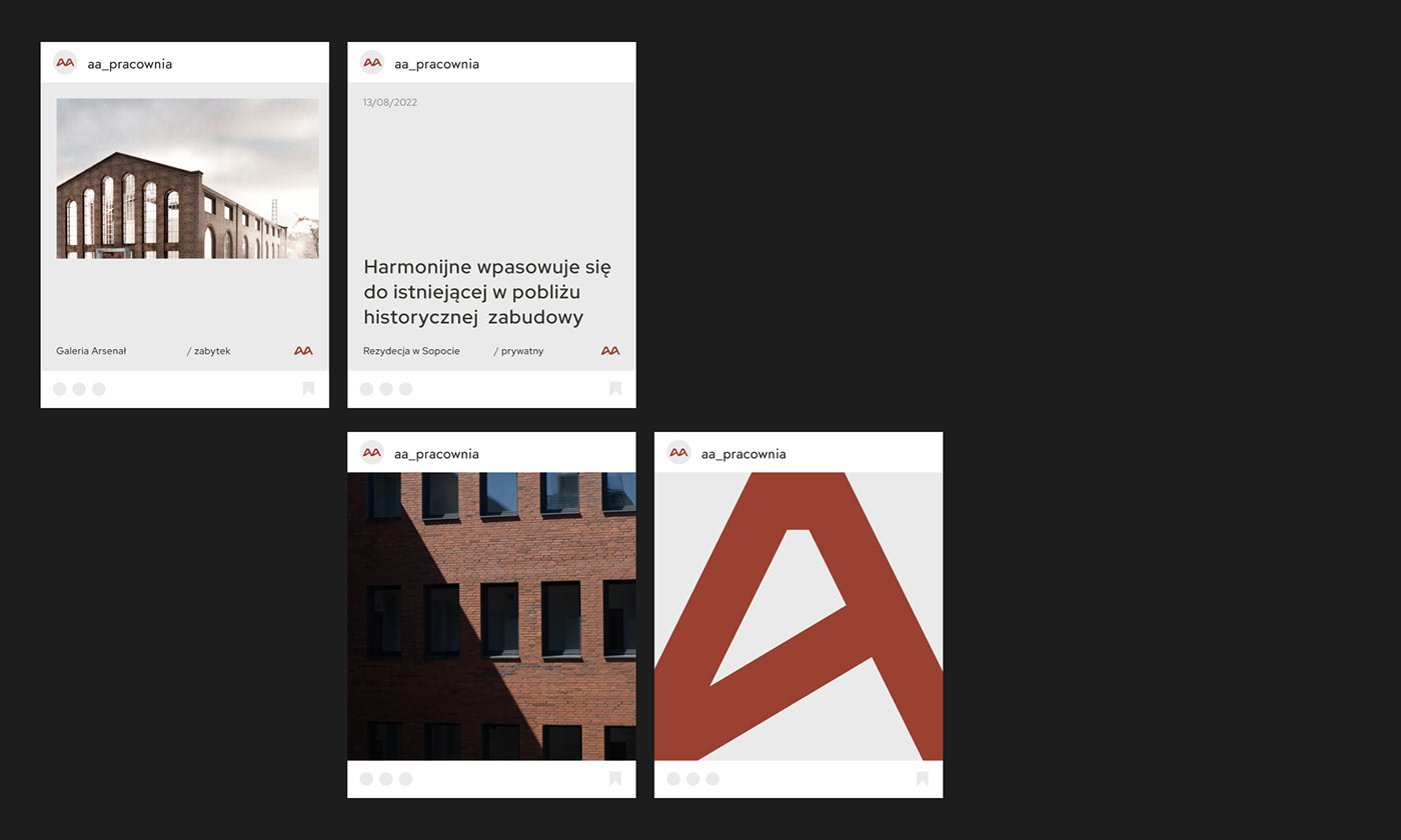
The need to create a new visual version of the studio was to present the website in the architectural world and additionally to make it easier for potential private clients to find the studio on the Internet. The web portfolio itself was supposed to be transparent, but also to comprehensively describe selected buildings if the recipient wanted to know architectural details. The studio creates a large number of publications and collects many entries about the buildings it designs, so there was also a need to present news related to the studio's activities and a list of publications. From the outside, the studio wanted not only to focus on a professional image, but also to present itself as people interested in architecture out of passion and to present basic building materials, because their selection is very important in the message of the buildings themselves.
& solution
We focused on simple and strong solutions in the logo design and website transparency, which emphasizes visualizations and implementations. The shape of the signet and the selection of colors result from the designs appearing in the studio's portfolio. Here we have projects dominated by brick or red roof tiles and gray facades. The forms of the buildings are very angular, but they have their own characteristic style, which we wanted to include in the sign. The brick color used does not dominate, it only defines the company's image and allows for wider use in materials where there is a need to use color and remember the image as a coherent brand - just like in the studio's designs. A large amount of light allows you to take a closer look at the presented architectural designs and easily read information about them, without being distracted by additional elements.


|
|
project menagment —— marta wołejko
art direction & design —— konrad roche
development —— koncept 404
client —— pracownia architektoniczna AA

|
|


