

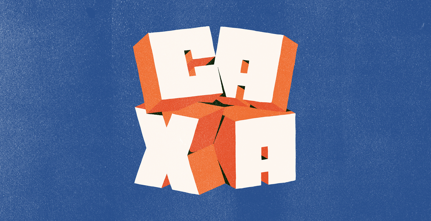
The very name says it all: Caxa Display is a display font with quite questionable legibility, composed of both lowercase and uppercase, with some properties that help the letters fit together.
The general idea was to showcase in a project one of the things that guide the creative thinking of the studio: the versatility to adapt. It fits in and fills the spaces, giving weight and presence to layouts. All vowels have ligatures that are extended versions of the letters. We were inspired by sharp, hard shapes, almost as if the letters had been carved into wood to become a woodcut.
But despite the artisanal and vernacular inspirations, Caxa Display is a digital creation that emerged from a long process of maturation. It is part of the graphic identity that the studio has been building in recent years, mixing elements that are part of our lives with hints and references to Latin American culture.
This aesthetic began to be explored in other projects we have already developed, and gradually matured until the first letters appeared, in our logo, and then became a complete alphabet. Caxa Display was created by designers and illustrators who are not exactly typographers, but who made a great effort to realize this project and make it minimally functional. There was a lot of idea exchange and experimentation - and hours of conversation and shared fun along the way of this endeavor carried out by many hands.
The result is now out in the world. You can download Caxa Display through the link:
https://drive.google.com/open?id=1nWThCgx0G5KQcDLyOJi7SjuG2-vgPyyQ&usp=drive_fs
It was created with the intention of being free, today and always. It's our way of adding a touch of Latin American flavor to other layouts out there.
https://drive.google.com/open?id=1nWThCgx0G5KQcDLyOJi7SjuG2-vgPyyQ&usp=drive_fs
It was created with the intention of being free, today and always. It's our way of adding a touch of Latin American flavor to other layouts out there.


Designers:
João Maiolini
Renato Brito Mamede
Vitor Brito Pereira
João Maiolini
Renato Brito Mamede
Vitor Brito Pereira
Produção:
Márcio J. Freitas
Ilustrações do projeto:
Laura Nunes, Renato Brito Mamede e Vitor Brito Pereira.
Márcio J. Freitas
Ilustrações do projeto:
Laura Nunes, Renato Brito Mamede e Vitor Brito Pereira.


