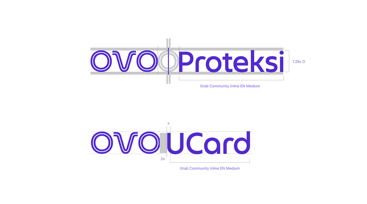


Grab and OVO have seamlessly come together in a full integration. To mark this collaborative journey, we’re embarking on a brand identity refresh that not only aligns with Grab’s brand philosophy and character but also preserves OVO’s robust equity. This transformation is a source of pride, representing the long-awaited unification with Grab and symbolizing the brand’s evolution toward the future. The redesigned OVO logo draws inspiration from Grab’s current logo, embodying fluidity and rounded aesthetics. To emphasize OVO’s integration into the Grab family, we’ve incorporated Grab’s iconic Freedom Lines. The additional terminals on the letter “V” serve as connectors, symbolizing OVO’s role as an intermediary guiding users towards diverse possibilities. Beyond the logo, our visionary approach extends to a new architectural system for logo configurations. Adapting elements from Grab’s visual identity, we’ve reimagined color treatments, layouts, iconography, font usage, and photo tonality. The result is a seamless blend that maintains the essence of both brands in this joined venture.
Team:
Rege Indrastudianto, Priska Asriani, Mahdi Albart, Rival Ronaldi, Buda Patrayasa, Naufal Aflah, Daffa Okta, Ratna Yuriasari, Dina Ardelina


