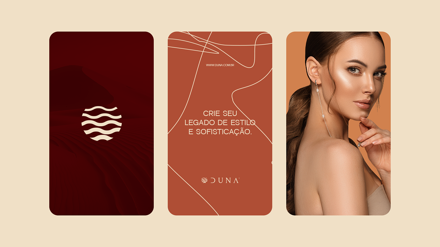
Create your legacy of style and sophistication.
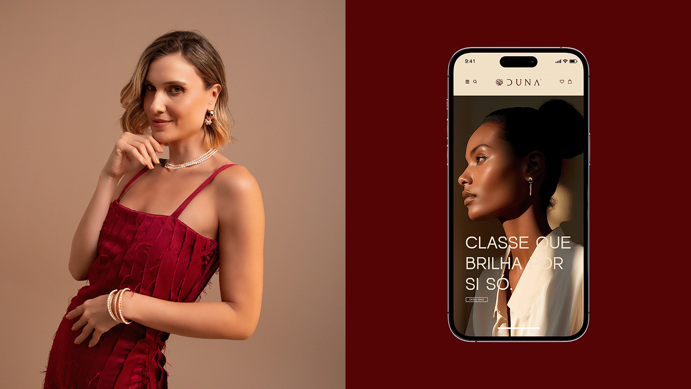
Duna is a company specialized in jewelry, located in the city of Fortaleza, in the state of Ceará, Brazil. Standing out for its dedication to excellence and its commitment to quality, the brand focuses its efforts on captivating a carefully selected clientele. Its proposal is to delight consumers through the sophistication intrinsic to the products it develops and sells.

Concept
Duna transcends the mere definition of a tourist attraction, a stunning landscape or a natural wonder. Duna represents a lifestyle marked by unparalleled exclusivity and power.
The brand strives to provide its customers with an experience of sophistication and exclusivity through a careful selection of jewelry.
In this sense, the essence of the visual identity seeks to communicate this message with clarity and impact, giving the brand significant added value.

Logotype
The concept behind the Duna brand logo was meticulously developed to capture the brand's distinct essence and personality, aiming to convey its message effectively.
The symbol consists of the fusion of two emblematic elements of the state of Ceará: the sun and the sand. The representation of waves on the dunes, combined with a circular symbol that evokes the sun, emphasizes the exclusivity that the brand's customers can expect when associating with it.
As for the typography, it was selected to reflect a minimalist and modern style, while remaining classic and contemporary. I chose to incorporate hollow elements in some letters, in order to improve the minimalism of the project as a whole.

Visual Identify
The colors chosen for the brand's visual identity convey warmth, connection with nature and reflect the different shades of the dunes, establishing an intrinsic connection with the project.
The selected typography plays a fundamental role in the entire brand identity. Its modernity and applicability guarantee exceptional effectiveness, facilitating both the application and reading of the brand in different contexts.
The supporting graphics adopted by the brand are completely in line with its principles and objectives. Inspired by the shapes of dunes, these elements not only present a design that recalls natural landscapes, but are also skillfully integrated into each application, reinforcing the brand's identity in a cohesive and engaging way.