


GOAL
To raise awareness of Cutty Sark whisky to the youth market (25-35)
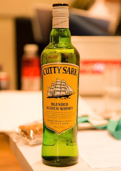
Cutty sark was an old wooden ship used for transporting goods. In its prime it was known as the fastest ship of its kind.
The client stressed how they wanted to the sprit of adventure to run through the promotion, we thought about what the word adventure means in a modern context.
We concluded that adventure today is about fresh inventive ideas and the sprit of spontaneous creativity, a characteristic we felt the target audience would identify with.
The youth of today want to make things their own, to customise and show individuality. To showcase there personal skills and to be generally creative.
Our aim was to capture and embrace the adventurous nature of the youth.
Research
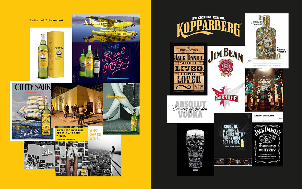
We looked at what the brand had done in the past, so we had a good idea of what NOT to do. We then looked at the brands main competitors, trends in the market and some really nice examples of successful marketing.

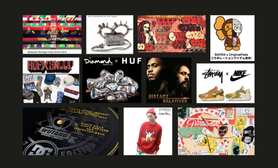
We also looked into our target, Millennials. The generation that the entire team identify with. The core themes we identified relating to the target were- photo sharing, social media, parties, underground events, art scene, street culture and individuality. We questioned how we could apply these values to the product.

Concept
Cutty Sark is made for mixing. Which led us to ask what else could be mixed?
At this point we became obsessed with the idea of ‘Collaboration.’ The idea that creatives from various disciplines could somehow put there skills together to discover unknown territory. Forced to innovate to create unique and unexpected experimental outcomes.
We really liked the idea of mixing things together to make something new, similar to how drinks are mixed.
Collaboration is a big part of Millennial Culture. Many brands have experimented with this, in fashion, music, art and advertising. It is a fresh and exiting trend that we felt would make the brand much more accessible with target audience.

Which led us to our concept. Mash Up. This is the idea that things can be combined in unusual and unexplored ways to produce new and interesting content.
Logo

First thing we did was modernise the logo. We wanted to retain the feel of the old logo, so it was a case of slightly simplifying the design. This retains brand recognition whilst giving it a more sleek and elegant look. A definite improvement.
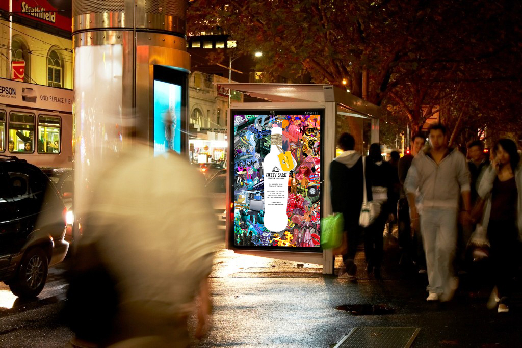
Initial Advertising

The first line of posters we did simply advertise the brand. We didn’t want to be to obvious here, our aim was to make the target question the ad, rather than write it off as just another advert

So we used an arty collage feeling. This style would influence the entire stylistic approach of the project.

We wanted them to look like art pieces rather than conventional advertisements. The components of an ad are there, but dissected and re assembled.

The adverts contained a link to the website. Our hope is that the target will be intrigued by the deconstructed nature of the advert, enough to check out the website.
Web Presence
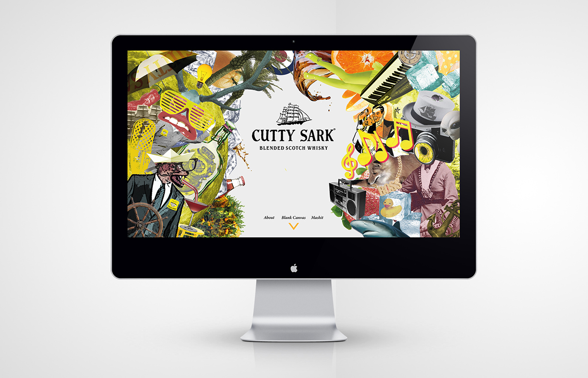
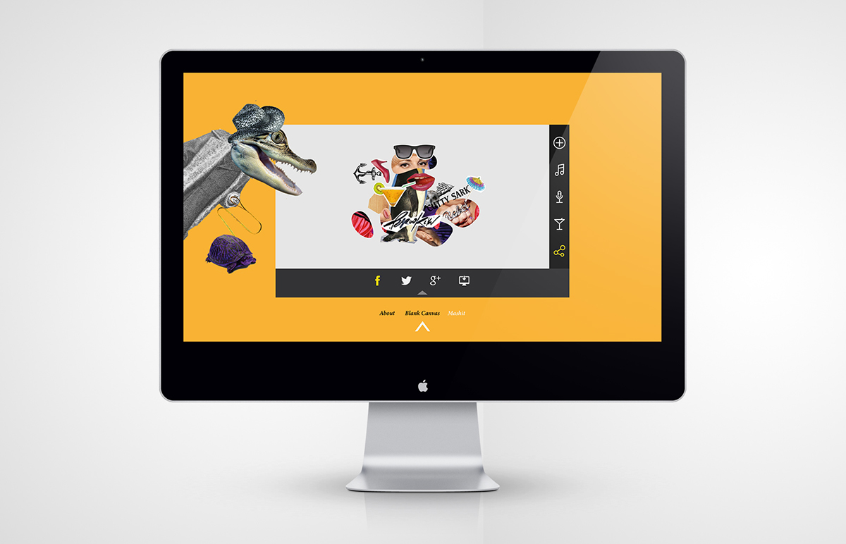
We built a website to promote the brand. We designed it to simply be a fun little thing for the target to play with, the end result being a positive impression of the brand.
It is a place where the Target is given an opportunity; to create something, very easily and quickly. Tapping into the artistic zeitgeist of the millennial generation.
It is a space for people to share their creativity- drink mixtures, re designs of the bottle and create a little personal audio GIF. To share via social media.
On broad terms, a place to showcase the mindset and lifestyle of the brand.
landing page
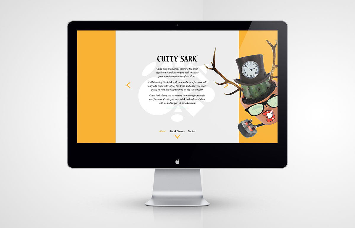
description of the brand

Mixture Libary. Users can share the mixes they have discovered here

Yes, you can purchase the product straight from this website.

Mashit. This is the web app we designed. It allows users to make a fun little soundgif that can be shared across multuple channels. We ensure the creation process would be super simple and actually require minimum effort.

Users sign in via facebook. The app chooses various images of the user which they can use as raw elements to make a moving collage from.

The app cuts up these images using image recognising technology. It chooses the most interesting elements from the images the user chose. Streamlining the process allowing the user to just play around and have fun, without being too precious about it.
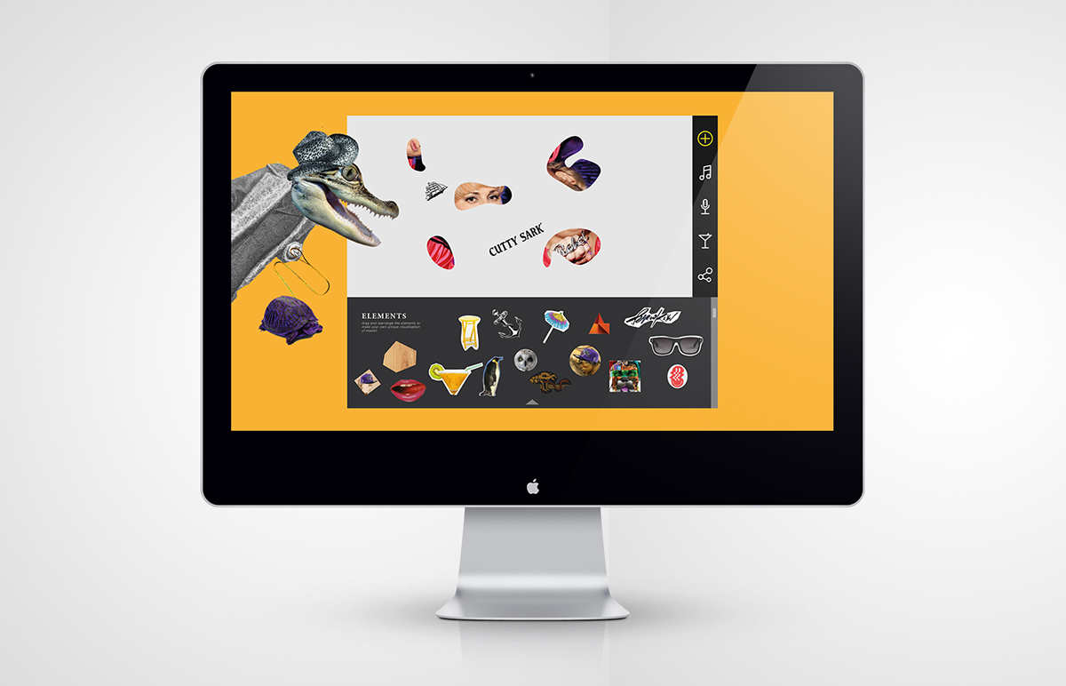
The user can add stickers from a libary of diverse and random imagery.

Using a simple beat machine they can add audio. Sound effects, musical notes. The favorite sounds can be mapped to a soundboard that they can customise.
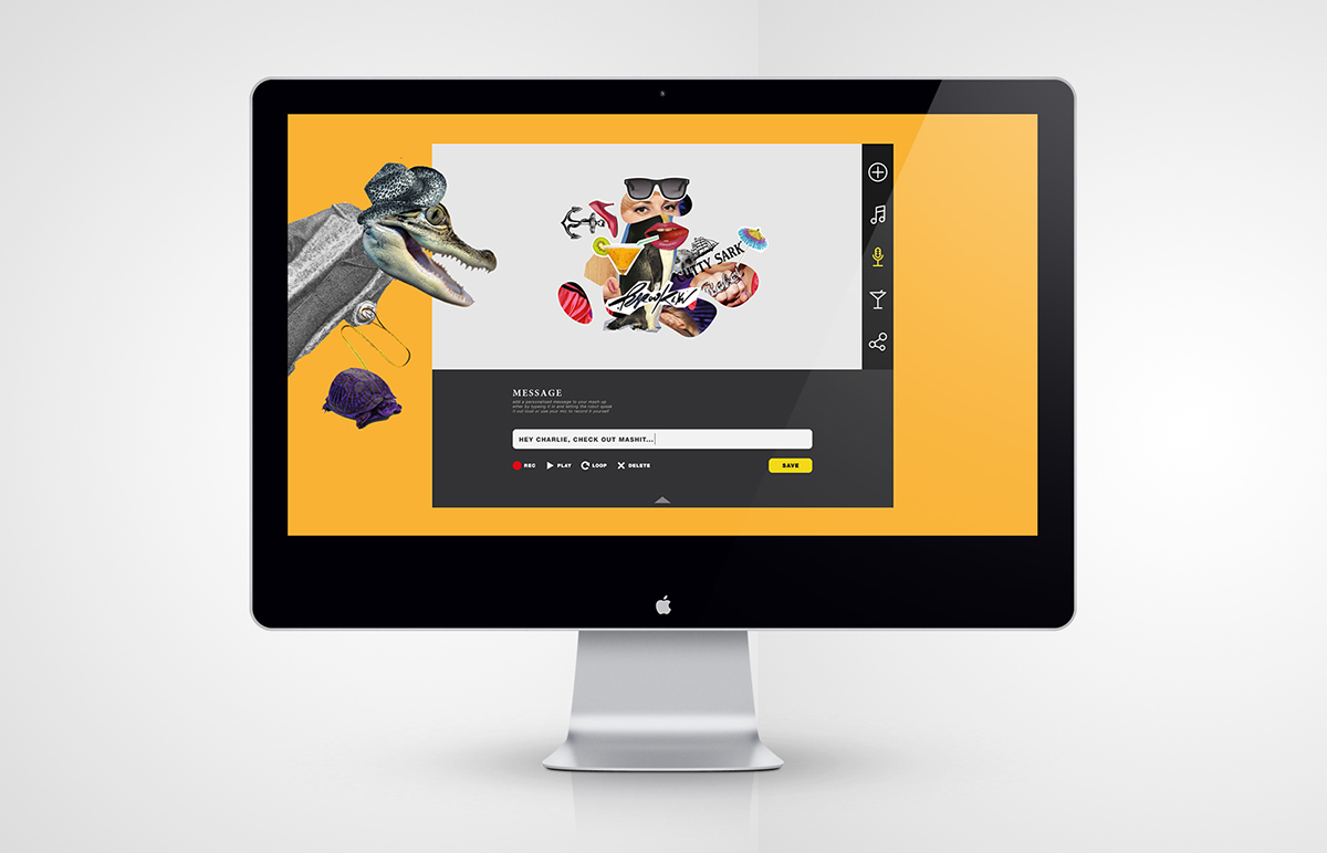
They can record a voice message or text message to accompany/explain there creation.
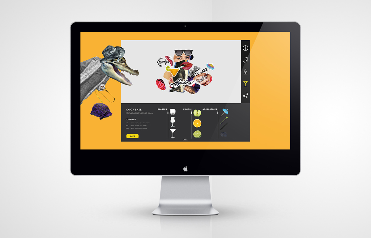
Then the user can design there perfect cocktail. This information is saved as date to determine the tastes of the Target audience, potentially useful data for the company.
Finally they can choose how to share their creation. Facebook, Twitter and Google Plus. We believe they will want to share this as- it is a personal creation and doesn’t feel like an advert at all. (Even though secretly it is)
The app also works on mobile devices.

The app also can generate a cocktail dictated by the elements they choose when creating the audioGif. Perfect for indecisive types!


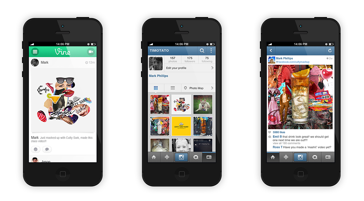
This is an example of what the user may produce.
Launch event
We felt a big old bash to introduce the renewed brand was in order. Looking at the interests of the Target, specifically the underground party/ art scene, we wanted to emulate that type of event.
We wanted to do something more inventive than ‘2 for 1 night’, something that is true to the concept of collaboration.
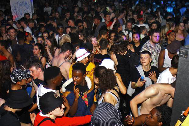
We envisioned the event as an underground art event that celebrates the concept of collaboration.
We decided that 20 talented artists/musicians/creatives would come together to create interesting new material. A live art performance event that encompasses the raw energy of experimental creations. We would combine a graffiti artist with a DJ. A rock band with a video artist ect.
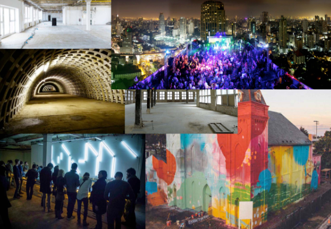
Examples of locations. Underground , counter culture venues. Untraditional and interesting locations to make this a night to remember, and add to the underground asthetic.
Basically a travelling gallery that exhibits the best and brightest creative Millennials. All creating new content, all adventuring into unknown territory.
10 events across 10 countries we felt would be enough to imprint the brand into the consciousness of underground culture.

We contacted 20 artists we were interested in working with, within a two days we already had 3 interested artists! Combined these three artists have a following of 22,000.
These artists would act as ambassadors for the brand. Sharing there journey with there online followers, basically singing the praise of this company that is helping them get exposure, leaving a positive impression of this brand.
This way the brand doesn’t have to be too pushy. They will be promoted in a word of mouth manner that feels more genuine. Authenticity is something that the target are searching for.
A good brand that nourishes creativity in a way other companies fail to.
Product Design
The existing bottle design had been constant for decades. We were willing to distrupt this.
Staying true to our beliefs on creativity, customisation and collaboration, we thought it would be fitting for the bottle to be a blank canvas, allowing the consumer to design her own bottle, which could be shared online and displayed on our web app.
The blank canvas bottle would be sent to all our involved artists, we hope they share there creations, in doing so inspiring there followers to follow suit- leading to a trend of bottle designing to start. Bringing more customers.
We also thought it looked very stark and minimal. The bold design of this bottle will stand out in contrast to its competitors who go daft trying to catch the eye of potential consumers.
The most popular/inventive bottle designs would have the potential to be used as future retail packaging.

The bottle has a sleek matt finish, a rope holding a label in place. The label contains instructions how to design the bottle and a sample mixer the consumer can try.


These posters work well in sequence. Simply adverts for the retail edition of the bottle.
Future suggestions to carry on the brand


Thanks for scrolling through!


