

Color journey
This project was created for a Mexican swimwear brand called “Bari Swimwear” that sought to develop personalized illustrations of world landscapes that are related to water. The main objective was that, in addition to differentiating each illustration through the chosen landscapes, a color contrast between the designs should also be emphasized to provide diversity to the collection. The techniques used in the illustration process are purely digital, and combine watercolor, crayons and fine pencils.
Este proyecto fue creado para una marca Mexicana de tajes de baño llamada “Bari Swimwear” que buscaba desarrollar ilustraciones personalizadas de paisajes del mundo que estén relacionados con el agua. El objetivo principal fue que, además de diferenciar cada ilustración por medio de los paisajes escogidos, también se debía enfatizar un contraste de color entre los diseños para otorgar diversidad a la colección. Las técnicas utilizadas en el proceso de ilustración son meramente digitales, y combinan el “watercolor”, “crayolas” y “lápices finos”.

Refreshing forest
Considering the trend of new age combined with the mystical, I made a visually refreshing illustration. The blue and green tones, the leaves flying with the wind, the waterfall as background elements and the wet stones allow you to receive a sensation of pleasant cold.
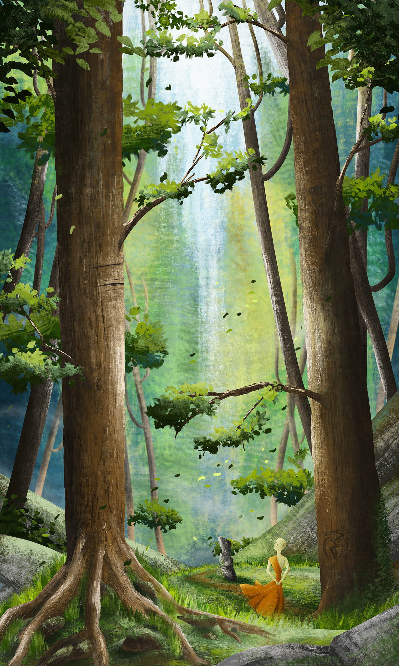
In these close ups you can better appreciate the brush strokes used that combine the crayon technique with vector silhouettes with structured and precise cuts.


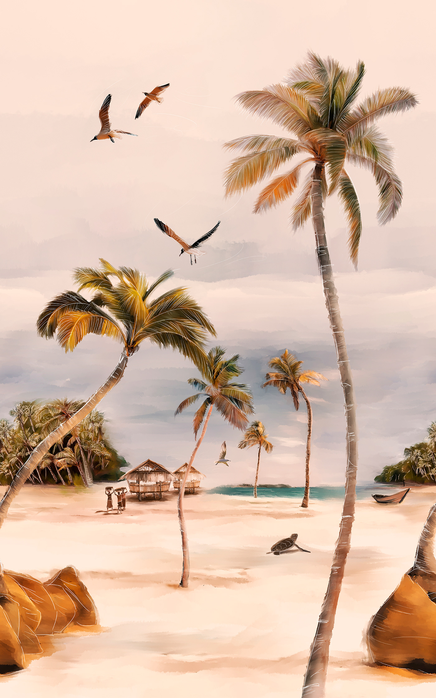
Pink mangrove
In this illustration I tried to create a quiet, pleasant environment that takes us to the peace that a good vacation can offer. As the concept of "mangrove" can have a more gloomy perception, soft and bright tones were applied, and moving elements were incorporated to counteract the aforementioned concept.

In the following close ups you will be able to see the combination of techniques such as "crayons" with some touches of "watercolors". As in the previous illustration, vector geometric shapes were used with defined strokes and cuts.


Tropical beach
This illustration was created with the aim of producing “warmth” when observing it. For this reason, warm tones were used applied in a beautiful tropical, rustic and virgin landscape.
Here you can see the combination of watercolors, a touch of oil paint, and white pencil strokes to define the elements.


Miami vibes
A silent and nostalgic sunset accompanies the end of a great day at the beach. The illustration with an air of Miami in the 80s, purple and red tones connects us with the gratifying pleasure of ending a fun day at the beach.
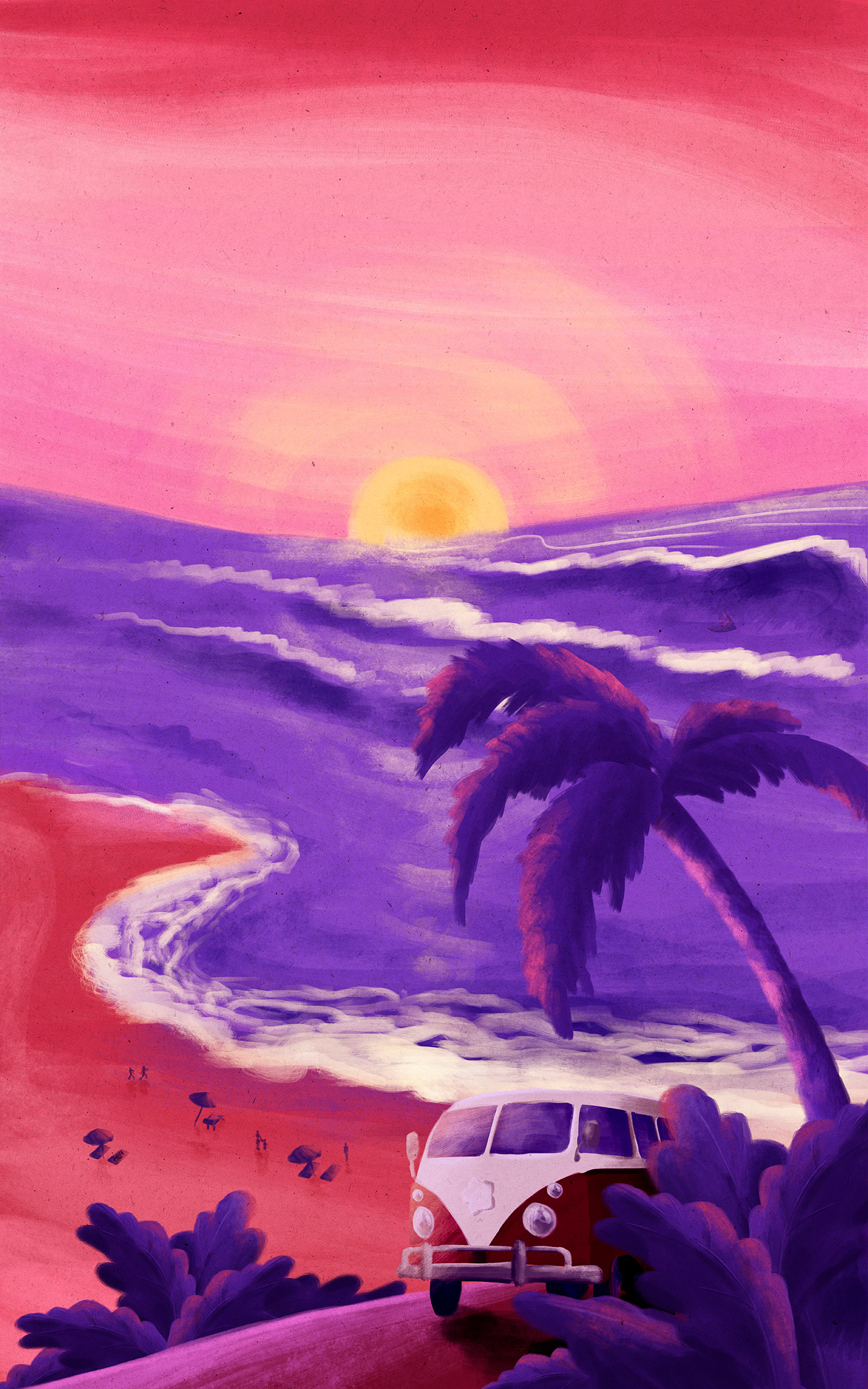
A closer look at the details of the illustration shows the combination of Crayola and watercolor techniques, with some fine pencil strokes. The tones used give warmth but at the same time connect us with the coming of the night (The colors differentiate this scenario with the illustration of "Tropical Beach").


Thanks!


