
We’re empowering more people to experience specialty coffee and support the coffee community.
As is a critical link between roasters and coffee drinkers, we feel a responsibility to grow the market for better coffee. To that end, we’re committed to bolstering small and mid-sized independent roasters, creating more accessibility to quality coffee.
Role
As a member of the Anatta team, I worked on this CRO and rebrand + replatform project. Together with the researcher, coders, and art director, I worked as the interaction designer.
Goals
Our main goals were to improve the website's overall look and feel, performance, and conversion rate while adhering to their new brand guidelines and industry best practices.
Approach
The project strategy was planned out after the Anatta and Trade leadership teams participated in an introductory workshop. This project was not like the others, where we typically begin by focusing on low-hanging fruit through a heuristic audit. We had to migrate this one from a headless website to Shopify, adjust to their new branding, and use all the best practices we had learned thus far. To reduce customer churn rate and increase retention, we also had to update their subscription portal to make it more accessible and intuitive.
At first, this project was challenging because we had a lot on our plates and a short deadline. Initially, it was also challenging for us to fully align with the Trade stakeholders' vision. To fully grasp Trade's new brand and vision, we decided to start with the homepage.
NOTE: I do not have access to the original files and documents; hence, I’m using screenshots of the updated site and https://archive.org/web/ to fetch screenshots of the old site. I’m sharing a few highlights of the project.
Also, we always take a mobile-first approach to fixing the design on the smallest and most used screen, but here I’m sharing desktop res images for better understanding. Feel free to browse drinktrade.com to view various breakpoints (mobile & tab).
Homepage
Old Page
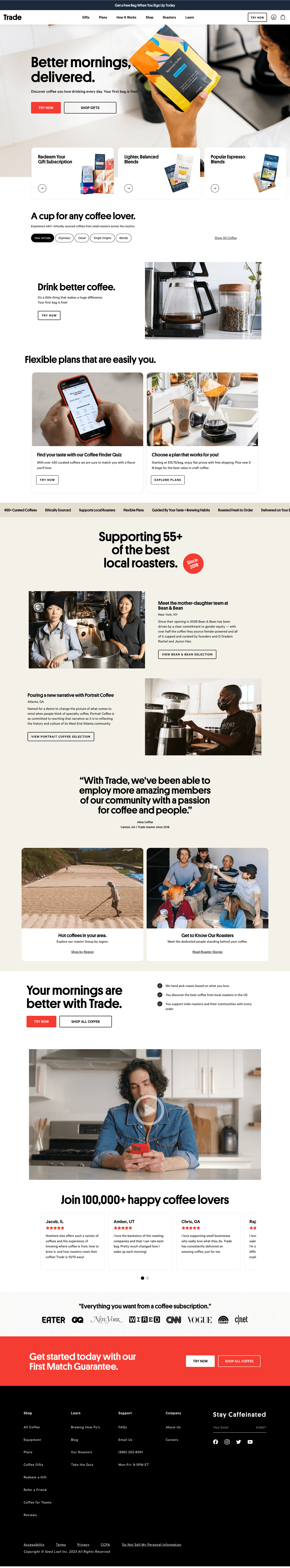
We met with the Trade team's product manager to gain a thorough understanding of the brand's USP and value propositions. We believe that the primary message (narrative) from the homepage (as well as the rest of the website) is that Trade's coffee is freshly roasted, sourced from local indie roasters, specially curated just for you, and delivered straight to your door. Since Trade was primarily focusing on subscriptions, we had to let the users know that once they subscribed to Trade, they'd receive various coffees on each shipment based on their taste profile. Another crucial component was promoting the quiz, since, as we all know, it increases the conversion rate. Additionally, Trade informed us that "Gifts" are crucial to their business, particularly during the holidays.
We began with lo-fis and went through multiple iterations before presenting our ideas to the client team to gain their approval and match their goals. Considering the value propositions, we chose to narrate the story using a number of components on the homepage. First, we used a short looping video for the hero banner. It shows the story of how trade works, from roasters packing your bag to arriving at your door, and has a clear, supportive headline. It also includes two calls to action, "Get Started" and "Give a Gift," to encourage impulse shoppers to start their shopping journey.
The quiz callout formerly had two different naming conventions: "Get Started" and "Try Now," but we changed them all to "Get Started" to avoid confusion. We collaborated with Trade's illustrator to design some icons for the next component, showing how Trade and its subscription function. Following up with a media presence module to boost user confidence and then a product carousel for users to start exploring. Next, in order to boost SEO impact, gain user loyalty, and engage users, we built a blog carousel. The "Gifts" module was placed as the final shoppable component in the homepage. Finally, but just as importantly, we also made a few minor changes to the review section and the footer.
As we were also applying Trade’s new brand guidelines, we decided to make gradual changes so the returning user still felt familiar, hence, we only used their new typeface and colors. Unlike other clients, we developed the entire page and tested it instead of testing each module separately. Although the page went through multiple uasbility tests before being developed, the overall page performance improved after this project.
Updated Page
Old Page
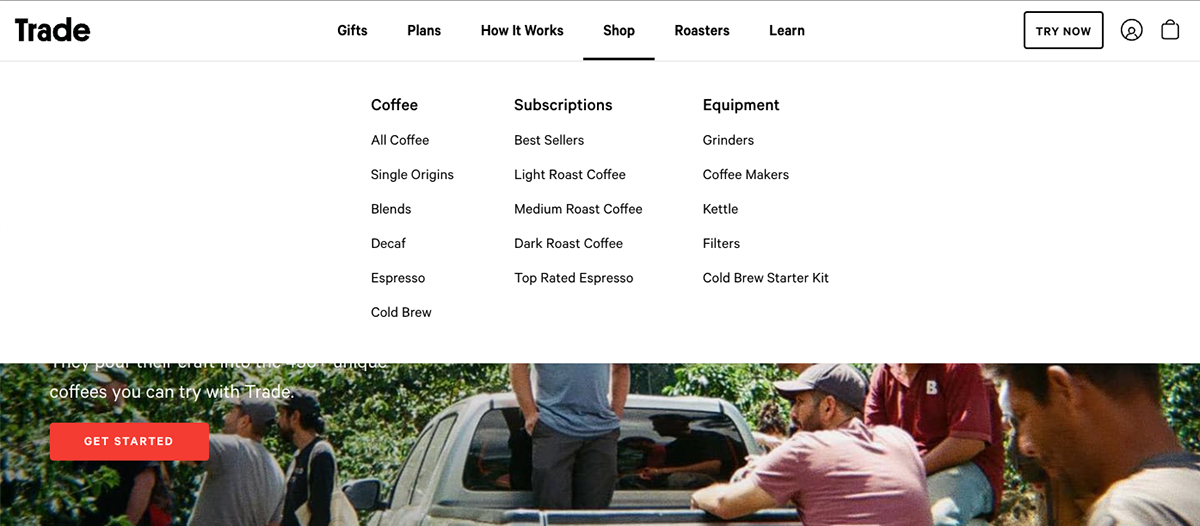
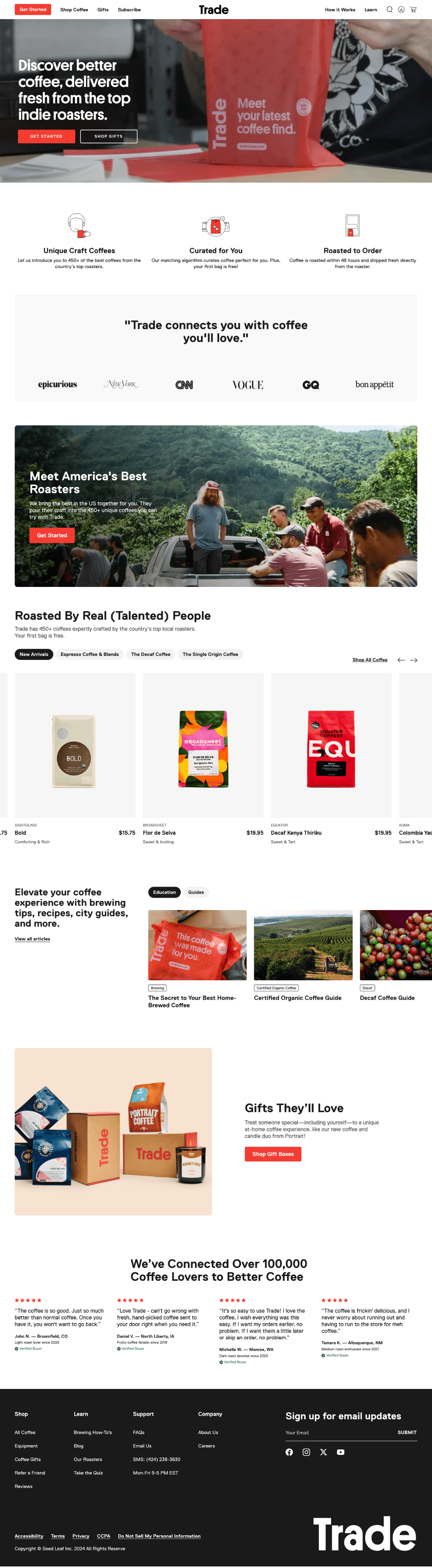
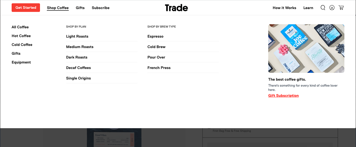
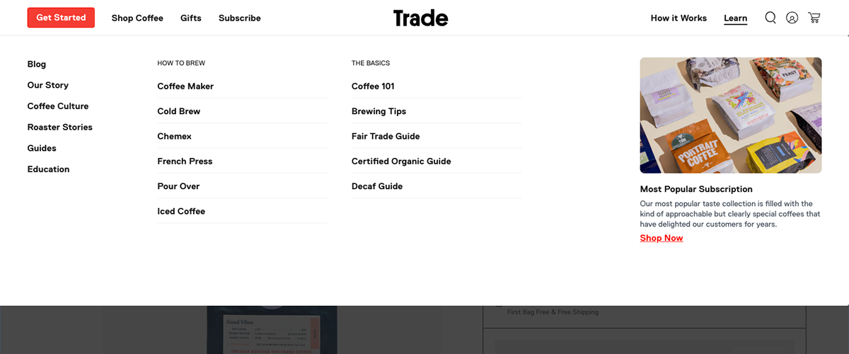
For the navigation update, we primarily relied on the researcher for the initial phase of this project. After an initial internal huddle, we decided to separate the shoppable and non-shoppable links for better accessibility. Then our researcher did card sorting and tree testing, along with usability tests, to come up with the structure. On the other hand, I was looking at competitors (and popular sites) with mega navs to get inspiration and references on type hierarchy, placement, and layout styles. My main focus was to improve its usability and accessibility aspects, as well as to make better use of real estate.
We re-stuctured the entire nav, for the “Shop” menu, we previously had "coffees," "subscriptions,” and “equipments” as subcategories with various links nested under them. We re-categorized them and used two subcategories, i.e., “shop by roast type” & “shop by brew type,” to make a clear segregation. Later on, we renamed roast type to plan type. As Trade offers subscription plans based on roast types, we decided to use a single naming convention. We figured that users rarely explored “equipments”, hence we stacked it on the left along with other generic links like “All Coffee”, “Hot Coffee”, “Cold Coffee” etc. We also included promotional blocks (optional), which can be used to promote gifts, quiz and new arrivals as per need. We also used a similar approach for the “Learn” menu, as we reduced randomness by sorting primary links under two major subcategories, i.e., “How to Brew” & “The Basics.”. Last but not least, we used a primary red button to call out the quiz and labeled it “Get Started” instead of “Try Now.”
The main navigation updates were proven to be impactful, as we had hypothesized.
Updated Page
Product Page
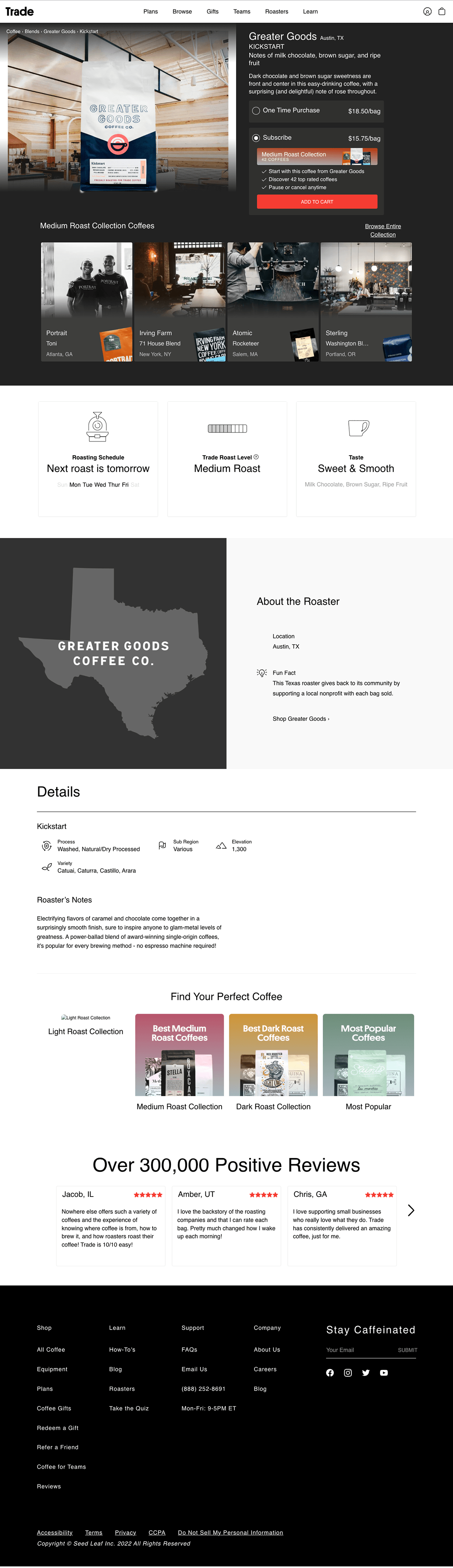
Old Page
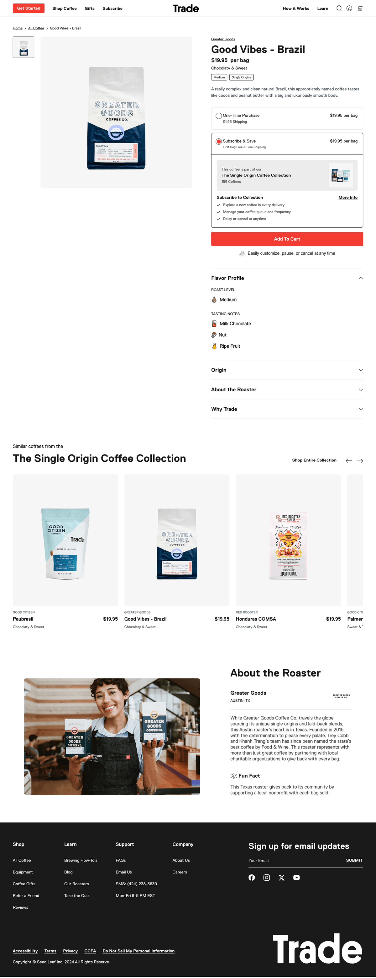
After reviewing the PDP, we observed a major opportunity for improvement. The page lacked visual coherence with the rest of the website, with too many font sizes, randomly placed components, and a black background for the first two folds. I took advantage of the opportunity to use their new typeface and brand to tidy up the web page. We used every standard pattern we had discovered from previous experiences. We understood that the Trade team wanted to give the user as much information as possible, including the coffee's origin, taste profile, and area. To ensure that users don't miss anything, we used accordions to truncate all of the content directly below the buy box, leaving the first one open. Notifying the user that this coffee is a part of a collection and that they will be subscribed to it if they choose to subscribe was one of the most important objectives. After the first coffee is chosen, each shipment will have a different coffee with the same taste profile. To make the information easier to scan, we highlighted that in the subscription toggle using a label and bullet points.
We included a product carousel beneath the accordions, showcasing a variety of different coffees from the same collection, allowing the user to continue browsing. Finally, since the roaster plays a significant role in the story, we tied up the page with an image and a content block to highlight them. We also deleted the review component because we didn't see much engagement with it. This was overall a significant update.
Other Notable Mentions
In addition to the projects stated above, we significantly improved their subscription portal to enable users to modify, cancel, upgrade, or delay their shipping. Invested a great deal of time improving cancellation flows to lower the churn rate. Another significant change was working with Trade's internal product designer to revamp the quiz flow.
Conclusion
This one was one of the most challenging projects I've ever worked on. The hardest aspect at first was realizing and aligning with the needs and goals of the Trade team. The client team had many points of contact, which added to the complexity as each person had their notes and feedback that occasionally conflicted with one another. Considering the circumstances, we held internal meetings and asked our art director to have a conversation with the client leadership group. We asked them to first assess our designs and concepts internally to provide more concrete feedback.
Aside from that, it became much more challenging with the switch from headless to Shopify and a rebrand altoghether. Setting a tight deadline didn't work out because we kept having to extend it because of all the repetitions and iterations. Even so, we were able to move over the initial obstacles and successfully complete the project by learning from the experience. I've gained a lot of knowledge overall from this endeavor. Please check out the ever-evolving website at drinktrade.com!


