About this project:
Greenside Design Center is a creative’s dream! This college offers a large variety of learning methods ranging from contact learning to part-time online learning and offers qualifications across various departments and levels. As time moves on, any digital space needs an upgrade, and in this project, I aim to use the principles of UX design, UI design, adaptive web design and Information Architecture to implement a new and improved website for GDC. To show what the website will look like, I will focus on three different web pages, namely, the landing page, the BA Degree for Multimedia Page, and the Registration Page.
The Problem:
On the current GDC website, there are elements that don’t fit the brand, such as the use of blue. Some information is outdated, and some areas display inconsistencies in design and alignment. There can also be some adjustments made to the structure of information on each of the pages. In some instances, there is a lack of typographical hierarchy, which could cause confusion for the user.
My Solution:
Through Primary and Secondary research, I found that some users would find too many colours, information, and inconsistencies frustrating and would ultimately turn away from a website. My solution is to create a minimal, clean website with a clear hierarchical structure. I aim to include more work from GDC students and provide a better introduction to the academic staff members who teach the students of GDC. I am going to focus on restructuring some elements and information as to make more sense when reading through the document.
I want to also place more emphasis on the available courses and learning methods that the college has to offer. And finally, I want to ensure the greys and the iconic GDC green are displayed correctly and according to the GDC Brand Guide.
The process that I followed:
I have done research on the principles of web design and information architecture. I compiled a questionnaire and did a few precedent analyses on other websites to gather enough data to support my changes and new design. With all the information that I gathered through research and questionnaires, I formulated a new content strategy with regards to the structure in which GDC has their information, this includes, changes in the menu's and reorganization of their current content.
I have created site maps for the Landing Page, the BA Degree: Multimedia page, and the registration page. After this, I created a low—to medium-fidelity wireframe, a clear component library, and then a high-fidelity wireframe, which is ultimately my final website redesign. I have completed this for three different device types, namely desktop, tablet and mobile to show the adaptability of the website and how the elements will be structured on different devices.


User Flow Diagram:
Below is a short user flow that I created to show the journey that the user will take to get from the landing page to the registration page in a few simple clicks!

Landing Page Site Map
Below is a diagram that shows the map of the landing page that I followed for this design.

BA: Multimedia Degree Page Site Map:
Below is a diagram that shows the map of the BA: Multimedia Degree page that I followed for this design.

Registration Page Site Map:
Below is a diagram that shows the map of the Registration Page that I followed for this design.


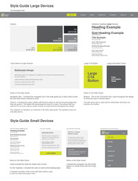
An overview of the Desktop Layout:

Here is a working Prototype of the Desktop Version:
Please note as this is only a prototype not all functions are working, this is just for the user to view the design in a working and moving space. I have not included a prototype for the mobile or tablet versions, but I have included the flat designs for them as well.


An overview of the Tablet Layout:


An overview of the Mobile Layout:


I also want to extend my thanks to:
My lecturers:
Evan Reyneke
Lindi Maritz
Savannah Meyer
To my fellow Students for providing me with some of their works for this project:
Janus van Niekerk:
Jeanne Krige:
Mockup references: