
Blueland's mission is simple: make it easy to be eco with innovative products in reusable packaging that are convenient, effective, and affordable.
The website is built on Shopify.
The website is built on Shopify.
Role
As a member of the Anatta team, I worked on this CRO project. Together with the researcher, coders, and art director, I worked as the interaction designer.
Goals
As previously stated, our main goals were to improve this website's conversion rate and lower its bounce rate. Moreover, maintain the visual coherence and brand alignment of the entire website.
Approach
Following an initial workshop involving the leadership teams of Anatta and Blueland, the project plan was mapped. The roadmap required us to perform a visual audit and a light heuristic initially. Going forward, we have to optimize the customer site and the complete funnel.
NOTE: I do not have access to the original files and documents; hence, I’m using screenshots of the updated site and https://archive.org/web/ to fetch screenshots of the old site. I’m sharing a few highlights of the project.
Also, we always take a mobile-first approach to fixing the design on the smallest and most used screen, but here I’m sharing desktop res images for better understanding.
Homepage
Old page
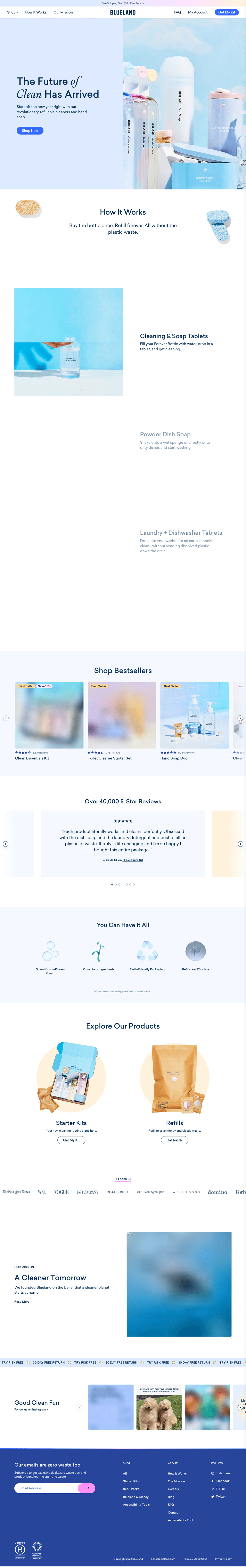
We started working on the website by conducting a light heuristic audit based on NNG & Baymard. Our team identified that the primary navigation needed to be updated urgently, but we decided to tackle it in the next project because it required more resources and bandwidth. Instead, we focused on smaller improvements to achieve some quick wins.
We also added a category carousel and an icon section directly beneath the hero section. It surprised us to see that, contrary to our assumption that a shorter height would work better for the hero banner—a peeking viewport below would entice viewers to scroll down—a full-blown hero version emerged victorious in the test.
We returned to the webpage for more optimization following the first improvements. To generate recommendations, our researcher examined data, user behavior, and competitor analysis.
Numerous components and their positions on the page were tested in several variations. Since users dislike reading long passages on funnel pages, especially the homepage, one of the main enhancements was to provide brief content sections for modules like "how it works" and "subscription benefits" with a link to learn more. Because of this, we made them crisp and easy to scan. The "quick add" buttons that were added to the "bestseller" module product card were another significant improvement.
Our Updates

Main Navigation
Old page


In order to minimize eye travel, we began by organizing primary shopping links and non-shoppable (utilitarian) links. As those are some of the best practices, we added the cart icon (which previously only appeared after adding a product) and integrated search functionality. Additionally, we added a "Get Refills" link upfront to make it easier for returning customers to find their refills since Blueland sells refillable cleaning products. We also decided to remove the "Get My Kit" after testing several variations of the same link and finding that users were interested in checking out the shopping links placed under the "Shop All" menu.
We are aware that in the majority of use cases, providing the "Bestsellers" link up front has been beneficial. However, our researcher conducted numerous usability tests and user interviews for this website before recommending the addition of a secondary menu bar that would showcase all of the shoppable links to increase clickthroughs, decrease confusion, and lower the cost of interaction. This suggestion proved successful. Additionally, we tested variations with and without the supporting images for each link under the "Shop All" menu and found that those images were not adding any value. Having only text links also makes the menu drawer even more scalable (at the time, Bluelend was also working on launching their personal care segment).Additionally, as requested by the Blueland team, we updated the promo bar to incorporate country settings.
The entire UX team put a lot of work into this project, but the results were justified.As an interaction designer, I had to create several navigation versions for three different breakpoints (mobile, desktop, and tablet). This was significant work and a fantastic learning experience. Working closely with the developers and conducting thorough VQA were also crucial.
Our Updates


Mini Cart
The old page could not be found.
As was already observed, the header had no cart icon. It used to appear when you clicked on the available CTAs on the homepage and product pages after adding a product to your cart. The user was previously directed to a cart page by clicking on the cart icon. We convinced the Blueland team to convert to a side cart or mini cart right away because it has worked well for previous clients. Following their brand guidelines, we included cross- and up-sells and made the cart easily scannable. There was a noticeable boost in conversion rate with this upgrade.
Our Updates

Conclusion
Aside from the projects listed above, we also participated in numerous critical updates, such as updating the customer portal, the PDP buy box, designing landing pages, and developing a UI library. As a whole, this initiative was crucial to understanding user behavior in subscription services.


