
Role
As a member of the Anatta team, I worked on this CRO project. Together with the researcher, coders, and art director, I worked as the interaction designer.
Goals
As previously stated, our main goals were to improve this website's conversion rate and lower its bounce rate. Moreover, maintain the visual coherence and brand alignment of the entire website.
Approach
After meeting with the client and holding internal huddles, we decided to do a light heuristic analysis based on Baymard and NNG principles to target the low-hanging fruits. We also implemented some "best practices" that we've learned from previous projects, allowing us to deliver some quick wins with less development effort, which in turn helped us gain the client's trust at the very beginning of the project. After that, we collaborated with the researcher to understand user behavior, identify their problems, and determine what steps should be taken to build easily accessible funnels. As a result, we decided to focus on a few key elements and pages, including the Homepage, Main Navigation, Minicart, PLP, and PDP.
Below, I will highlight a few pages about the changes that have been tested and implemented.
NOTE: I do not have access to the original files and documents; hence, I’m using screenshots of the updated site and https://archive.org/web/ to fetch screenshots of the old site. It was not possible to render some of the former site's images.
Also, we always take a mobile-first approach to fixing the design on the smallest and most used screen, but here I’ll share desktop res images for better understanding.
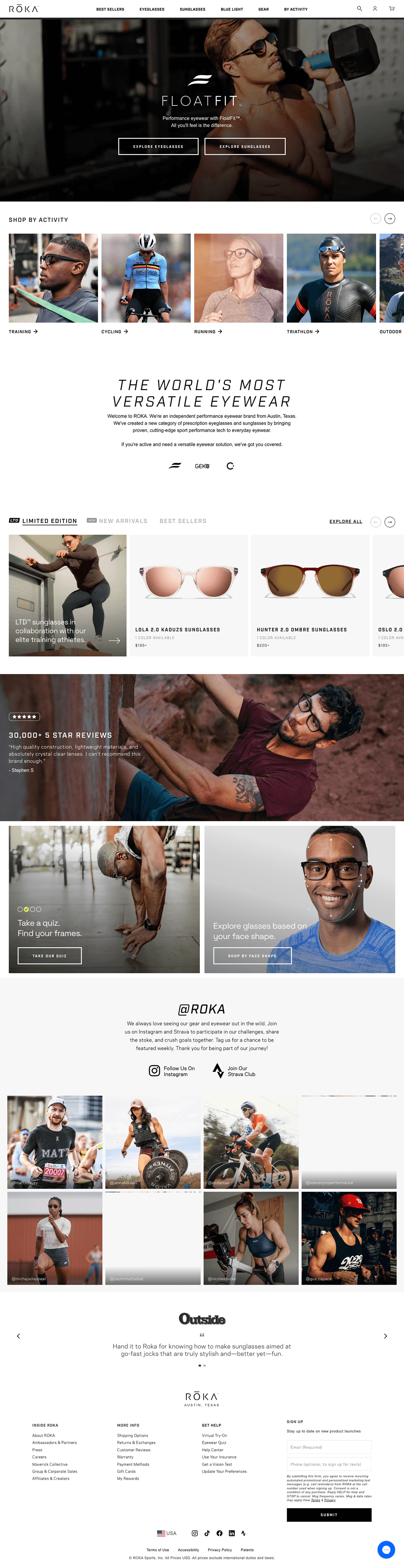
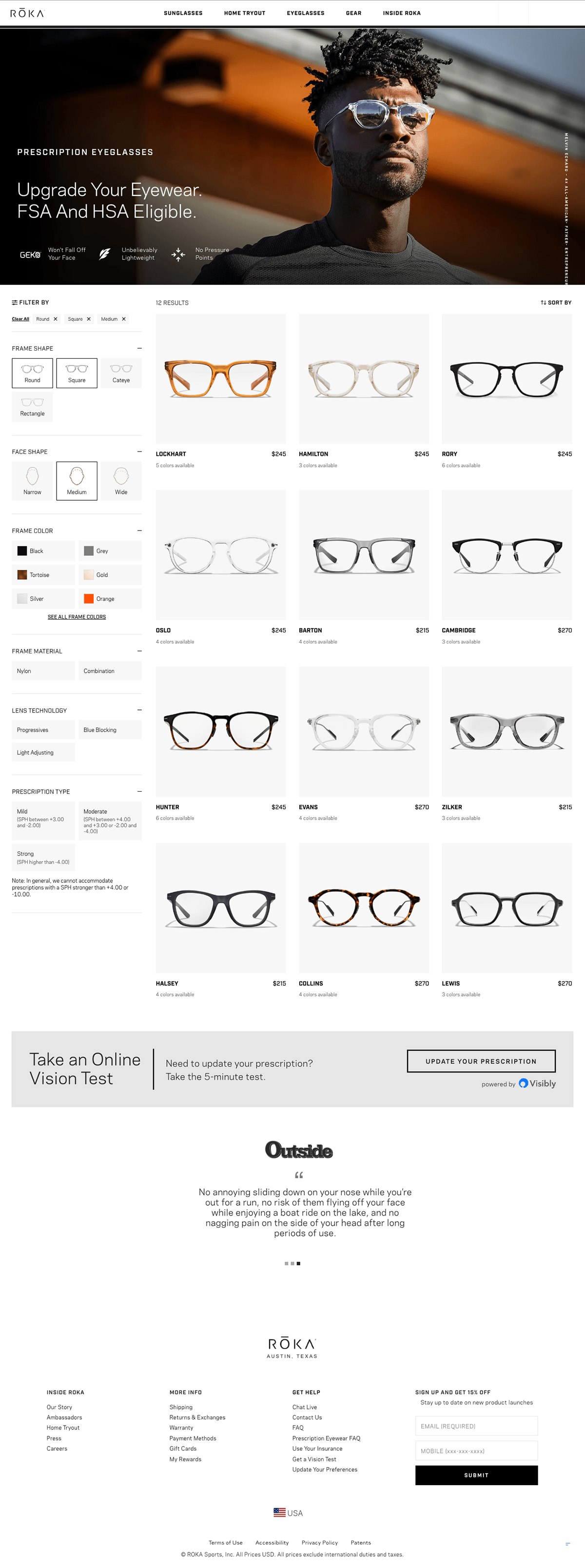
Homepage
Old Page

When we first viewed the homepage, we saw that the hero image filled the full viewport, and then there was another banner just below that. Furthermore, the primary navigation and two content blocks with calls to action (CTAs) to shop for sunglasses and gear were the only ways to browse the products and go through the funnel.
To enable the next component to peek at the bottom of the initial viewport, we first lowered the height of the hero banner. We then made the banner uniform so that it could be used for a variety of purposes throughout the site. It is also common knowledge that showcasing the range of products offered and a few best-sellers directly on the homepage helps to decrease funnel drop-off. It also assists impulsive buyers in moving to a PDP and making a swift selection. For this reason, we used a variant of the same component to construct a category carousel and a product carousel that highlight the categories and products that Roka offers. Next, in order to increase user confidence, we included a "review highlight" component.
The Roka team wanted to add a quiz feature (via a third-party app) while we were working on the aforementioned modules because quizzes are always good for conversion. After conducting some user interviews, our researcher concluded that users would like to browse glasses based on the size and shape of their faces (we've seen this feature on competitor sites as well), so we added these two paths to the homepage.
While working on this task, we also made a few minor adjustments to the footer and used a third-party app to show Instagram images.
Our Updates
Main Navigation
Old Page
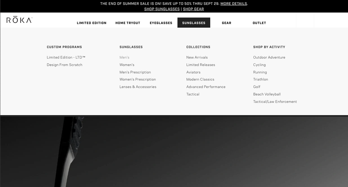
In the early stages of the project, we mostly relied on the researcher for guidance. In order to obtain understanding of the reasoning behind the current information architecture, we also collaborated with the Roka team. To finalize the structure, our researcher conducted user interviews, card sorting, tree testing, and a brief usability test (though it was tested once more before release). However, I was working on a competitor analysis to look at how other well-known websites organize their main navigation with a variety of links and information. We observed that the category for sunglasses and eyeglasses had too many links nested beneath it. Our past experiences have also taught us that one of the best practices is to make the bestsellers link prominently visible.
Aside from everything else, our researcher produced a presentation featuring research, findings, and recommendations. My entire focus was to visualize that in the three primary resolutions (mobile, web, and tablet), making better use of the available real estate to accommodate promotions. Additionally, several minor variations are being made to increase its flexibility for potential future use cases.
Our Updates
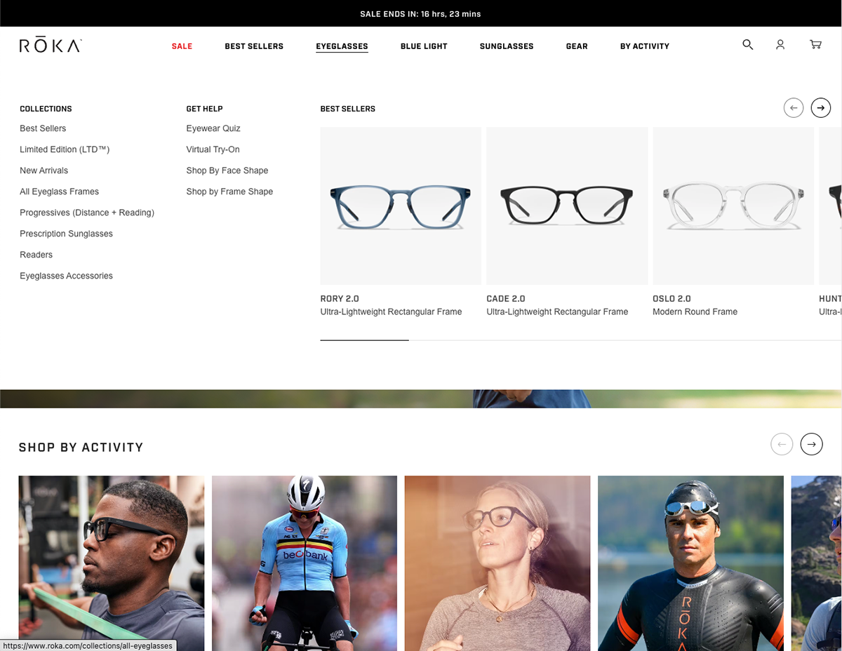
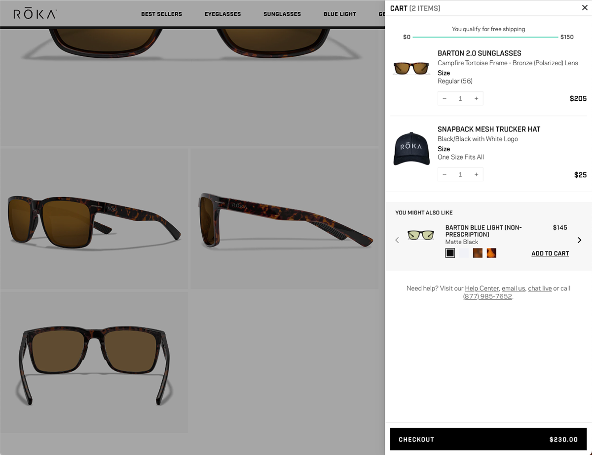
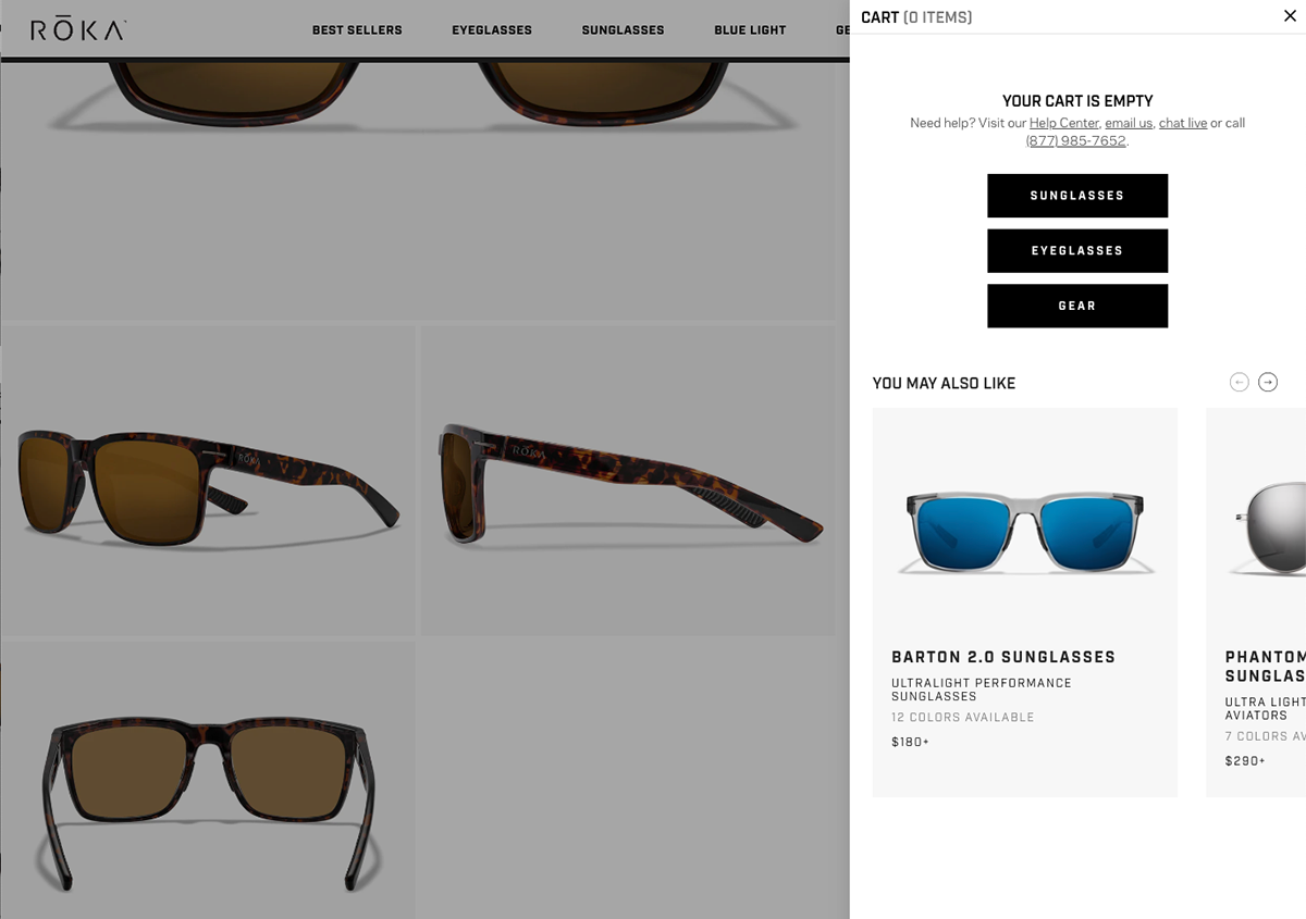
Minicart
Old Page
We saw that upgrading the cart would be a great way to have a positive impact. We've found that, out of all the cart types, the sidecart or minicart is most effective for most e-commerce websites. It is simple to use and doesn't interfere with the user's shopping journey. Adapting from mobile to desktop and tablet is relatively easier compared to other modules.
Adhering to the brand guidelines, we added upsells, crosssells, and empty states. In addition, we added a free shipping meter to gamify the experience and encourage users to shop more if they haven’t qualified for free shipping. Additionally, we've shown product recommendations in their empty state using the same product carousel from the homepage.
Our Updates
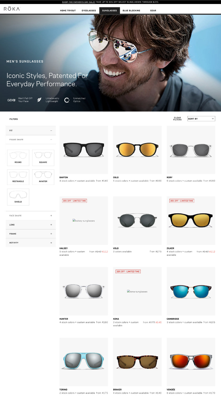
Product Listing Page
Old Page
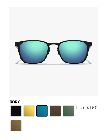
previous product card swatch hover state
Our task was simple on this page: we needed to make a few little ux and ui adjustments. We corrected the usability concerns with the filter using industry best practices and also gave it a visual cleanup. Another upgrade was made to the hover experience of the product card, which now has smaller color swatches to accommodate all the colors in a single row with an icon to indicate more colors if they have them for any particular product. Additionally, hovering over a different color swatch used to be ineffective for the user; instead, we had to click on various swatches in order to view the glasses—that too on the PDP. In order to decrease interaction cost and pogo sticking, we made them accessible. Hovering over any color swatch would alter the color of the eyewear on the product card.
Our Updates
updated product card hover state
Product Description Page
Old Page
PDPs are always crucial for conversions since this is the page where the user makes a purchase decision. This is the last funnel page before checkout as well. After reviewing the current product page, we decided to quickly redesign the buy box using industry best practices. Additionally, we have trimmed a large amount of exposed text material with accordions and improved the typography and information hierarchy. Additionally, as there were previously different designs for different kinds of glasses, we created a consistent structure for PDPs that can be applied to all kinds of glasses to increase site speed, save development effort, and provide visual coherence. We also added a “recently viewed” module to keep the user in the loop.
Unfortunately, the web archive has not archived the updated page.
Conclusion
For nearly a year, I participated in this multifaceted project. The cooperation between the content writers and the marketing teams at Roka and Anatta UX was enjoyable. We grew from both setbacks and victories. Last but not least, each of the aforementioned projects began with a hypothesis that was developed through research and prior experience before being designed and tested.
Visit roka.com to browse the ever-evolving website that offers one of the greatest glasses on earth.


