Pomus
Magical creative production.
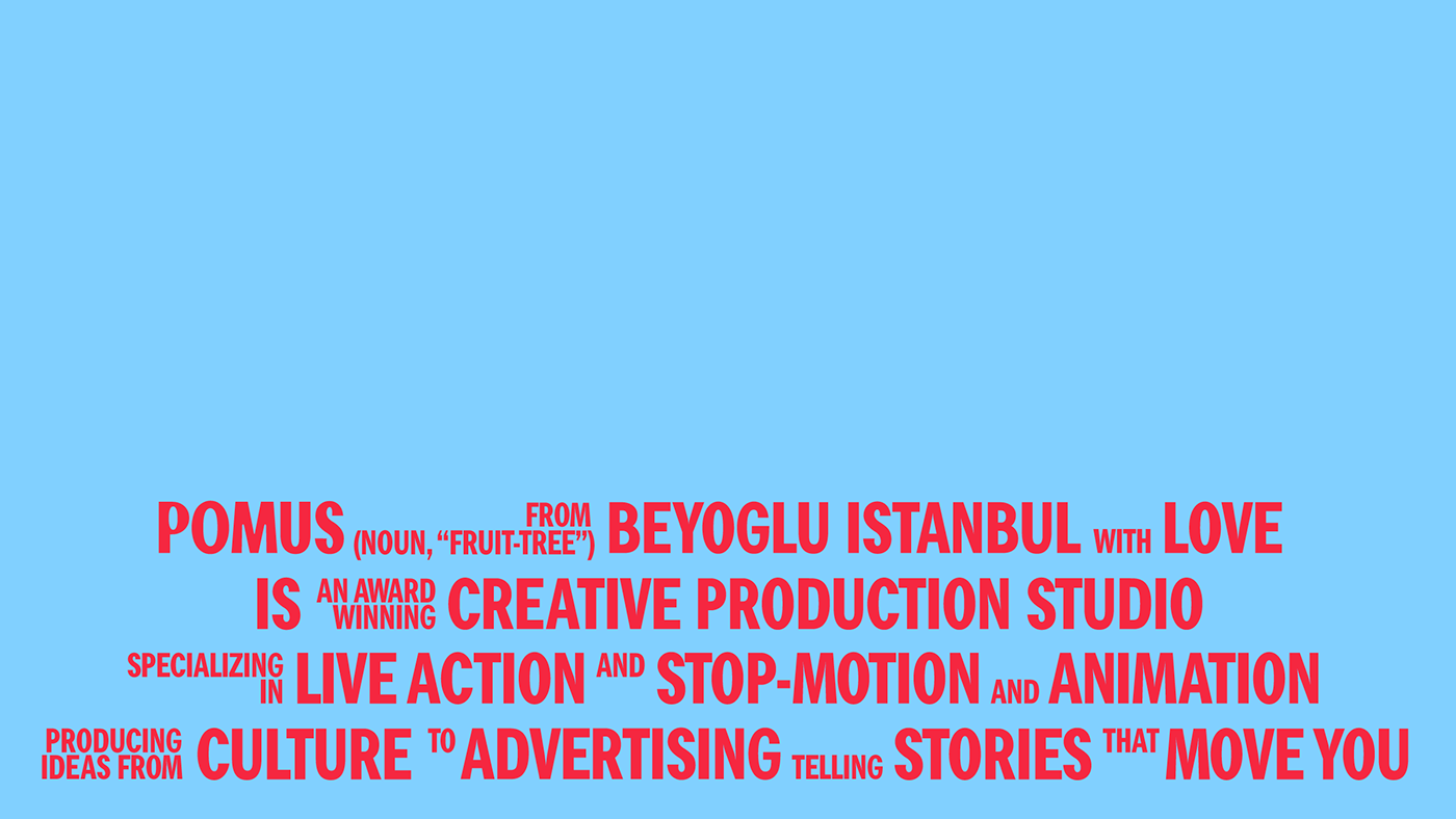
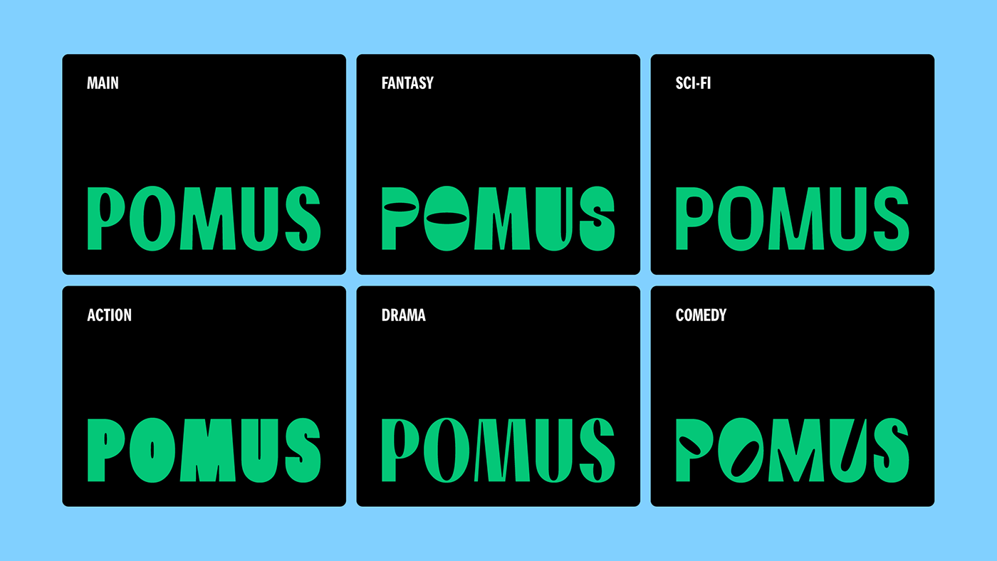
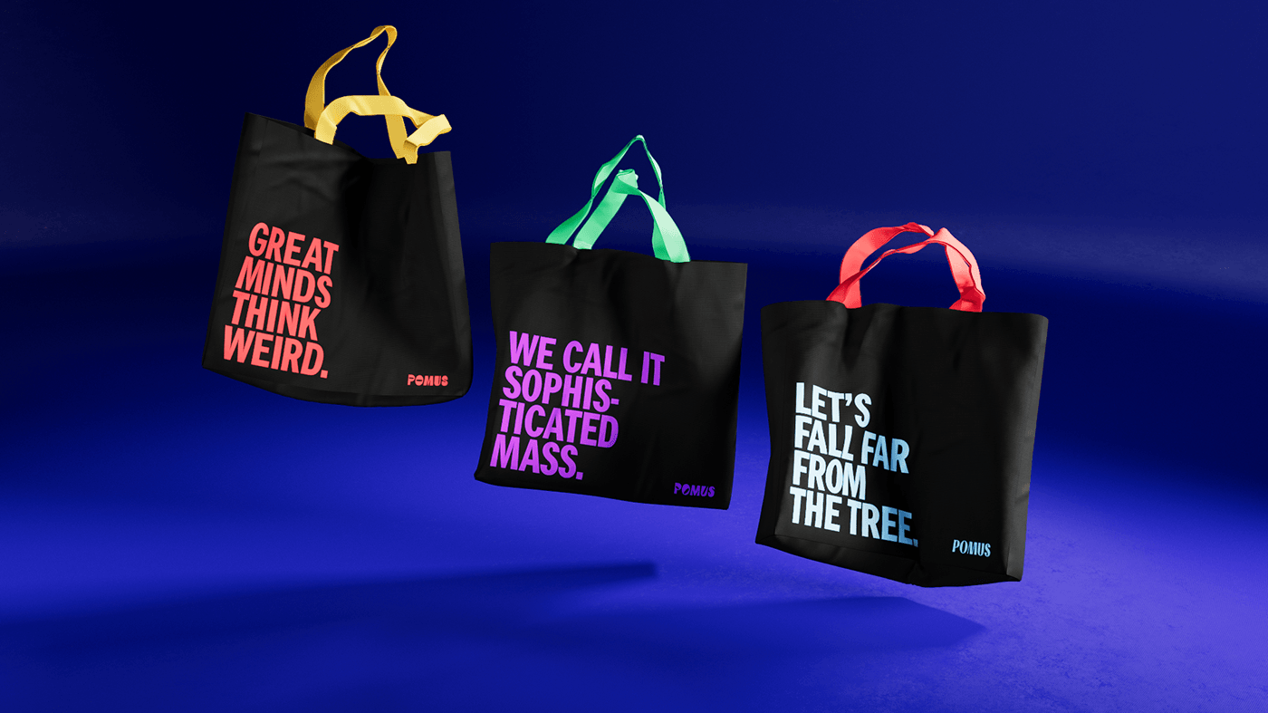
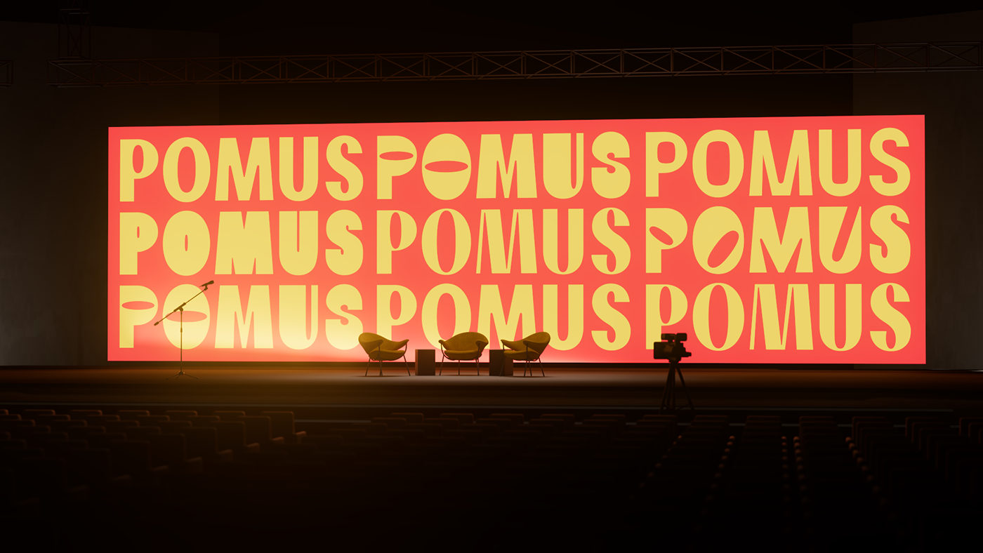
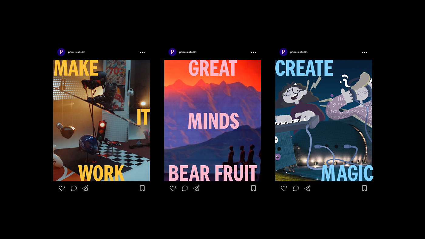
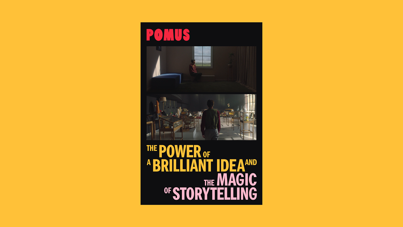
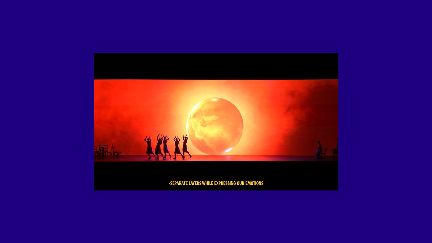
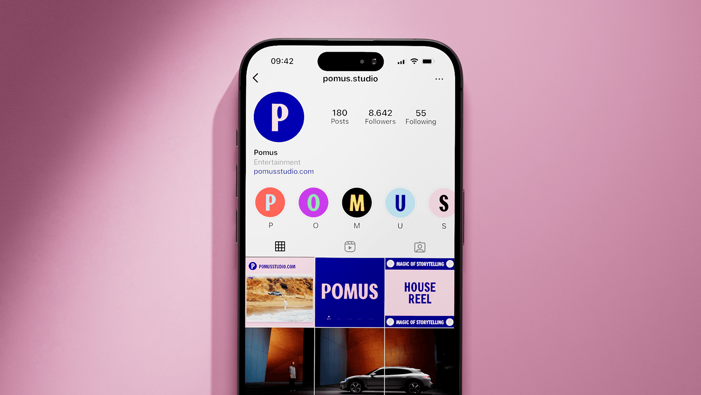
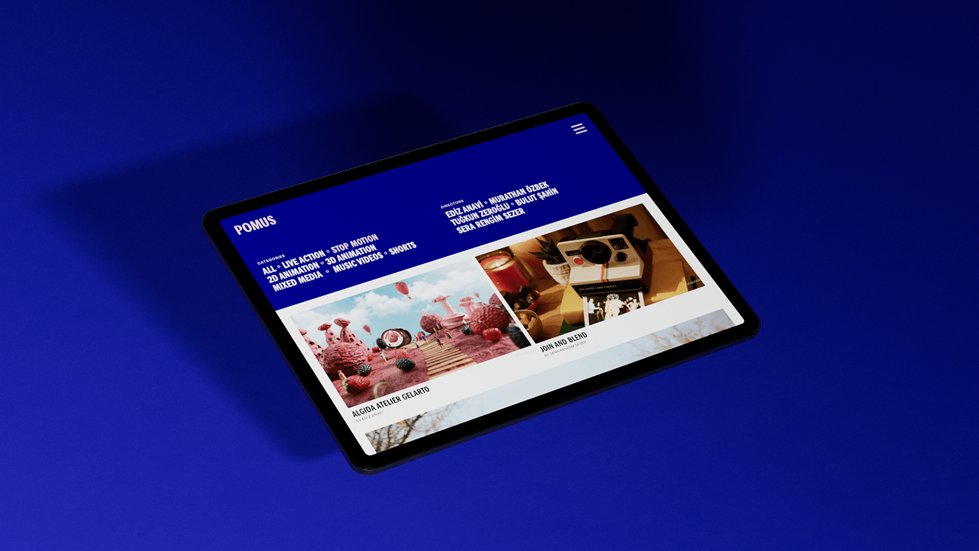
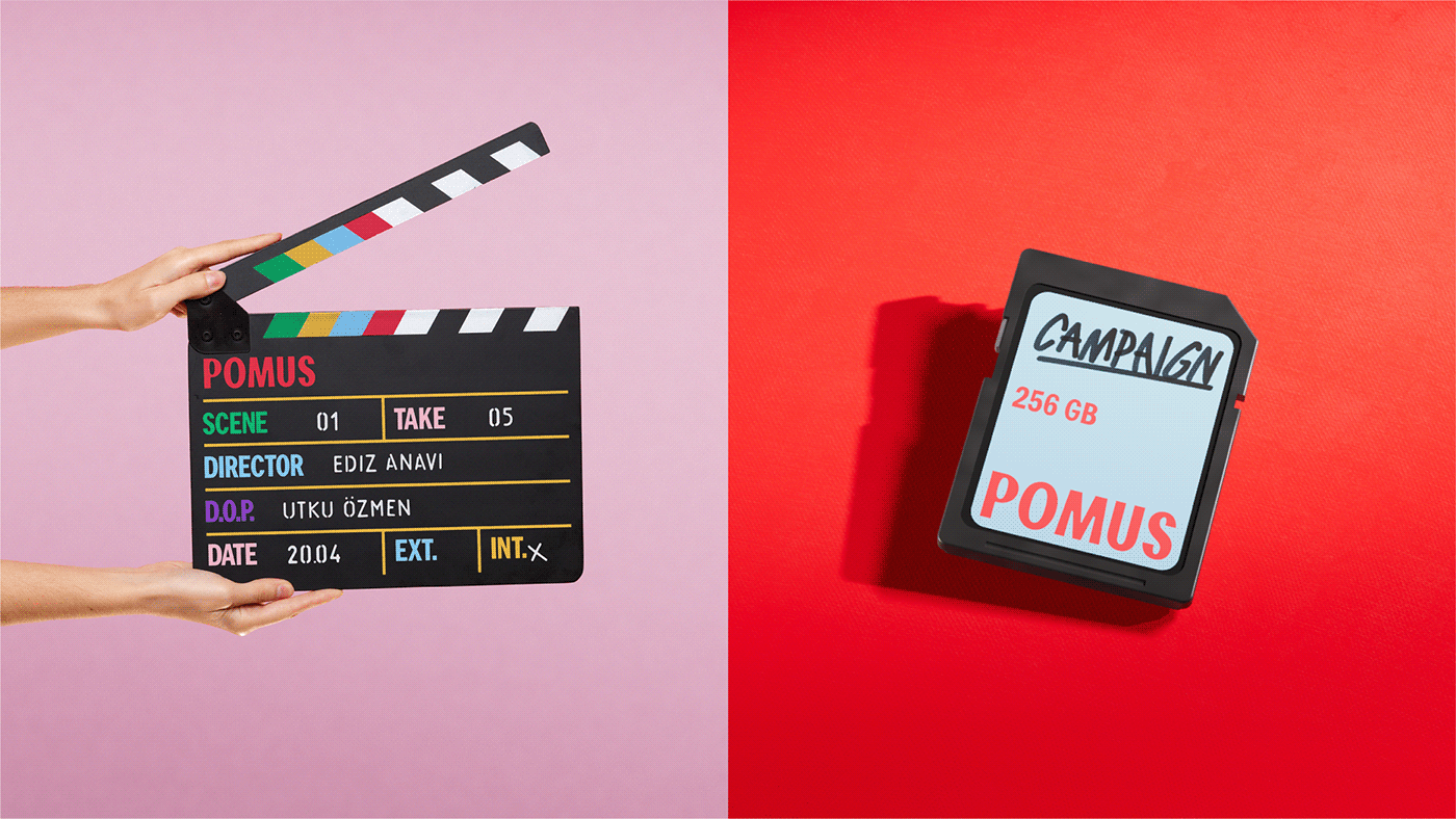
A team made of storytelling magic, video miracle and tasty direction. Pomus (noun, "fruit tree") is a creative production studio taking over projects that even courageous will tremble dreaming working on. Sömestr collaborated closely with Pomus to shape the branding for its next chapter, one aimed at embracing a global talent and clientele. We created an identity revolving around variable typography and energetic layouts inspired by movie card titles. Pomus logo has six different states for the most popular film genres and it is used all over the communication materials for blending uniqueness and misfit. The logo is produced as a .OTF font file (in collaboration with Element Type) for effective usage and versatility in animation properties. Besides the logo, we have created the custom typeface, Pranklin Pothic (kudos to Morris Fuller Benton) for transferring the typographic flair into the website and other design materials. Colorful, powerful and fruitful. The new identity inspires and motivates the Pomus collaborators to tell stories that move people, challenge perspectives, and leave a lasting impact.
Services:
Brand Identity, Website, Communication, Print