Loni Dekor
Loni Dekor, a furniture manufacturer, wanted to refresh its brand for a new era while maintaining a strong connection to its roots. The challenge was modernizing their logo without abandoning the familiar tree symbol and retaining the traditional green color scheme.

The new Loni Dekor logo strikes a balance between tradition and innovation. The tree element is cleverly incorporated into the 'L' and 'D' initials, subtly referencing the company's history.

Color Palette
This carefully chosen palette features natural greens that reflect Loni Dekor's connection to sustainability. The darkest green suggests stability, while the mid-tone conveys calm. The lightest green adds freshness, with the vibrant highlight providing an energetic accent.

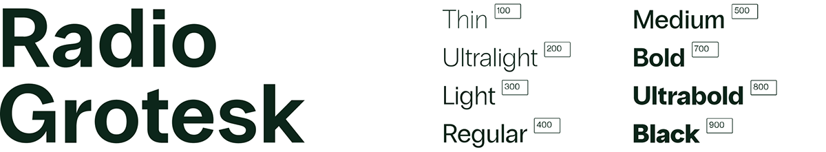
Typeface
16 Styles with 742 Glyphs eachIncluding Italics & Cyrillic Support
Pattern
This repeating pattern, derived from the negative space within the logo, adds texture and versatility to the Loni Dekor identity. It extends the existing visual language without competing with the logo, offering opportunities for use in packaging, textiles, and more.
Applications
The cohesive use of the new logo, color palette, typography, and pattern across various mediums showcases the strength of the Loni Dekor rebranding.