REDD'S Rebranding Pitch
-
Brief:
The main objective of this project is to carry out a rebranding of the REDD'S brand in order to update its image without losing its distinctive identity. It is essential to maintain the most distinctive elements of the brand during this rebranding process.
-
The Solution:
Discover the new era of REDD'S with our exciting rebranding! Our goal is to take the brand into new graphic territories without losing its essence, keeping its most distinctive elements intact.
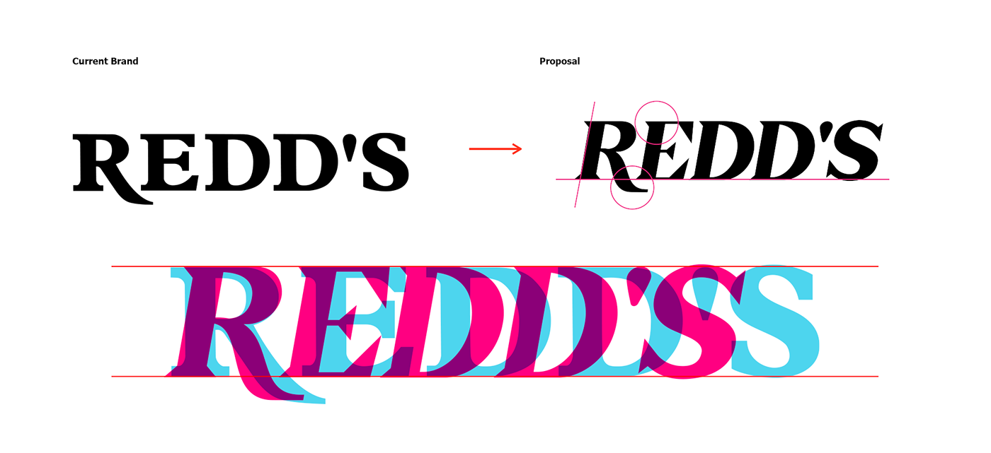
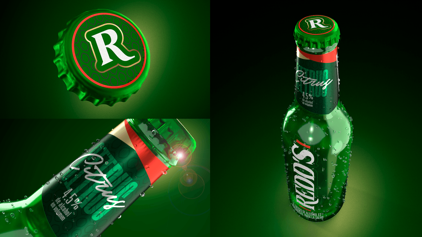
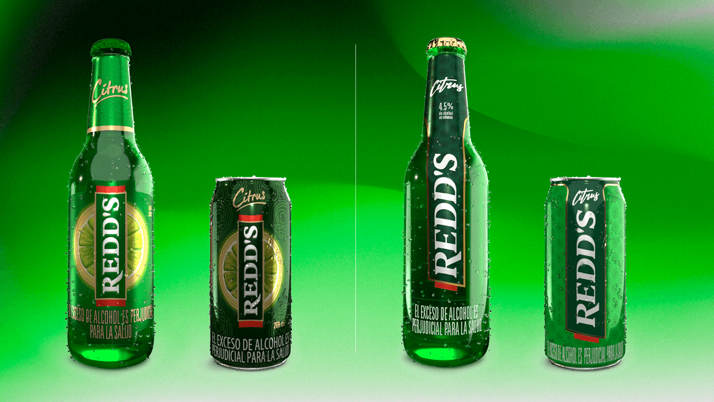
How do we achieve this? We have completely redesigned the brand's typography, infusing each option with freshness while maintaining its original authenticity. From label design to the appearance of the can and the six-pack, every detail has been carefully considered to offer you a visually stunning experience.
Working hand in hand with the talented Planning team at VMLY&R in Colombia, we have developed design principles that capture the true essence of REDD'S. Our exhaustive analysis of the brand has led us to identify the most important attributes, which we have carefully integrated into each of our proposals.
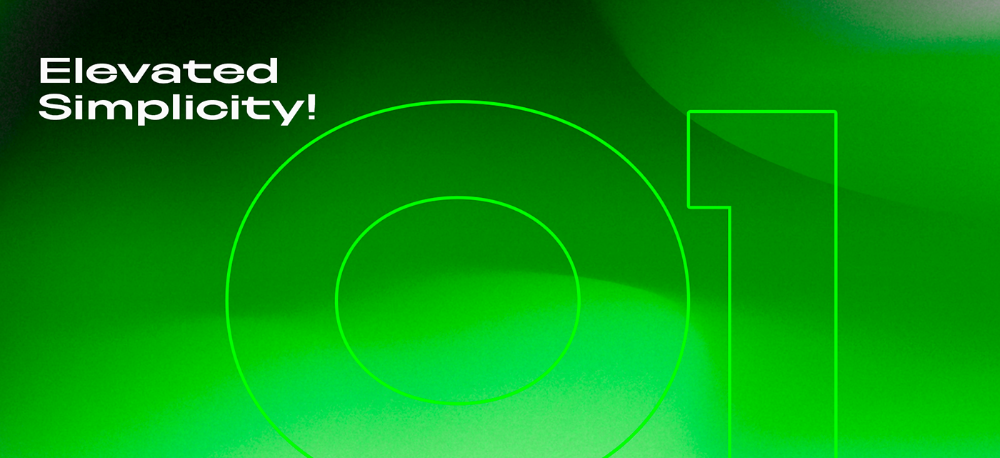
Option 1: Elevated Simplicity!
We have simplified the brand by removing superfluous elements and highlighting the original form with our red side ribbons. The typographic design features a 10° inclination with angular serifs, offering a fresh and modern look.
Option 2: Essence at its Maximum Expression!
Drawing on the strength of the brand name, we have created a proposal that stands out for its elegant simplicity. Our typography features subtle serifs and an R tail that adds solidity and character.
Option 3: Faithfulness to the Original!
While retaining the most emblematic elements, this option remains faithful to the original font of the brand. With a 10° inclination to soften its rigidity and angular serifs, this proposal offers a fresh and natural look.
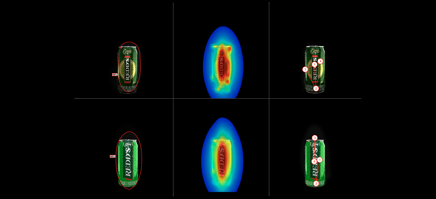
And that's not all: each proposal has undergone exhaustive analysis using artificial intelligence, providing crucial data on viewer attention and interaction with the product in the real world.
Our goal is clear: to update the brand and its graphic universe without losing sight of the essence that makes REDD'S unique. PLEASURE WITHOUT BITTERNESS
-
Credits:
Agency: VMLY&R - COL
Country: Colombia
Client: AB InBev
Roles: Creative and Art Direction, Branding, Packaging, Label Design, 3D Modeling, Photo Retouching
-
Extra Credits:
VMLY&R Chief Creative Officer: Julián Andrés Núñez Caballero
VMLY&R VP Business & Operations - Colombia: Juan David González
VMLY&R Director of Growth: Adriana Gaitán
Industrial Design and 3D Modeling: Malena González Serena
-