Paiper is a type family for use in magazines, book covers, packaging design, logos, and movie posters. See the online specimen on my website, and the making-of article on my blog.

Paiper is available for sale exclusively at Gestalten Fonts. Buy it now!
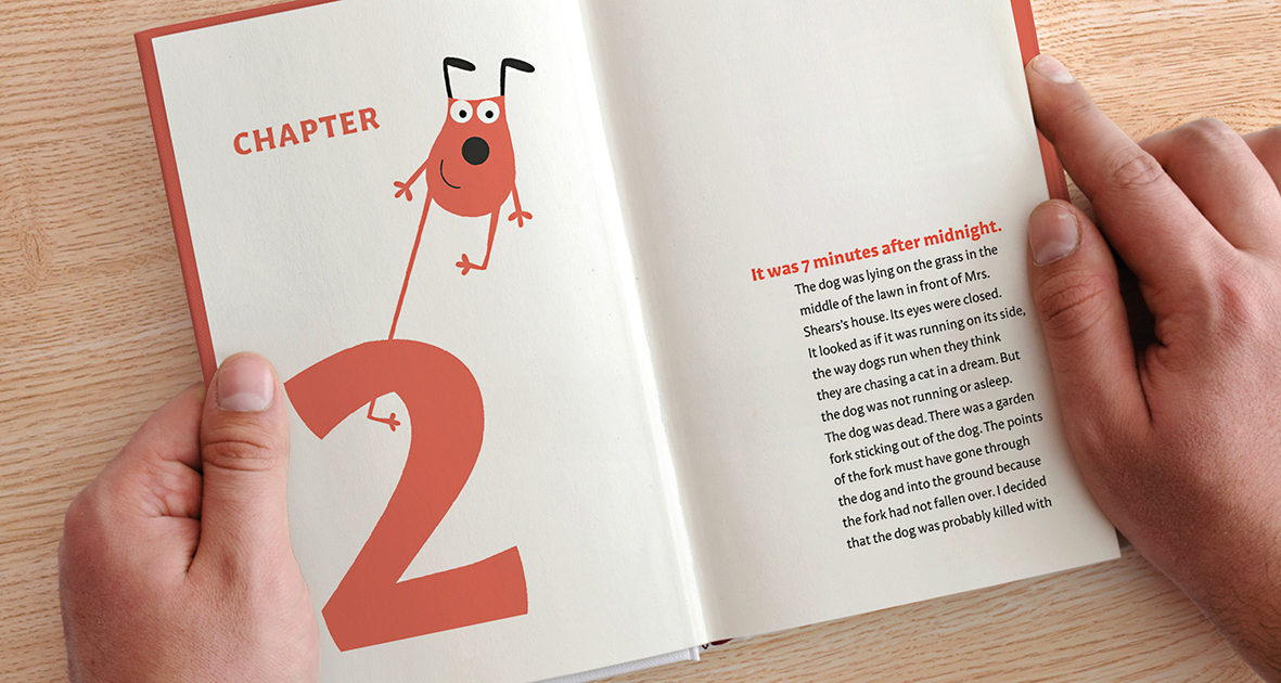
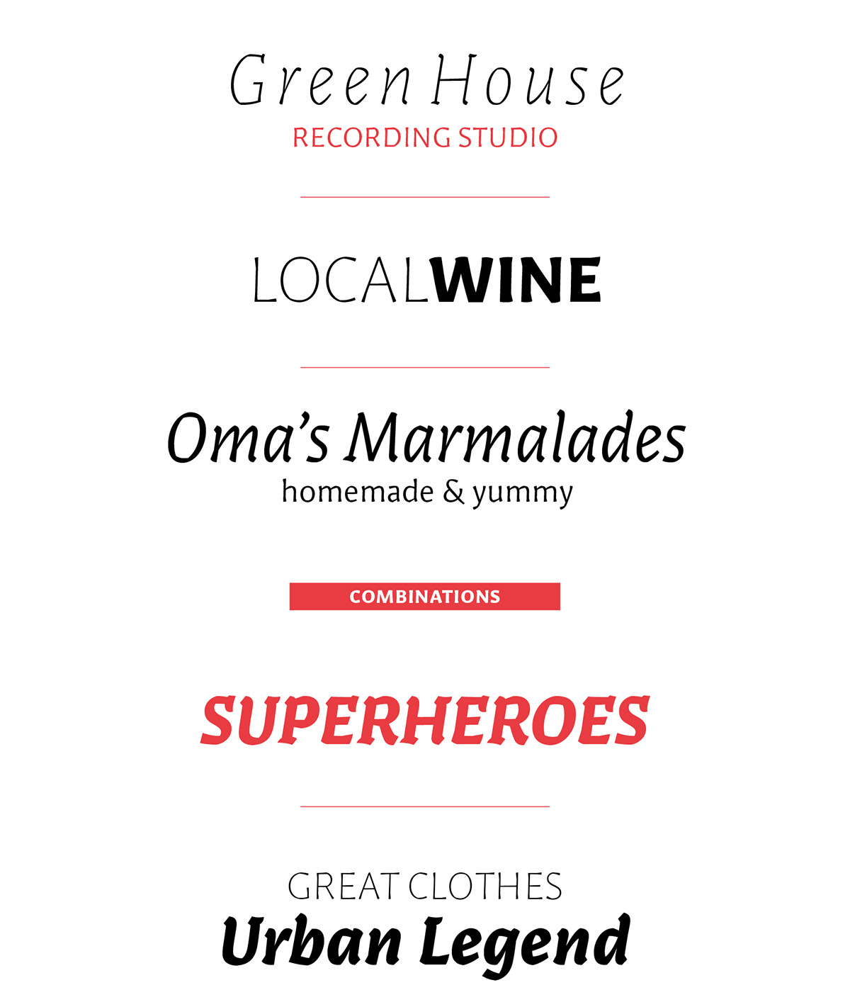
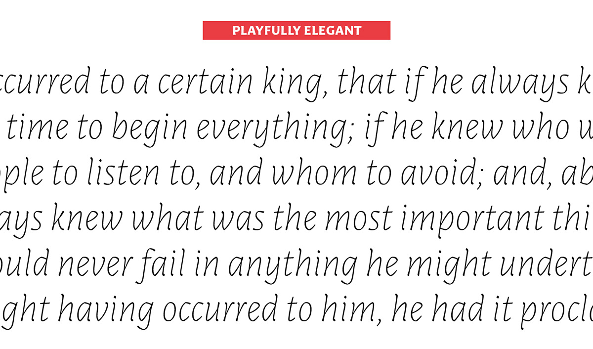
Paiper is an informal type family for display and text use. The roman weights have slightly flared stem-endings and low contrast, while the italics feature higher contrast and more pronounced serif-shapes. Each family member has been drawn individually and delivers a unique personality to the mix, from elegant and skinny to poetic and chubby. Paiper’s intended use is for designing movie posters, book covers, logos, flyers, ads, magazines, and funky packages.
Paiper started as an innocent experiment (back then it was called Paige) at the intensive one-week TypeClinic workshops in Slovenia. After Gestalten Fonts approached me to publish it, and after I graduated from the TypeMedia course, Paiper developed into a six-member type family.
Paiper’s design was originally inspired by folded strips of paper. Rather than stopping at a literal interpretation, the shapes have been crafted to work as a system of type, to perform well and harmoniously on paper. Paiper is available exclusively from Gestalten Fonts. You can download a PDF-Specimen or buy the Paiper family.


A rendering of the original idea paper-folded idea; superimposed is the final shape, with some drastic optical corrections.

Paiper Thin is an elegant & fragile weight. It is meant to beused
at large sizes, although yowill be surprised how even it looks at 12 points.
Paiper Regular features pronounced flared serifs and funky cuts,
but it can easily be used for running text at both large and small sizes.
Paiper Black is chubby & really gives a punch of ink on the page.
Featuring alow contrast, the cuts have been exaggerated.
Paiper Thin Italic is elegant and even more fragile than its roman
counterpart. It is meant to be used at large sizes, for quotes or poems.
Paiper Regular Italic takes the paper cuts to the next level.
It features higher contrast. Its edginess will give new meaning to your poems.
Paiper Black Italic is the most outspoken of the family members.
Chubby and melodious,it just screams to be used at large sizes.





The Process

In the summer of 2011 I attended a workshop in Slovenia (it was my second time there), where each one of the participants was expected to develop their own typeface within one week! At this point, like most over-achieving design students, I wanted to come up with something unique. I don’t know exactly how it happened, but I got the idea to play around with a strip of paper and fold it (without pressing it down flat) to get a lettershape.
I was thinking about tools. Each tool leaves a specific mark on a paper, a predictable mark, which becomes part of the personality of that typeface. The tool can be a broad-nib pen, a brush, or a completely imaginary tool. This is quite an abstract way to think about type design, but this is where the paper folding came into play. Fooling around with that paper, taking some pictures and tracing over them, I noticed a few details that were interesting. With my strip of paper I could not really build all the letters, but I was starting to put together an “imaginary” tool in my head that would make the shapes I wanted in a consistent way.


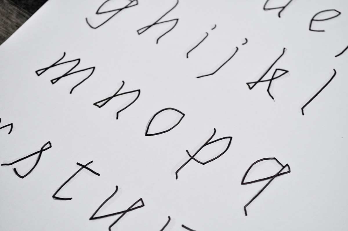

After three workshops, I stopped working on the typeface. My passion for type design had grown and I applied for the one-year master course in type design at the Royal Academy of Arts in The Hague, TypeMedia. Here I learned much more about designing type, my eyes were opened to hundreds of new aspects. When I graduated, I was approached by Gestalten Fonts to release Paiper with them, so this motivated me to do more.
After TypeMedia, I had a really hard time approaching the quirkiness of this original typeface. It was drawn very quickly and naively by a younger me, who did not know much about letters. This was both frustrating, because there were so many inconsistencies to be dealt with it was hard to decide how to continue on it. But it was also a great thing! The original naïveté gave room for innovation and playfulness. These details really should be preserved because, in the end, it is exactly that quirkiness that would make the typeface unique. I decided to take it as I would a commissioned project, without questioning the basic idea. My task was just to polish and refine it so that it functions in the given context, as well as to expand it to be a family of six members.

An overview of the original «naive» design as compared with the final design.

Work in progress. Working on the Thin Italic ampersand

Corrections on the Thin Italic.

Corrections on the whole family.
Kerning tests for the bold italic. This test sheet tests common combinations of letters that should be kerned together.

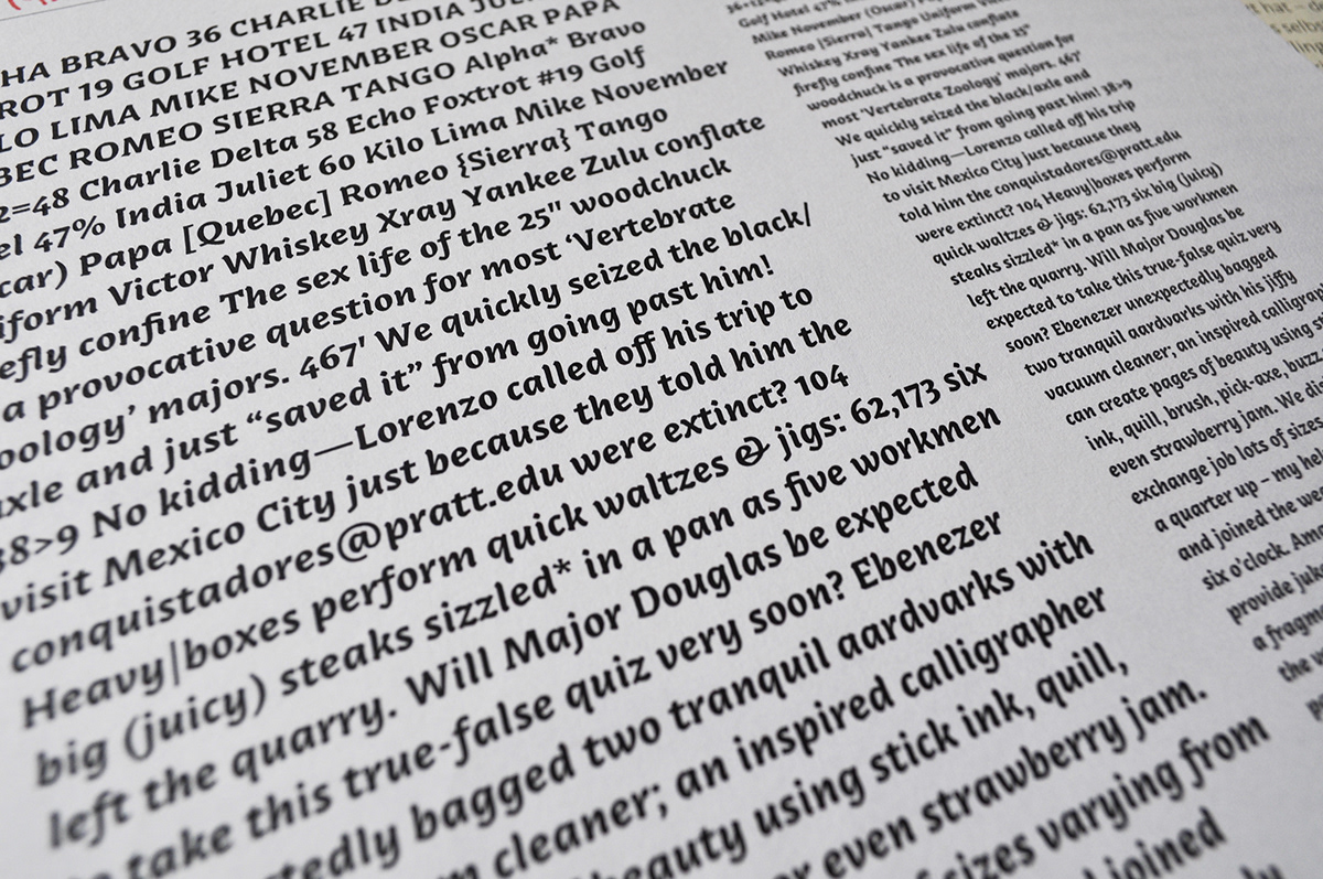
Many test sheets & proofs have to be made to test the typeface at different sizes and in different combinations.

Want to read more about Paiper? Check out the in-depth article on my website and the making-of article. Gestalten News also features an interview about Paiper on their blog.

