


REVITALIZING ABANDONED
SPANISH VILLAGES THROUGH FOOD
For this project, our task was to not only redesign the complete visual identity and branding for this nonprofit but also to formulate a new and modernized sales strategy. We introduced two different subscription methods that benefits not only the organization, but the producers, the planet, and the customers alike.
With our help, Delpueblo is now set to conquer the European market and beyond!
As more and more people move to the city, hundreds of towns face abandonment. Delpueblo is on a mission to revert the effects of the rural flight, one jar a at a time.

THE PROJECT
In response to the gradual decline of Oliete, a small rural village in northeastern Spain, a group of friends founded Apadrinaunolivo (‘adopt an olive tree’ in Spanish), a non-profit initiative where people could adopt and take care of the centenary olive tree of their choice for 50 euros a year. Quite unexpectedly, this sparked a big, supportive community, generated new jobs, and offered hope for Oliete’s future.
As the initiative expanded, they ventured into selling surplus oil and preserved vegetables (also in extra virgin olive oil!) through a humble e-commerce: Mi Olivo. However, lacking a cohesive strategy, their visual identity and brand became disorganized. When preparing to enter the Portuguese market, they reached out to us for help.

THE CHALLENGE
Their internal structure, sales strategy, and visual identity were chaotic, hindering the project’s growth. Our mission was to create a new sales strategy and solid branding for the various sub-brands.


THE SOLUTION
After extensive surveys and research, we consolidated these brands into one: Delpueblo. We also gave it a radical new look while dispelling worn-down stereotypes associated with rural life. The sales strategy was also expanded, creating a membership system that would make the brand flourish.


A NEW VISUAL IDENTITY
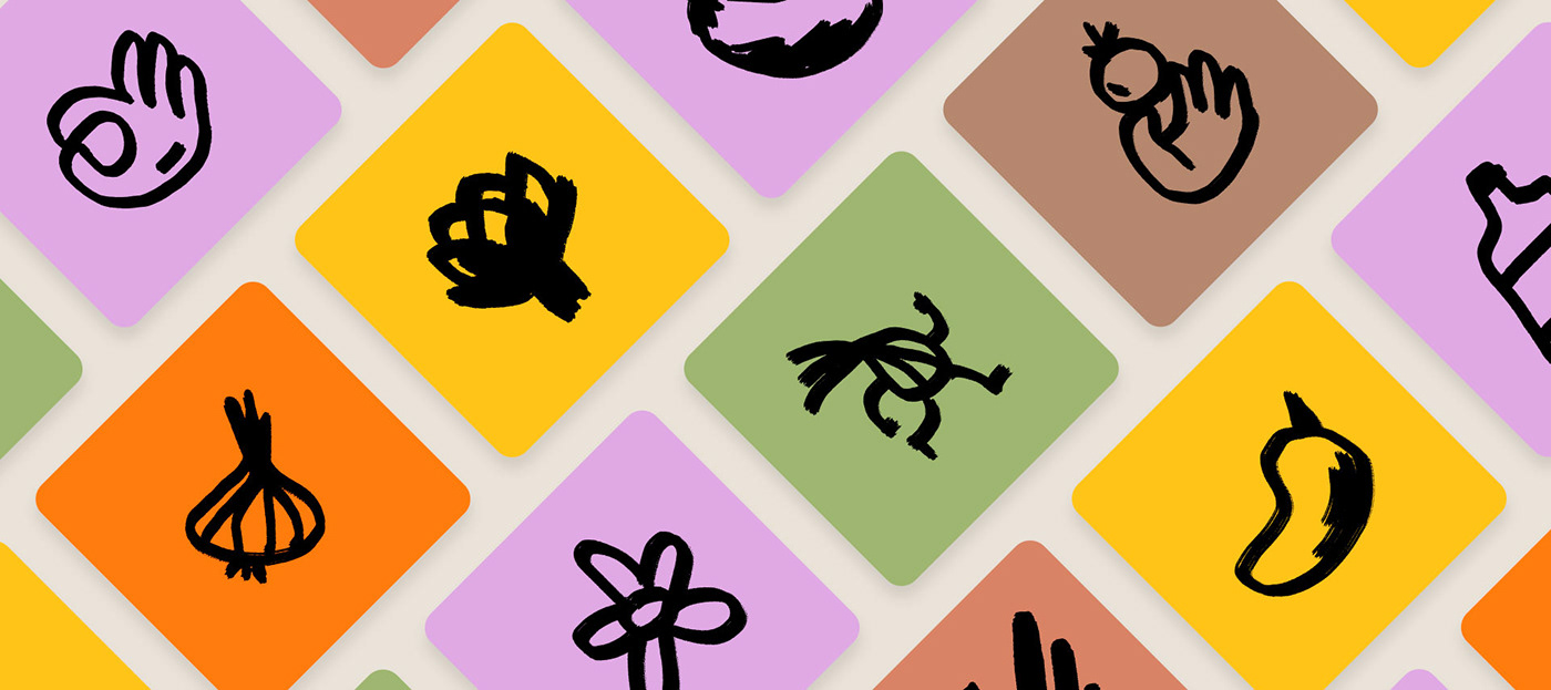
The old identity didn’t capture the care, love and radical ideas behind the initiative. To solve that, we crafted a modern image using brush strokes to represent handmade work. and in contrast with a minimal font and logotype, create a nice balance that’s memorable and iconic. In addition, a soft and neutral color palette representing each of the seasons contrasts with a bold reddish orange that’s meant to express their innovative approach and radical ideas. Finally, to add life to the brand we developed a series of animated icons and handmade illustrations that make their digital spaces, such as their website and social media, more playful.

AN UNCONVENTIONAL COLOR PALETTE &
FONTS THAT SPEAK FOR THEMSELVES
The accent color is strong, with personality, and is far from those used by other brands in the sector. The secondary tones will be used not so much as a specific accent, but rather on larger surfaces and as a highlight for each season.
Cooper is a friendly typeface, which reflects things made with love and with a retro touch that reminds us of tradition and traditional products. As a counterpoint, the secondary typography, more serious and forceful, reflects the social responsibility and professionalism of the brand.


A radical new look that dispels the worn-down stereotypes associated with rural life

MINIMAL PACKAGING FOR MAXIMUM IMPACT
We also designed a minimal packaging system for their entire product range, opting for recyclable glass jars and bottles. The packaging showcases custom illustrations with minimal ink usage and a bold accent color, making the products stand out.


As part of the new visual identity, we also developed a website that is at the same time easy to navigate and fun, moving away from conventional websites in the same category. Delpueblo’s website is dynamic, bold and vocal, and its design and aesthetics underscores their brand values.
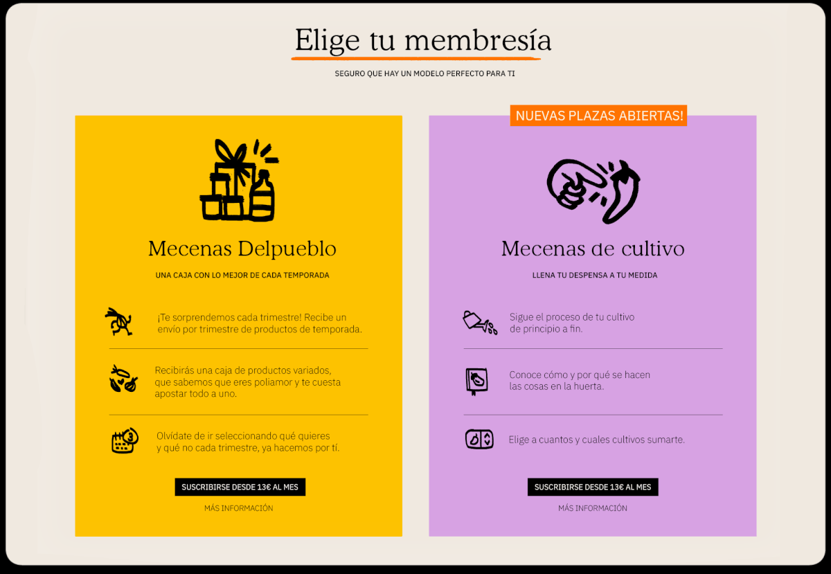
A NEW TAILORED MEMBERSHIP SYSTEM
As part of the new sales strategy, we also developed two memberships, each offering advantages over their traditional e-commerce. One is flexible, allowing users to choose products, frequency, and quantity. The other provides four fixed deliveries per year, aligning with the seasons and emphasizing harmony with nature and the rural world. This approach directly supports farmers and keeps consumers informed about the project’s development.
THANK YOU!


