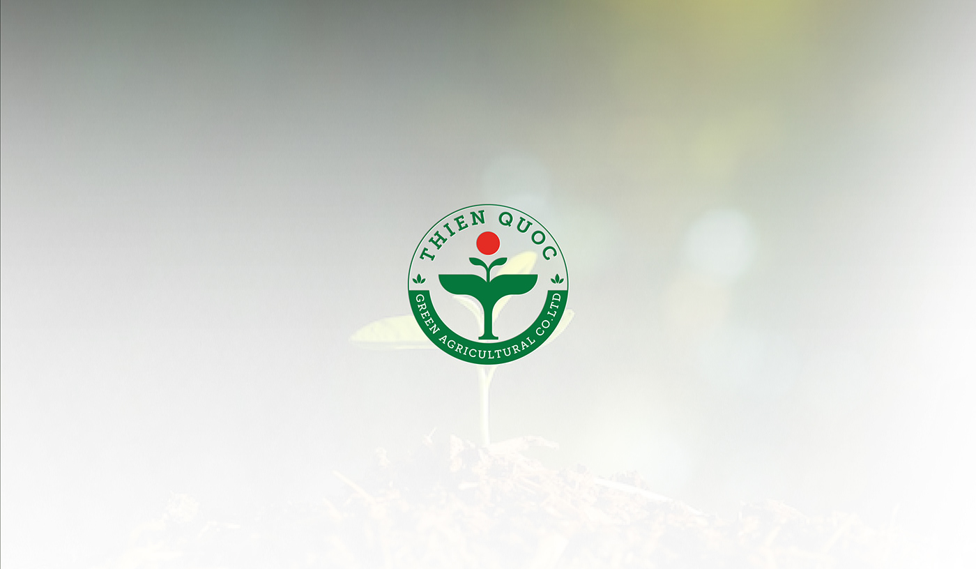
Thien Quoc belongs to the "Emblem Logo" design style, also known as the Emblem Logo, famous for its sophistication and complexity when using small details, many layers and combining with letters to create. With the characteristics of this design style, important information such as the brand name "Thien Quoc" and business line "Green Agriculture Co. Ltd" are integrated into the logo to help customers easily recognize the brand.
The colors in Thien Quoc's logo are also full of meaning. The green background represents the freshness and life of the natural world, while the yellow color represents fortune and development. Besides, the white color in the logo represents professionalism and sophistication. This color combination creates an image suitable for the business industry and increases brand recognition.
The logo is a clever arrangement of different elements when combined with the image of a bag top and the sun to create a T-shaped symbol - the first letter of the brand name. All symbols are metaphors for the vastness of heaven and earth, as vast as the name Thien Quoc, meaning the interaction between humans and nature, between freshness and strong development and prosperity in the agricultural industry. Vietnamese industry.