


First of all there are some website that are selling this design without authorization and they are not related to me (all you can see here is done by me) so be aware from those websites:
https://titantwister.com/projects/fresh-resume-skills-chart/
https://titantwister.com/projects/fresh-resume-skills-chart/
Since june 2014 I'm looking for a new job and, due to that, I've experienced some problem with online job platforms... usually the most common was the file size limit, so time to goin on a different way making an eye catching resume with a really small size?
Below you can see my resume that, with his 43 KB size, is the lighter I've ever done.
I've to say that this was absolutly not easy to do but here it is. All work was done in InDesign, no Photoshop, no Illustrator.
If you want to hire me, get in touch. :)

Font choice is always an hard part of the making of every project. For my resume font had to respect certain parameters:
- compact
- most readable as possible
- modern
Considering all the points I've preferred to use the Franchise regular (I've already used this font for the "Because Racecar" project).


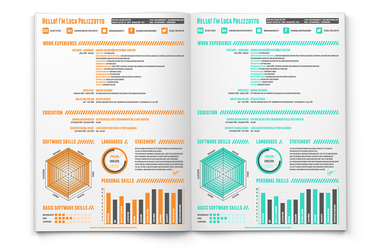
I'm a huge bright colors fan. For that I've tryed to find the best color that represents me... after some attempt here is the two finals colors. As you can see these are Pantone colors cause I've considered also a possible resume print using less colors as possible (in this case the base is a 80% black and then or a Pantone 715C or a Pantone 333C).


First section is also the one I've redesigned from zero expecially considering that out of Italy is not required, due to privacy, to specity if I've a driving license or where I'm born or other not work related things.
In this section are available also few web and social links:
- Behance portfolio link
- Linkedint profile link
- Personal website link
- Facebook freelance page
- Twitter
In previous resume versions there was a lot of icons with more social media account... I think this was too many links and that could be confusing, so I've preferred to reduce to making the section cleaner as possible.

Second part of resume is focused on my working experience... there are no changes, except of course font and some new client.

Like the work section also the education one is the same as the previous one.

Probably the skills section is the one that had the most changes of all resume.
I love to improve and experiment new things and this is for sure the best example.
The previous "Software Skills" line chart was removed and I've used a hexagon chart with a different color gradient from the center to the border to show the skills level.
But there are others changes:
- languages corner now is composed but a singular circle chart composed by three circle (one for every language spoken)
- first new entry is my statement where I explain what I do and what I'm looking for
- second new entry is the basic software skills corner: we all know that we are able and "masters" of some softare but there are also other that are not strictly related with our work (if you're focused on editorial design it's possible that you're not so skilled in 3D or webdesign or viceversa)... so here are listed few software I use but not in professional way.
- personal skills chart is quite similar the previous one, I've simply added some other voice.
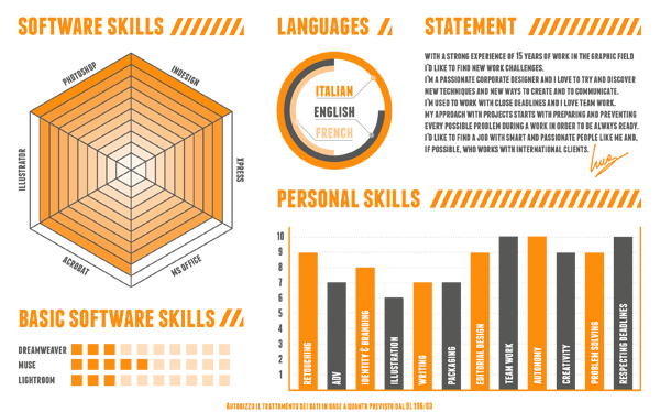

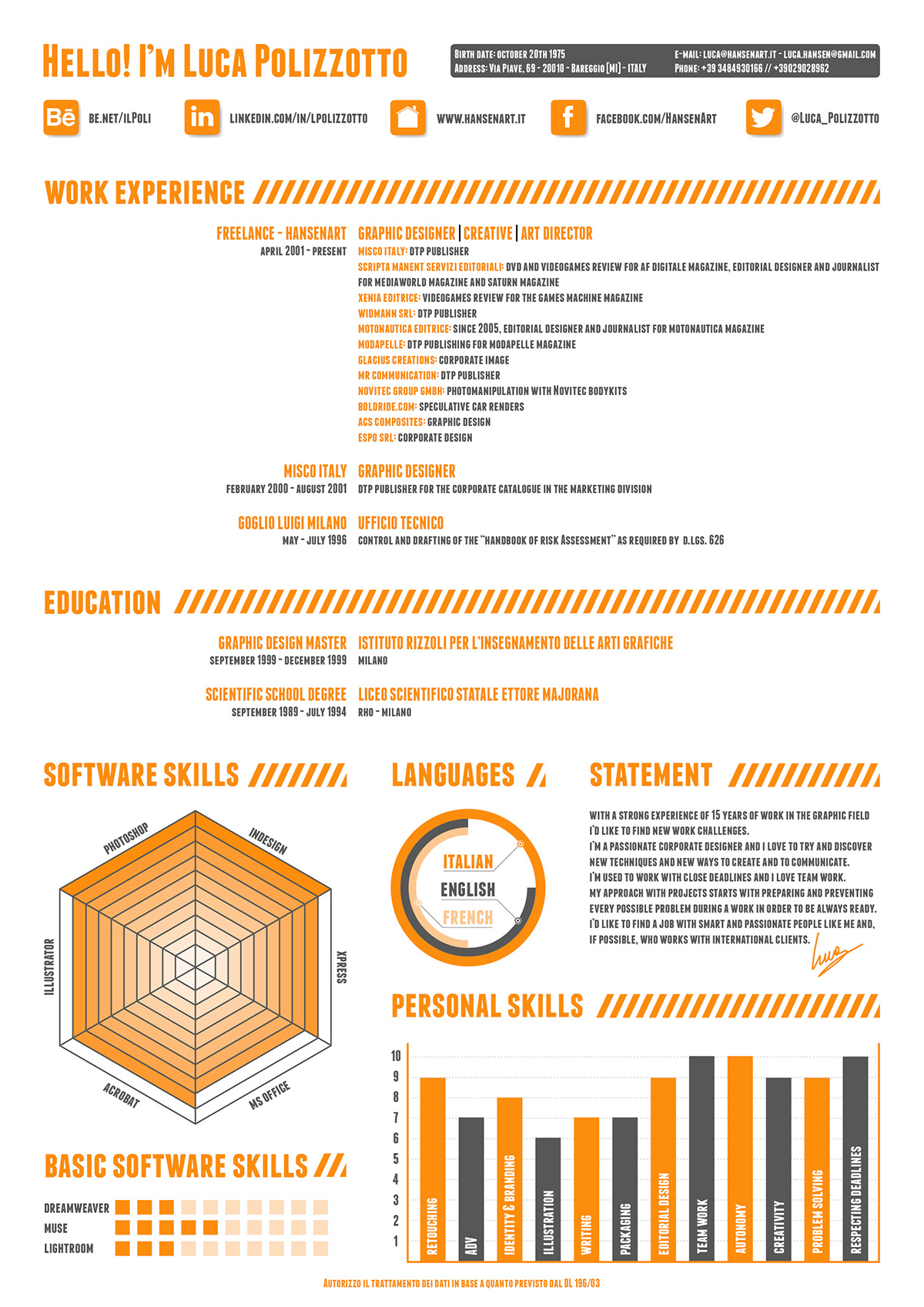


After lot of positive feedbacks I've worked again on this new resume redefining the Software Skills corner with a more readable look.


