


-
야금야금
“Yageum Yageum” is a bakery with a quiet and calm atmosphere located in Korea. We all live in a busy modern society, and we all need to be free from time constraints. We hope to spend a leisurely day in this space, enjoying a slice of warm bread and a cup of coffee.
"야금야금” 은 대한민국에 위치한 고요하고 차분한 분위기의 빵집입니다. 우리는 바쁜 현대사회에 살고 있는 모두가 시간적인 제약을 받지 않고 이 공간에서 따뜻한 빵 한 조각과 커피 한 잔의 여유를 즐기며 느긋한 하루를 보내기를 소망합니다.


Prologue
The dictionary meaning of the expression "Yageum Yageum" is a Korean expression that describes the shape of food being put in your mouth and eaten little by little. In line with these expressions and brand slogans, we designed the interior to feel textured using concrete to create a calm and vintage atmosphere. There is an outdoor terrace and an indoor ordering space on the first floor, an indoor space on the second floor, and an indoor space and a rooftop on the third floor.
"야금야금” 이라는 표현의 사전적 의미는 음식을 입안에 넣고 조금씩 먹어 들어가는 모양을 묘사한 한국식 표현입니다. 우리는 이러한 표현과 브랜드 슬로건을 결합하여 차분하면서 빈티지한 분위기를 연출하기 위해 콘크리트를 사용하여 질감이 느껴지도록 인테리어를 설계했습니다. 1층엔 야외 테라스와 실내 주문 공간이 있고, 2층엔 실내공간, 3층은 실내공간과 루프탑으로 이루어져 있습니다.
Logo & Color
The brand logo of "Yageum Yageum" gradually transformed the existing thin and angled shape of Hangul, focusing on the soft and stable feeling in line with the brand image using a curved type face rather than a hard and static feeling. It also selects a soft yellow color as the brand color to deliver a warmer and more comfortable feeling.
“야금야금” 의 브랜드 로고는 기존의 얇고 각진 한글의 형태를 조금씩 변형시켜 딱딱하고 정적인 느낌이 아닌, 곡선 형태의 타입페이스를 사용해 브랜드 이미지에 맞추어 부드럽고 안정적인 느낌에 초점을 두었습니다. 또한 몽글몽글한 분위기의 노란색(ffe000) 색상을 브랜드 컬러로 선정하여 보다 더 따뜻하고 편안한 느낌을 전달합니다.
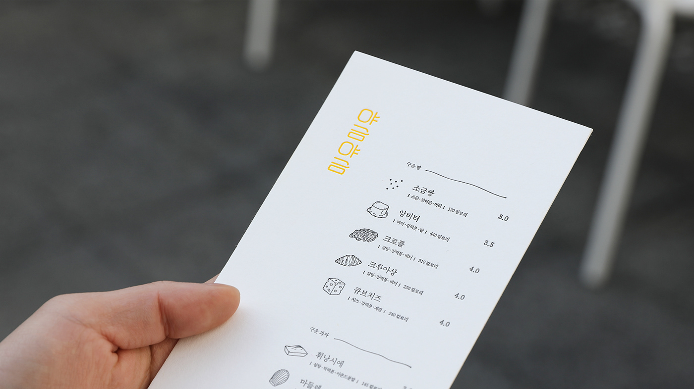
Menu
"Yageum Yageum" bakery offers bite-sized, small bakeries that match the brand name. Representative menus include Korean desserts such as red beans and butter, croffles printed with croissant raw paper in a waffle machine, Cube cheese, whinancier, croissant, madeleine, canulet, egg tart, etc It is composed of menus that are easy to cut little by little rather than bulky and burdensome menus. In addition, we marked ingredients and calories for each menu to address the needs of consumers.
대표적인 메뉴들로는 한국 디저트인 팥과 버터가 들어간 앙버터빵, 크루아상 생지를 와플 기계에 찍어낸 크로플, 치즈크림을 품고 있는 큐브치즈, 휘낭시에, 크루아상, 마들렌, 까눌레, 에그타르트 등 부피가 크고 부담스러운 메뉴들이 아닌, 브랜드 이름과 어울리는 한 입 크기의 작은 베이커리들을 제공하고 있습니다. 또한, 소비자들의 니즈를 해결하기 위해 각각의 메뉴마다 구성 재료와 칼로리를 표기하였습니다.


Icon
The icons used on the menu were created more delicately using brush tools. It avoids regular or hard feelings, and designs each icon in a naturally curved form to create a softer and more cute feeling. Also, the small dots arranged on the right side of each icon represented the powder on the bread using yellow, the brand color of little by little.
메뉴판에 사용된 아이콘들은 브러쉬 툴을 사용하여 보다 더욱 섬세하게 제작하였습니다. 규칙적이거나 딱딱한 느낌을 지양시키고, 각각의 아이콘들을 자연스럽게 굴곡 있는 형태로 디자인하여 조금 더 부드러우면서 아기자기한 느낌을 연출합니다. 또한, 아이콘마다 우측에 정렬된 조그마한 점들은 야금야금 브랜드 컬러인 노란색을 사용하여 빵에 묻은 가루들을 표현하였습니다.


Font
The Yageum Yageum project was created using a 310 canonical font, which is a Korean font. Optimized for small letters, the 310 canonical typeface is a modern drool with a neat and neat feeling with a curved beauty, and the smaller the letter, the better the efficiency. We created logos and packaging by incorporating these characteristics of typeface, By using only Korean fonts, we focused on brand identity while considering convenience to make it a little more accessible to consumers.
야금야금 프로젝트는 한글 폰트인 310정인자 서체를 사용하여 제작했습니다. 작은 글자에 최적화된 310정인자 서체는 곡선미를 가지고 있는 정갈하고 단정한 느낌의 현대적 흘림체이며 글자가 작아질수록 효율이 좋아지는 것이 특징입니다. 우리는 이러한 서체의 특성을 접목시켜 로고 및 패키징을 제작하였고, 한글 폰트만을 사용함으로써 소비자들이 조금 더 접근하기 쉽도록 편의성을 고려함과 동시에 브랜드 아이덴티티에 초점을 맞추었습니다.
Epilogue
We provide a stable and comfortable space for consumers by using a quiet, calm interior, and yellow, a brand color that conveys a warm and cozy feeling. In this way, we have created one bakery project called "Yageum Yageum" by combining our slogan with packaging and various brand identities.
우리는 조용하면서 고요하고 차분한 분위기의 인테리어와, 따뜻하면서 포근한 느낌을 전달하는 브랜드 색상인 노란색을 사용하여 소비자들에게 안정적이고 편안한 공간을 제공합니다. 이처럼 우리의 슬로건과 패키징 및 여러 가지의 브랜드 아이덴티티를 결합하여 “야금야금”이라는 하나의 베이커리 프로젝트를 제작하였습니다.


야금야금
Creative Director: Seongmin Lee
BX Designer: Seonwoo Choi
© 2024 SeongminLee. Team
We inform you that it was produced by purchasing the copyright license for the font "310 JeongInja"
폰트 310정인자 에 대한 저작권 라이센스를 정식 구매하여 제작되었음을 알려 드립니다.


